DESIGN NAME:
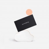
Joy of Playing
PRIMARY FUNCTION:
Brand Identity
INSPIRATION:
Balin is a brand with purpose.
Their aim is to promote healthy active play, develop social and emotional skills and foster knowledge about the environment through fun and engaging play experience.
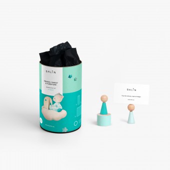
They needed an identity, look and feel coherent with their brand purpose, values and beliefs. That is why we developed an authentic, positive and fun visual language based on minimalistic aesthetics and topped with heartmelting aquarelle illustrations.
UNIQUE PROPERTIES / PROJECT DESCRIPTION:
Balin is a brand offering beautifully crafted toys that educate, inspire and delight.
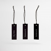
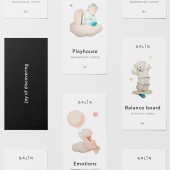
We developed all aspects of their communication: from the design of their logo and branding assets to the colors and shapes of their toys and characters... and then we brought them to life in a series of charming illustrations. Each character has a name and story behind, helping to build an emotional connection with children.
OPERATION / FLOW / INTERACTION:
All toy characters have a name and story behind, helping to build an emotional connection with children. They are further brought to life in a series of charming aquarelle illustrations.
PROJECT DURATION AND LOCATION:
The process of creating the whole visual style of product and visual communication was long and exhaustive, starting from mid 2020 and finished somewhere late 2021.
FITS BEST INTO CATEGORY:
Graphics, Illustration and Visual Communication Design
|
PRODUCTION / REALIZATION TECHNOLOGY:
All materials, as well as for the toys production, as well as for the branding and packaging used are selected from the highest quality sustainable, harmless and recyclable. Wood, plywood, harmless water and plant based paints, paper, organic cotton.
SPECIFICATIONS / TECHNICAL PROPERTIES:
-
TAGS:
branding, brandidentity, visualcommunication, graphicdesign, kids, empathy, emotionalconnection, illustration, craft, design
RESEARCH ABSTRACT:
The research we performed was not that much design based, but we explored some topics that are related to the brand purpose: Active Play and its physical, cognitive and emotional benefits on children; Social Awareness and how to foster knowledge about environmental issues through play experience, Emotional Intelligence and the importance of social and emotional skills that children of today lack.
CHALLENGE:
The hardest to achieve was the balance between minimalism, plain shapes, a reduced color scheme and at the same time giving a positive, child appealing look and cuteness of the products and identity.
ADDED DATE:
2022-03-30 07:05:38
TEAM MEMBERS (1) :
Creative Director - Yana Okoliyska
IMAGE CREDITS:
SQUARED, 2021.
|


