|
|
|

|
|
DESIGN DETAILS |
DESIGN NAME: Primary Residence
PRIMARY FUNCTION: Visual Branding
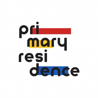
INSPIRATION: The idea of the logo comes from the Chinese character Ju, which stands for living space. The red, yellow, and blue primary colors are well integrated into different stories of the character, which embodies the architectural theme of this project.
The Chinese brand name of this project is Yuan Se Ju, which is an artful translation of Primary Residence, with the translated word primary also meaning primary colors in Chinese. Took the 3 primary color stripes from the Chinese character.
UNIQUE PROPERTIES / PROJECT DESCRIPTION: An identity system for a multidisciplinary brand that explores the relationship between the human condition and the meaning of home in an age of isolation. The project originally started as a typography exploration that connects the style of the Bauhaus Movement with abstract architectural forms. The classic red, blue and yellow primary color scheme of Bauhaus inspired us to name the project "Primary Residence", a double entendre alluding to the style of this project and the messages behind it.
OPERATION / FLOW / INTERACTION: A visual design identity that takes the viewer to know this brand and the messages behind it.
PROJECT DURATION AND LOCATION: Started logo design in July 2021, finished in Feb 2022
FITS BEST INTO CATEGORY: Graphics, Illustration and Visual Communication Design
|
PRODUCTION / REALIZATION TECHNOLOGY: Will print on the textured paper that gives the prints the touch feeling.
SPECIFICATIONS / TECHNICAL PROPERTIES: Main:1080px*1080px, the ration is 1:1
TAGS: Brand Identity, Visual Communication, Logo design, VI design, Bauhaus
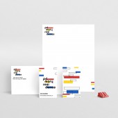
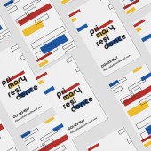
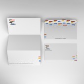
RESEARCH ABSTRACT: The research goal was to find a design solution for visualizing the embodies the architectural theme of this project. And develop the thinking of how to merge the concept from the original Primary Residence type design and logo design. To support an active print were developed including the brochure design, business card, and a custom stationery kit.
CHALLENGE: How to combine the elements and concepts from the Primary Residence type design with this brand logo. It takes a long time to make the exploration of transferring the design strategy from the Primary Residence type design to the logo. And also make an artful translation from Chinese characters.
ADDED DATE: 2022-03-29 02:17:33
TEAM MEMBERS (1) :
IMAGE CREDITS: Evleen Huang
|
|
CLIENT/STUDIO/BRAND DETAILS |
 |
NAME: evleen.
PROFILE: A creative owner based in New York and enjoys more than storytelling and bringing ideas to life through design. The works span a variety of disciplines including digital social, typography, branding, event production, and motion media. The notable clients include Google, Evolution Fresh, Coke Cola, Coach, Estée Lauder, American Express, Macallan, among others. And also produces creative content for top American entertainment brands and some of the world's largest beauty brands.
|
|
|
|
Did you like Tianzhen Huang's Graphic Design?
You will most likely enjoy other award winning graphic design as well.
Click here to view more Award Winning Graphic Design.
Did you like Primary Residence Visual Branding? Help us create a global awareness for good graphic design worldwide. Show your support for Tianzhen Huang, the creator of great graphic design by gifting them a nomination ticket so that we could promote more of their great graphic design works.
|
|

|
NEWS Results will be Announced to Public on April 15, 2025. Visit this page on April 15, 2025 to see the worlds' leading designs, ideas, trends and concepts in 2025. REGISTRATIONS OPEN Registration to A' Design Award & Competition 2024-2025 period is now open. Register and upload your design today to know how good your design is: get a complimentary preliminary score. 
|
|