Archadia Brand Identity by Cristian Carrara |
Home > Winners > #139697 |
 |
|
||||
| DESIGN DETAILS | |||||
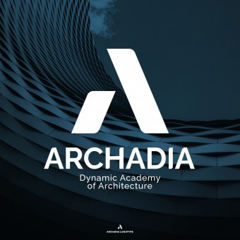
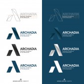
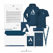
| DESIGN NAME: Archadia PRIMARY FUNCTION: Brand Identity INSPIRATION: The inspiration came from the letter A of the name, but also from the words that generated it and that contain the mission of the school such as Architecture, Academy, Abitare (Living) and Archos, the architecture studio that deals with the management of masters and courses. A static but dynamic "A" at the same time transmitting stability and strength in a contemporary guise. The form starts from the elementary geometry of a triangle, the static form par excellence in architecture. The blue recalls its institutional role but also the colors of Venice lagoon, headquarters of the academy. UNIQUE PROPERTIES / PROJECT DESCRIPTION: ARCHADIA is the establishment of a European Higher Education School based in Venice, Italy, capable of acting as an active laboratory in the transition of the way of living on the planet towards sustainability. On this, the Archadia logo conveys the spirit of the mission starting from a stylized letter "A", split in two solid volumes, static but dynamic at the same time and understood both as the initial letter of the brand name, but also as Academy, Architecture, Abitare (Living) and Archos Studio creator and organizer of courses and masters. OPERATION / FLOW / INTERACTION: The vector logo is versatile and can be used in different ways, shapes and versions for brand identity needs. It can be used on light or dark backgrounds, only as a symbol, word-mark only or both with symbol and word-mark as complete logotype. In this regard, solutions have been devised for personalized gadgets, both for stationery products and clothing and textile products. PROJECT DURATION AND LOCATION: The project was developed from February to March 2022 in Bergamo and was presented in Venice in March 2022. FITS BEST INTO CATEGORY: Graphics, Illustration and Visual Communication Design |
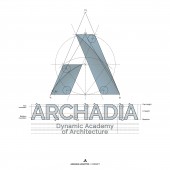
PRODUCTION / REALIZATION TECHNOLOGY: The Archadia logo was produced with Adobe Illustrator CC 2021 and Adobe Photoshop CC 2021. The symbol concept was conceived with a technical drawing based on the geometric construction of an equilateral triangle and an isosceles triangle. SPECIFICATIONS / TECHNICAL PROPERTIES: The logo was designed starting from an equilateral triangle and inscribed in isosceles triangle. The blue color recall the blue water and reflections of Venice lagoon, where Archadia headquarters are based. TAGS: Archadia, Logo, Brand Identity, Logo design, Archadia Academy, Archadia Brand Identity, Archadia logo, Cristian Carrara, Archos RESEARCH ABSTRACT: Starting from the mission of Archadia, the logo conveys the spirit of stability but also of the dynamism of this architecture academy transmitting its identity, the strength and the will to go further. The versatility of use and the simplicity of the shape of this logo makes it immediately recognizable, both as an academic symbol and as an identity of a new way of approaching architectural design. CHALLENGE: The most difficult part in creating this logo was certainly to not fall into a banal or overly simplified forms, not being able to convey the spirit and the mission of the brand with the risk of plagiarism of a highly inflated form such as the letter "A", widely used in graphics and logos. After a careful investigation and research on the already existing forms recalling the letter A in the world of graphics and brand identities, we proceeded with the design and stylization of the A starting from a geometric construction and then personalizing it on the needs of the brand in a contemporary and captivating look. ADDED DATE: 2022-03-23 10:47:23 TEAM MEMBERS (1) : IMAGE CREDITS: Image #1: Creator Cristian Carrara, 2022 Image #2: Creator Cristian Carrara, 2022 Image #3: Creator Cristian Carrara, 2022 Image #4: Creator Cristian Carrara, 2022 Image #5: Creator Cristian Carrara, 2022 PATENTS/COPYRIGHTS: © 2022 Cristian Carrara |
||||
| Visit the following page to learn more: http://bit.ly/3qCkVMB | |||||
| AWARD DETAILS | |
 |
Archadia Brand Identity by Cristian Carrara is Winner in Graphics, Illustration and Visual Communication Design Category, 2021 - 2022.· Read the interview with designer Cristian Carrara for design Archadia here.· Press Members: Login or Register to request an exclusive interview with Cristian Carrara. · Click here to register inorder to view the profile and other works by Cristian Carrara. |
| SOCIAL |
| + Add to Likes / Favorites | Send to My Email | Comment | Testimonials | View Press-Release | Press Kit |
Did you like Cristian Carrara's Graphic Design?
You will most likely enjoy other award winning graphic design as well.
Click here to view more Award Winning Graphic Design.


