Greeninful Rebranding by Michelle Poon |
Home > Winners > #139444 |
 |
|
||||
| DESIGN DETAILS | |||||
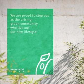
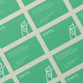
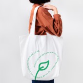
| DESIGN NAME: Greeninful PRIMARY FUNCTION: Rebranding INSPIRATION: The brand carries the character of persevering, curious and positive. It represents a community, a group of people who care for the environment. Therefore, the inspiration comes from humans, the green community. UNIQUE PROPERTIES / PROJECT DESCRIPTION: Greeninful is an ecofriendly brand supporting a sustainable lifestyle and drawing the green community together. It is set up by a young Hongkonger aiming to raise public awareness towards environmental protection. Greeninful brings society innovative and environmental friendly which products providing a solution towards the increasing amount of garbage and introducing a whole new recycling lifestyle to society. OPERATION / FLOW / INTERACTION: This work is using a collaborative design thinking approach taking in the client's input from time to time, as well as interviewing the brand users and customers on any insights from the products to brand touchpoints and social media engagement. The designer worked closely with the client on generating ideation for the rebranding as well as creating brand proposition, mission, vision and value. PROJECT DURATION AND LOCATION: October 2021 - January 2022 FITS BEST INTO CATEGORY: Graphics, Illustration and Visual Communication Design |
PRODUCTION / REALIZATION TECHNOLOGY: The logo depicts a raw yet cultivated aesthetic of the face of the community. It represents the determination and curiosity in exploring the new and continuous green lifestyle, which is also the main activation of the community Greenin'ful wanted to be a part of. SPECIFICATIONS / TECHNICAL PROPERTIES: This rebranding project is going to extend as the business of Greeninful is going to expand. Hopefully, they will start different product lines which will be recycling wheat wastes from beer brewing and new sub-brands will be created in the future. TAGS: Green, Branding, SocialDesign, Rebranding, VisualIdentity, Brand, VisualCommunication RESEARCH ABSTRACT: We look into the products and services the brand provided over the years, study the audience profiles and also dig deep into the founder's mindset and vision about the brand. The research phase took about 2-3 months to understand the brand holistically. From the research, we find out that the green community actually lack the connection where they do not know each other's existence which makes the community lose their voice. Greenin'ful just act perfectly as the middle person who could connect all these people together. CHALLENGE: The challenge is definitely going out and interviewing people under the situation of COVID and get enough data to support the insight. ADDED DATE: 2022-03-19 06:22:52 TEAM MEMBERS (1) : Michelle Kason IMAGE CREDITS: Image 1: Michelle Kason (Designer) |
||||
| Visit the following page to learn more: http://tinyurl.com/2p8fpw9z | |||||
| AWARD DETAILS | |
 |
Greeninful Rebranding by Michelle Poon is Winner in Graphics, Illustration and Visual Communication Design Category, 2021 - 2022.· Read the interview with designer Michelle Poon for design Greeninful here.· Press Members: Login or Register to request an exclusive interview with Michelle Poon. · Click here to register inorder to view the profile and other works by Michelle Poon. |
| SOCIAL |
| + Add to Likes / Favorites | Send to My Email | Comment | Testimonials | View Press-Release | Press Kit |
| COMMENTS | ||||||||||||
|
||||||||||||
Did you like Michelle Poon's Graphic Design?
You will most likely enjoy other award winning graphic design as well.
Click here to view more Award Winning Graphic Design.


