DESIGN NAME:
Sxdesign
PRIMARY FUNCTION:
Brand Identity
INSPIRATION:
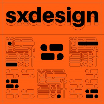
As a design studio in China, “SX” stands for Chinese “ShangXiang” which taken from “Yi Chuan”. The name expounds the brand core opinion: To build significance of daily life through the observation, extraction, abstraction and reorganization of phenomena. We think the role of human language is the same too. So, we excite people's imagination of language to express the culture of the brand and to build a connection between the logo and the Chinese name.
UNIQUE PROPERTIES / PROJECT DESCRIPTION:
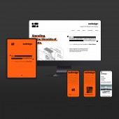
The logo can grow into its traditional Chinese name, linking history and future dynamically. The graphics in the corner is reminiscent of quotation marks and gives imaginary meaning to the rectangles in the logo. This design not only makes the logo symmetrical, but also implies a citation, markup, or modification of human language and thoughts. So, it tells that the brand creates and values language and idea of client and user, such as requirements, knowledge, or the attitude of sxdesign itself.
OPERATION / FLOW / INTERACTION:
The brand stimulates a kind of imagination about language, that is, sxdesign is glad to face people's various languages and ideas, such as the phenomena of market, the voices of clients, the requirements of users. And then the brand can cite them, understand them, mark them, communicate with them and create significance through them.
PROJECT DURATION AND LOCATION:
Fr. November 2021 to January 2022, Beijing, China.
FITS BEST INTO CATEGORY:
Graphics, Illustration and Visual Communication Design
|
PRODUCTION / REALIZATION TECHNOLOGY:
Every detail of the logo uses a 1:1.414 ratio. This proportion makes the logo look compact and composed. In the left and right direction, the circle slightly protrudes from the rectangle to compensate for the visual deviation.
SPECIFICATIONS / TECHNICAL PROPERTIES:
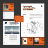
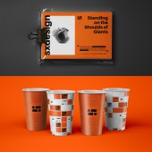
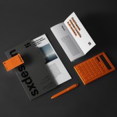
It can be print on various size and material.
It also can grow into its classical style Chinese name by motion graphs.
TAGS:
Brand Identity, Chinese, Modern, Traditional, Orange, Language
RESEARCH ABSTRACT:
Research has shown that the similar elements can evoke familiar experiences in human brain. The symbol similar to quotation marks, and the visual framework similar to the citation remind people of related experiences about language. Sxdesign uses such brand image to express that it attaches great importance to information and hopes to create significance for the world through design, just like people use language to build meaning.
CHALLENGE:
The Chinese name and core concept of Sxdesign are very profound and abstract. At the same time, sxdesign also hopes to convey its emphasis on the connection between tradition and modernity. The challenge of the project is to use a simple and modern logo to convey rich information while making a connection with the Chinese name.
ADDED DATE:
2022-02-27 13:34:12
TEAM MEMBERS (13) :
Xu Chen, Rong Zhang, Fangbo Wu, Hao Huang, Qian Hao, Beibei Liu, Yingfei Sun, Tianshu Liu, Haining Jiang, Shulong Li, Zhihuan Yuan, Mingjie Zhang and Yan Liu
IMAGE CREDITS:
Sxdesign
PATENTS/COPYRIGHTS:
Sxdesign
|
