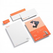
Heargo Visual Identity by Hiemen Chung |
Home > Winners > #136597 |
| CLIENT/STUDIO/BRAND DETAILS | |
 |
NAME: Halo Design Studio PROFILE: Halo Design Studio is an independent graphic design studio based in Hong Kong since 2018. Their works cover brand identity, print communications, art direction, websites and packaging. |
| AWARD DETAILS | |
 |
Heargo Visual Identity by Hiemen Chung is Winner in Graphics, Illustration and Visual Communication Design Category, 2022 - 2023.· Read the interview with designer Hiemen Chung for design Heargo here.· Press Members: Login or Register to request an exclusive interview with Hiemen Chung. · Click here to register inorder to view the profile and other works by Hiemen Chung. |
| SOCIAL |
| + Add to Likes / Favorites | Send to My Email | Comment | Testimonials | View Press-Release | Press Kit |
Did you like Hiemen Chung's Graphic Design?
You will most likely enjoy other award winning graphic design as well.
Click here to view more Award Winning Graphic Design.


