Pentaheal Clinic Rebranding Brand Identity by Pentaheal and Eidetic |
Home > Winners > #135773 |
 |
|
||||
| DESIGN DETAILS | |||||
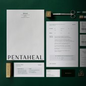
| DESIGN NAME: Pentaheal Clinic Rebranding PRIMARY FUNCTION: Brand Identity INSPIRATION: The biggest motif of Pentaheal Clinic design is 'extension' UNIQUE PROPERTIES / PROJECT DESCRIPTION: Pentaheal is a Korean medical clinic specializing functional medicine, biology-based approach to identify the cause of disease. To deliver its philosophy, integrated rebranding has been undertaken. To meet the global need of patients, the visual language needed to be universal and straight-forward. OPERATION / FLOW / INTERACTION: Every letter, except 'P, T, H', has a unique serif that expresses Pentaheal’s global medical vision. For symbol mark, 'P, T, H’ abbreviated new symbol has been integrated with the universal medical symbol 'cross'. The axis of the symbol mark is extended in both directions, to be used on various shapes and sizes of the brand application items. Each line sprawling from the 'Cross(+)' shape represents the core value of #pioneering #leading #central #trust; and it differentiates Pentaheal as a set of medical practices that goes beyond treating people to providing people exuberant lives. PROJECT DURATION AND LOCATION: The project started in July 2021 and finished in December 2021 in Seoul. FITS BEST INTO CATEGORY: Graphics, Illustration and Visual Communication Design |
PRODUCTION / REALIZATION TECHNOLOGY: Pentaheal Clinic is located at Gangnam Station, the most developed area in Seoul. The space was divided into two floors, 'reception and examination center' and 'VIP and treatment room', and signage suitable for the characteristics of each floor was designed. The reception floor is designed with a bright and lively white-tone concept with an atmosphere of hospitality, and the treatment floor is a luxurious and reliable concept with a toned-down color. It was designed for the consistent branding of separate spaces. SPECIFICATIONS / TECHNICAL PROPERTIES: Adress: Gangnam-daero, Seocho-gu, Seoul, Republic of Korea Reception and Examination floor: 350m² VIP and Treatment floor: 300m² TAGS: Functional medicine, Health, Well-being, Rebranding, Signage, Wellness RESEARCH ABSTRACT: To emphasize expertise, our team collected as much data as possible through a variety of methods, including surveys, style curation, interviews with hospital staff and visitors, and also functional medicine examinations. Our conclusion was that Pentaheal's philosophy should be easily communicated to the public and provide a consistent brand design. Through the idea of expandability of the medical symbol 'cross(+)' in both directions, we have developed a consistent brand identity with various communication items such as branding and signage. CHALLENGE: Functional medicine in Korea is an unfamiliar medical field that is not yet widely known. Through the rebranding of Pentaheal Clinic, we aim to promote functional medicine as a new medical field in Korea and Southeast Asia. Conceived from the medical symbol 'Cross(+)' which represent medical services, the motif of symbol mark is expandability of horizontal and vertical axis. Lines sprawling from the 'Cross(+)' shape express that Pentaheal's service area can be expanded to various fields. ADDED DATE: 2022-02-14 07:48:07 TEAM MEMBERS (5) : Project Owner: Harin You, Pentaheal, Executive Sponsor: Ashley S. Jung, Eidetic, Creative Director: Haein Chae, Pentaheal, Brand Designers: Olivia J. Shin, Kimmi M. Kim, Saerona Shin, Sunny Lee, Eidetic and Brand Strategiest: Rick Jeong, Eidetic IMAGE CREDITS: Pentaheal and Eidetic, 2021. |
||||
| Visit the following page to learn more: http://eideticmarketing.com/ | |||||
| AWARD DETAILS | |
 |
Pentaheal Clinic Rebranding Brand Identity by Pentaheal and Eidetic is Winner in Graphics, Illustration and Visual Communication Design Category, 2021 - 2022.· Read the interview with designer Pentaheal and Eidetic for design Pentaheal Clinic Rebranding here.· Press Members: Login or Register to request an exclusive interview with Pentaheal and Eidetic. · Click here to register inorder to view the profile and other works by Pentaheal and Eidetic. |
| SOCIAL |
| + Add to Likes / Favorites | Send to My Email | Comment | Testimonials | View Press-Release | Press Kit |
Did you like Pentaheal and Eidetic's Graphic Design?
You will most likely enjoy other award winning graphic design as well.
Click here to view more Award Winning Graphic Design.


