
|
|
| DESIGN DETAILS |
DESIGN NAME:
SP Saffron Grotesk
PRIMARY FUNCTION:
Type Specimen
INSPIRATION:
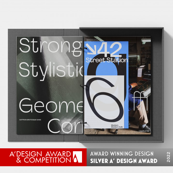
Inspiration for the design of the font was gained from swiss modernist typefaces from 1960 to present aesthetics. The design and form of the folder was inspired by the idea of a reference binder and a manual of usage and to give the idea of a modern digital typeface presented in a retro feel.
UNIQUE PROPERTIES / PROJECT DESCRIPTION:
Saffron is an elegant contemporary neo-grotesque sans-serif typeface with strong stylistic geometric contrasts, drawing on the aesthetics and the typographic standards of Swiss modernism. The distinctive wide-open stance was designed to give the right visual consistency for branding and communications. This authentic and original typeface represents the shifting contemporary aesthetics. The specimen is divided into sections, with ringbinded posters inside the pack.
OPERATION / FLOW / INTERACTION:
-
PROJECT DURATION AND LOCATION:
Font was designed from August 2021 and was finished in December 2021
FITS BEST INTO CATEGORY:
Graphics, Illustration and Visual Communication Design
|
PRODUCTION / REALIZATION TECHNOLOGY:
The binder is printed in 8 colors using various stock papers
SPECIFICATIONS / TECHNICAL PROPERTIES:
Binder 230 x 320 x 80
TAGS:
Font design, Branding, Identity, Type design
RESEARCH ABSTRACT:
The research was carried out in a museum of printing with the hot metal systems of linotype and monotype as a base to discover the best idea for the legality, spacing, and counter size.
CHALLENGE:
The challenge was to create a new set of forms and aesthetics for a san serif font, using the elegance of a serif and transforming it into a gothic sans.
ADDED DATE:
2022-02-11 14:58:47
TEAM MEMBERS (2) :
Paul Robb and Moira Bartoloni
IMAGE CREDITS:
Paul Henry Robb
PATENTS/COPYRIGHTS:
Paul Henry Robb
|
| Visit the following page to learn more: https://www.s6foundry.com |
|
| COMMENTS |
| Giulia Esposito |
Comment #15146 on December 27, 2022, 11:49 pm |
|
I am utterly amazed at the extraordinary "Type Specimen" created by the esteemed A' Design Award winner. The sheer level of craftsmanship and creativity in this work is absolutely remarkable. It is clear that the designer has an eye for detail and a passion for design that is truly inspiring. The work speaks for itself and is a true testament to the power of design. It is a masterpiece that will surely be remembered for years to come. Congratulations to Paul Robb and Moira Bartoloni for this incredible achievement!
|
| Paul Williams |
Comment #64233 on January 4, 2023, 12:01 am |
|
SP Saffron Grotesk is an exquisite work of contemporary design. Its unique wide-open stance and strong geometric contrasts make it stand out from the crowd, while its elegant and modern aesthetic is sure to be a hit with modern brands and communications. The research that went into the design of the font, drawing on the typographic standards of Swiss modernism, is evident in the perfect execution of the design. The attention to detail in the production of the binder is also to be admired, with the 8-color printing and various stock papers giving the folder a retro feel. SP Saffron Grotesk is a perfect example of good design and is a true testament to the skill and creativity of its designers.
|
| Paul Phillips |
Comment #75131 on January 4, 2023, 5:09 am |
|
I am in awe of the work that Paul Robb and Moira Bartoloni have achieved with their SP Saffron Grotesk type specimen. The combination of classic Swiss modernism and contemporary aesthetics create a distinct and powerful visual that is immediately recognizable. The wide open stance and strong stylistic contrasts are the perfect complement to any branding and communication design. The ringbinded posters inside the pack give a perfect overview of the typeface and its different applications. This is an elegant and stylish design that is deserving of the A' Design Award.
|
| Elena Petrenko |
Comment #78322 on January 4, 2023, 6:48 am |
|
This work is a stunning blend of modern and retro aesthetics that creates a unique typeface with strong geometric contrasts.
|
| Adam Harris |
Comment #85559 on January 4, 2023, 12:00 pm |
|
I am absolutely delighted by the stunning work presented by Paul Robb and Moira Bartoloni that has been recognized by the esteemed A' Design Award. Their type specimen, titled SP Saffron Grotesk, is a beautiful union of neo-grotesque sans-serif typefaces and Swiss modernism, creating an elegant and contemporary design. The distinctive wide-open stance, combined with the geometric contrasts, gives the typeface an authentic and original look that could easily be used for branding and communications. The research and inspiration that was put into the design of the font is commendable and can be seen in the reference binder-style folder and usage manual that was created for the specimen. Truly an amazing work that deserves to be celebrated.
|
| Chloe Turner |
Comment #91643 on January 4, 2023, 6:17 pm |
|
I am truly impressed by this work. The combination of modern and retro elements is simply stunning and takes the design to a whole new level! The use of swiss modernist typefaces with a reference binder concept is truly unique and creative. The result is a modern digital typeface presented in a classic and timeless way. It is clear that Paul Robb and Moira Bartoloni put a lot of thought and effort into their work, and the result is a beautiful and inspiring design. Congratulations to them on their well-deserved A' Design Award!
|
| Mark Allen |
Comment #93773 on January 4, 2023, 9:01 pm |
|
This work is a stunning example of modern design, combining the aesthetics of Swiss modernism with a contemporary neo-grotesque sans-serif typeface. The unique contrasts in the design give the right visual consistency for branding and communications. The research and production methods used in creating this typeface are impressive and demonstrate a great attention to detail. Congratulations to the designer for a job well done!
|
| Elisabeth Clark |
Comment #94679 on January 4, 2023, 10:32 pm |
|
As a design enthusiast, I'm absolutely in awe of Paul Robb and Moira Bartoloni's award-winning work, "SP Saffron Grotesk". The type specimen is a masterpiece of modern design that perfectly blends the aesthetics of Swiss modernism with contemporary design elements. It has a wide-open stance that gives it a unique visual consistency that is perfect for branding and communications. I'm also impressed by the amount of research and dedication that went into the design. Their research in a museum of printing to determine the best idea for the legality, spacing, and counter size really shows the level of dedication they have to their craft. Paul Robb and Moira Bartoloni have created an elegant and original typeface that will no doubt be a lasting representation of shifting contemporary aesthetics. Kudos to them for their A' Design Award win!
|
|
|


