|
|
|

|
|
| DESIGN DETAILS |
DESIGN NAME:
Dona Vitamina
PRIMARY FUNCTION:
Branding
INSPIRATION:
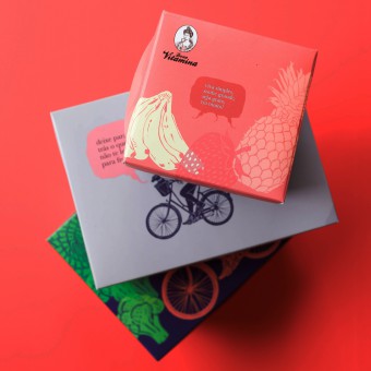
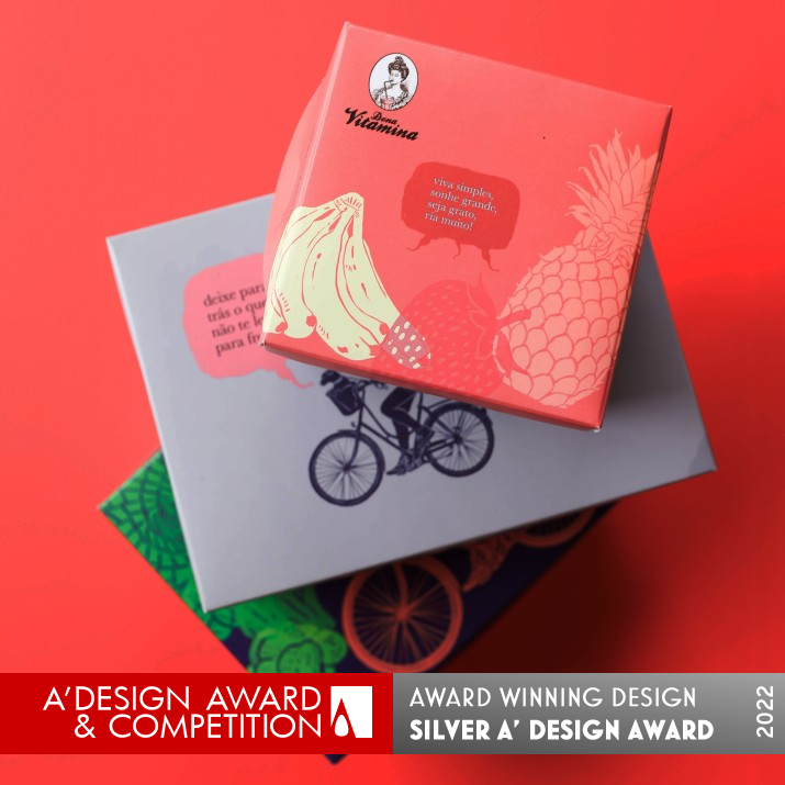
Dona Vitamina was need to change its branding language while preserving its original essence of humor (the logotype is a cross-eyed Victorian lady sipping a juice) and the genesis of female empowerment present since the begin. A series of narratives with women was created, building other Donas Vitaminas, which contemplate different ethnicities and feminine manners. Scattered across surface design, packaging, menus and more, these women are the epitome of the brand's fun and timeless spirit.
UNIQUE PROPERTIES / PROJECT DESCRIPTION:
The brand's language starts to have an expanded female representation and empathic with its public. Identity materials have a more intense and diverse graphic rhythm, an expanded color palette and occupaining of the environmental design. By giving more voice to female representations, the brand strengthens its original concept: a woman who owns herself. Text and graphic representation quickly talk to the public, who shares them on social media and engages with the brand's culture.
OPERATION / FLOW / INTERACTION:
The visual identity project contributes to empowerment the feminine nature of the Dona Vitamina brand, the owner and the majority of the staff are woman. In addition, it allows the client to feel welcomed by the casualness and informality of the brand visual language and its authentic narratives.
PROJECT DURATION AND LOCATION:
The project started in January 2020 and finished in September 2020 in Sao Paulo, Brazil.
FITS BEST INTO CATEGORY:
Graphics, Illustration and Visual Communication Design
|
PRODUCTION / REALIZATION TECHNOLOGY:
Most of the graphic materials were produced in offset in CMYK-scale colors. Offset packaging is suitable for delivery. The wall was handmade by Marcelo Ruis Vargas Martinelli.
SPECIFICATIONS / TECHNICAL PROPERTIES:
Wall, format 3.000 x 1.300 mm. Menu, sheet format 210 x 297 mm, printed on offset paper 300 g/m2., 4X4 colors (CMYK). Postals, sheet format 100 x 150 mm printed on offset paper 240 g/m2., 4X0 colors (CMYK). Bags, format 300 x 400 x 150 mm printed on silkscreen process. Packages, format 210 x 150 X 100 mm, format 150 x 150 X120 mm. Stickers, format 90 x 90 mm, format 30 x 90 mm.
TAGS:
Branding, Logotype, Package, label, illustration
RESEARCH ABSTRACT:
The Laika method is based on the synergy between linguistic and pictorial skills. Every project begins with the construction of meaning, an affirmation, and the need to design small graphic narratives. Thus, the visual identity project expands upon the detailed and strategic work of building an imaginary universe that represents the culture of the Dona Vitamina brand.
CHALLENGE:
The challenge was to reinvigorate the language of the Dona Vitamina brand. The brand is a timeless woman and master of her own will. Allowing the brand's voice to propagate itself in other female representations was the path for the brand to become polyphonic and collective. A series of illustrations of women interacting with elements of everyday life and nature were created, in a stencil style, to represent female polyphony. The voices are with fun phrases, translating the brand's spirit.
ADDED DATE:
2022-01-21 20:04:56
TEAM MEMBERS (1) :
Ruis Vargas, creative director and illustrator; Lorenzo Morelatto, graphic designer.
IMAGE CREDITS:
Photo by: Madelaine Seagram and Laika
|
| Visit the following page to learn more: http://t.ly/MNA6 |
|
| CLIENT/STUDIO/BRAND DETAILS |
 |
NAME:
Laika
PROFILE:
Laika is a design studio in a small tree-lined village in Sao Paulo. Just like the space travel female dog that gave its name to the Laika office, it's a way of looking at the same object from a different point of view. Since 2001, Laika has been traveling through the most diverse design modalities, always beginning from a method that starts from semiology and discourse analysis, for brand building.
|
|
|
| COMMENTS |
| Giulia Esposito |
Comment #15063 on December 27, 2022, 11:21 pm |
|
I'm in awe of the sheer brilliance of "Dona Vitamina"! The visual communication design is absolutely stunning and the branding so effective. It's truly an inspiration to see how the elements of design have come together to create something so impactful and meaningful. The incredible skill and creativity behind this piece is absolutely worthy of appreciation. Congratulations to Ruis Vargas for winning the A' Design Award with this work!
|
| Paul Williams |
Comment #64053 on January 3, 2023, 11:56 pm |
|
I am absolutely captivated by Dona Vitamina's award-winning work! This innovative design is a perfect example of how to create a brand that speaks to its public with empathy and female representation. Dona Vitamina's vibrant colors, graphic rhythm and environmental design aptly capture the brand's original concept of a woman who owns herself. It is truly inspiring to see the way that Ruis Vargas' research and production methods have brought the brand's voice to life in the form of these captivating illustrations. Congratulations on this incredible accomplishment!
|
| Paul Phillips |
Comment #74971 on January 4, 2023, 5:05 am |
|
I am truly inspired by the unique brand language that Ruis Vargas has created for "Dona Vitamina". Representations of female empowerment are strong and vibrant, and the intense and diverse graphic rhythm really stands out. The expanded color palette and environmental designs are bold and captivating. By giving more voice to female representations, this brand communicates its original concept with great strength and clarity. It's no wonder why this work has been awarded an A' Design Award. Congratulations to Ruis Vargas for this amazing accomplishment!
|
| Elena Petrenko |
Comment #78185 on January 4, 2023, 6:44 am |
|
The creative design work 'Dona Vitamina' is an inspiring representation of female empowerment, with a clever and timeless visual language.
|
| Adam Harris |
Comment #85356 on January 4, 2023, 11:50 am |
|
I am in awe of this work. It is truly inspiring to see how the language of the Dona Vitamina brand was reinvigorated and how the brand was able to become polyphonic and collective. The visuals are gorgeous and the intricate details of the illustrations are captivating. The work is a great example of how design can be used to create something meaningful and powerful. Congratulations to the designer for winning this award and for creating such an amazing piece of work.
|
| Chloe Turner |
Comment #91480 on January 4, 2023, 6:07 pm |
|
I'm in awe of the creativity and thoughtfulness behind this award-winning branding project. Every creative element, from the logotype to the narrative-driven surface design and packaging, speaks to the timeless spirit of the brand. It was particularly impressive to see how they managed to balance the brand's original essence of humor with a strong message of female empowerment. This is the kind of work that can truly inspire other designers and influence the industry as a whole. Congratulations to Ruis Vargas and their team for creating such an outstanding piece of design.
|
| Mark Allen |
Comment #93624 on January 4, 2023, 8:46 pm |
|
This award-winning work is truly remarkable, with its unique properties of female representation and empathic visuals that speak to the public. The inspiring narratives of the female characters are portrayed through a timeless, fun and vibrant design, while the research and strategy behind the project is evident. It is an amazing example of how graphic design can be used to create a powerful and meaningful message. Congratulations to the designer behind this amazing work!
|
| Elisabeth Clark |
Comment #94524 on January 4, 2023, 10:16 pm |
|
I am in awe of the stunning work that Ruis Vargas has created with the branding of Dona Vitamina. It is a great example of how design can be used to create meaningful messages that are inclusive and empowering. The research and effort that went into the crafting of this visual identity project is truly remarkable. From the colorful palette to the detailed graphic narratives, every aspect of this design speaks to its spirit of fun and timelessness. Congratulations Ruis Vargas on winning the A' Design Award - an amazing accomplishment!
|
|
|
Did you like Ruis Vargas' Graphic Design?
You will most likely enjoy other award winning graphic design as well.
Click here to view more Award Winning Graphic Design.
Did you like Dona Vitamina Branding? Help us create a global awareness for good graphic design worldwide. Show your support for Ruis Vargas, the creator of great graphic design by gifting them a nomination ticket so that we could promote more of their great graphic design works.
|
|
|
|
|
|
