Terra Coffee Roasters Branding by Akihito Shimizu |
Home > Winners > #134335 |
 |
|
||||
| DESIGN DETAILS | |||||
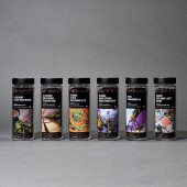
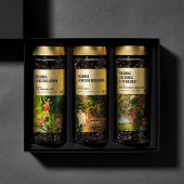
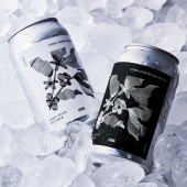
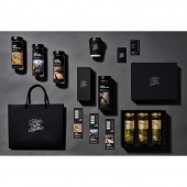
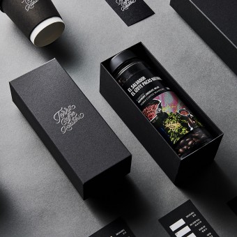
| DESIGN NAME: Terra Coffee Roasters PRIMARY FUNCTION: Branding INSPIRATION: Environment-oriented design development has finally become widespread in Japan, but it is still not enough. Communication designs such as logos, packages and tools incorporate high quality and ethical awareness in every respect. The mission is to "provide an experience as if you were in the production area". It wanted to embody a sincere attitude of pursuing design creatively and sustainably. The idea of design is to convey reality without abstraction. I felt that the expression was a simple and direct way to convey it to consumers. UNIQUE PROPERTIES / PROJECT DESCRIPTION: As a design expression, the curved logo design that makes you feel the nature with the image of "aroma drifting from the environment" makes you experience natural and high-quality coffee. The label design collages local photographs to visually connect manufacturers and consumers, directly convey the producer's face and environment, and convey the appeal of the unique coffee produced in the production area. All packages are recyclable or reusable to protect the special soil and environment of the production area. It is a material that does not affect the environment even if it is discarded. OPERATION / FLOW / INTERACTION: Consumers choose their favorite coffee brand and country and learn about the history and background of their coffee beans and production areas. Then, share the process of arriving in Japan with the barista and take it home. After purchase, use the subscription service to replenish the beans, change the label and travel the world of coffee. You don't have to go to the store, so you can reduce unnecessary movement. In a broad sense, it also leads to carbon dioxide reduction. PROJECT DURATION AND LOCATION: The brand started in October 2021 in Osaka, Japan. Currently there are two stores in Osaka. FITS BEST INTO CATEGORY: Graphics, Illustration and Visual Communication Design |
PRODUCTION / REALIZATION TECHNOLOGY: To change the low awareness of the environment in Japan We considered a design that consumers can easily work on and create a desire for environmental friendliness. The main container is a reusable glass bottle. The label shows the state of the production area and the face of the producer. You can travel the world of coffee beans. Although it is an abstract expression, I was particular about selling "taste including process", "imagination&qu SPECIFICATIONS / TECHNICAL PROPERTIES: Bean glass bottle: 65mmx65mmx182mm Bean glass bottle label: 69mmx117mm Cold brew can: 64mmx64mmx112mm Cold brew can label: 80mmx86mm Box (Large): 255mmx213mmx73mm Box (small): 77mmx194mmx73mm Recipe card: 55mmx182mm Business card: 55mmx91mm Shopping bag: 320mmx172mmx260mm Paper cup: 60mmx60mmx105mm TAGS: Branding, Coffee, Graphicdesign, Package, Logo, Identity RESEARCH ABSTRACT: In Japan, environmentally friendly plastic materials and manufacturing methods are still the mainstream of product packaging. Being a small roaster, not relying on mass production, packaging is not particularly important for using advanced materials, adopting simple glass bottles that were mainstream in the past, consumers using subscription services It is designed to be refilled while. Consumers can enjoy the brand change simply by changing the label. CHALLENGE: The brand of beans changes frequently due to the number of production. All labels are not mass-produced, and you need to use as many tools as you need according to the amount of beans produced, and that behavior leads to environmental friendliness. ADDED DATE: 2022-01-06 08:05:52 TEAM MEMBERS (2) : Kiyoshi Uehara and Akihito Shimizu IMAGE CREDITS: Photography : Yuma Gamae(Package,PR Tools) |
||||
| Visit the following page to learn more: https://www.instagram.com/terracoffeeroa |
|||||
| AWARD DETAILS | |
 |
Terra Coffee Roasters Branding by Akihito Shimizu is Winner in Graphics, Illustration and Visual Communication Design Category, 2021 - 2022.· Read the interview with designer Akihito Shimizu for design Terra Coffee Roasters here.· Press Members: Login or Register to request an exclusive interview with Akihito Shimizu. · Click here to register inorder to view the profile and other works by Akihito Shimizu. |
| SOCIAL |
| + Add to Likes / Favorites | Send to My Email | Comment | Testimonials | View Press-Release | Press Kit |
Did you like Akihito Shimizu's Graphic Design?
You will most likely enjoy other award winning graphic design as well.
Click here to view more Award Winning Graphic Design.


