Better Bodies Hi Brand Identity by Takahiro Eto |
Home > Winners > #133445 |
 |
|
||||
| DESIGN DETAILS | |||||
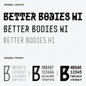
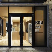
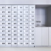
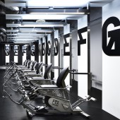
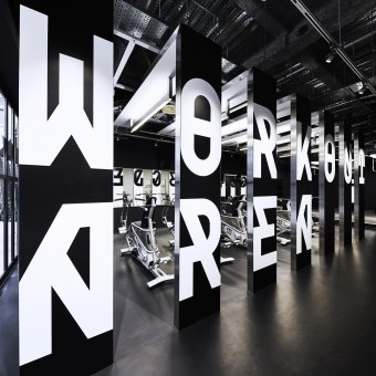
| DESIGN NAME: Better Bodies Hi PRIMARY FUNCTION: Brand Identity INSPIRATION: Normally, the weight of a typeface changes, but its skeleton does not change significantly. For a long time, I have been wondering if it is possible to create a typeface whose skeleton also changes when its weight changes. Also, in general signage projects, the typeface used is limited in order to give a sense of unity to the space, but I was wondering if it would be possible to change the typeface to match the function of the space. These two ideas became the inspiration for this design. UNIQUE PROPERTIES / PROJECT DESCRIPTION: Better Bodies Hi is a workout studio. They needed to create an environment where users after work could gradually prepare their body and mind towards exercise. Therefore, they designed a typeface that transforms in three stages. As users move from the reception to the workout area, the typeface of the sign gradually changes to a thicker and larger. The typeface gradually guides and encourages the user to work out. They used this typeface in logo, website, and products, to create a brand identity. OPERATION / FLOW / INTERACTION: It is impossible for a user who has just returned from working in an office to start training hard right away. It is necessary to gradually prepare the body and mind. For this reason, the sign at the reception desk is small and modest. The locker sign is a little larger. Signs in the workout area are very large. By changing the signs according to the user's situation, the user can gradually become more prepared. PROJECT DURATION AND LOCATION: The project started in November 2018 and opened in Aoyama, Tokyo in March 2020. FITS BEST INTO CATEGORY: Graphics, Illustration and Visual Communication Design |
PRODUCTION / REALIZATION TECHNOLOGY: A typeface that transforms in three stages was developed for this project. As that typeface gradually gets thicker, the diagonal lines increase, giving it a more lively look. In the reception area, the thinnest typeface is used sparingly to create a relaxed atmosphere. In the workout area, the boldest typeface is used at a size of more than one meter to encourage users. The use of different typefaces depending on the user's situation contributes to the quality of the user's experience. SPECIFICATIONS / TECHNICAL PROPERTIES: This specialized typefaces has been used for everything from small application icons to institutional signage up to 1045mm in height. It has also been displayed in a variety of ways, from printed materials to digital signage, cutting sheets, and acrylic. TAGS: Brand Identity, Branding, Visual Identity, Logo, Signage, Typeface, Experience RESEARCH ABSTRACT: - CHALLENGE: In Japan, advertisements for gyms often use pictures of very fit Westerners. Of course, Japanese do not become Westerners as a result of workout. BETTER BODIES HI conveys the message that you can improve your body and your life by making incremental changes to your current self. Therefore, They have visualized the "change". The difficulty was in managing the three different typefaces. They designed guidelines and format data so that the client could operate the typeface themselves. ADDED DATE: 2021-12-03 06:33:12 TEAM MEMBERS (3) : Takahiro Eto, Takaaki Nakamura and Shizuka Iijima IMAGE CREDITS: Takahiro Eto, 2021. |
||||
| Visit the following page to learn more: http://bit.ly/3HjWZDq | |||||
| AWARD DETAILS | |
 |
Better Bodies Hi Brand Identity by Takahiro Eto is Winner in Graphics, Illustration and Visual Communication Design Category, 2021 - 2022.· Read the interview with designer Takahiro Eto for design Better Bodies Hi here.· Press Members: Login or Register to request an exclusive interview with Takahiro Eto. · Click here to register inorder to view the profile and other works by Takahiro Eto. |
| SOCIAL |
| + Add to Likes / Favorites | Send to My Email | Comment | Testimonials | View Press-Release | Press Kit |
| COMMENTS | ||||||||||||||||||||||||||||||||||||||||
|
||||||||||||||||||||||||||||||||||||||||
Did you like Takahiro Eto's Graphic Design?
You will most likely enjoy other award winning graphic design as well.
Click here to view more Award Winning Graphic Design.


