Dumpling Republic Branding Project by Lawrens Tan |
Home > Winners > #132406 |
 |
|
||||
| DESIGN DETAILS | |||||
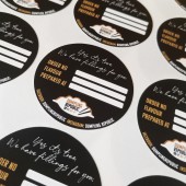
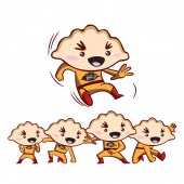
| DESIGN NAME: Dumpling Republic PRIMARY FUNCTION: Branding Project INSPIRATION: Contemporary, fun and premium had to be the tone in the overall design. It should not look rigid, thus research was carried out in terms of the entire execution of the end shape of how the dumplings would look like. The end visual of the dumpling would be the key to the entire logo. The next idea was how to blend in the chopsticks that is commonly used to hold up the dumplings. UNIQUE PROPERTIES / PROJECT DESCRIPTION: The entire branding project was for the identity to look modern, classy and premium. A stylized icon of a dumpling was used, and it reflects exactly how the product resembles both in shape and size. The entire color palate is based on only brown that resembles gold, white and black. The tagline used is also based on both humor and wit. OPERATION / FLOW / INTERACTION: In the overall design, humor and wit is infused in the key message and visual. For example the tagline was "Yes it's true. We have fillings for you." It was a phrase to evoke the humorous touch in the creation of the dumplings, with the ultimate play on "fill", where it could be just anything that the taste bud or recipe can be implemented. PROJECT DURATION AND LOCATION: Finished in Sept 2020. Website launched in Sept concurrently. FITS BEST INTO CATEGORY: Graphics, Illustration and Visual Communication Design |
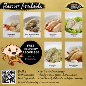
PRODUCTION / REALIZATION TECHNOLOGY: In the production, labels and box sleeves are used for the packaging. They are slotted into the dumpling boxes, packed and delivered. On the sleeve covers are sticker labels to update on the order number, flavour and the date of production to ensure freshness of the frozen dumplings. SPECIFICATIONS / TECHNICAL PROPERTIES: - TAGS: branding, dumplings, dumpling republic, logo design, branding design, branding, packaging design, RESEARCH ABSTRACT: Different shape of dumplings could be present in the market. It was vital that one prominent shape could be implemented in the entire design of the dumplings. The fillings could be different but the shape must be consistent as well. That was how the logo design was born. After experimenting with different fold techniques, the shell like shape was simple, and visually it tells of the business. CHALLENGE: The challenge was how to be different from the traditional chinese dumplings that is associated with China. These dumplings are produced in Singapore and what was distinctive was that the Singapore flavoured dumplings can be created. It was to break the whole perception that dumplings can only contain the chinese ingredients. New flavours like pulled pork, kimchi, miso flavoured dumplings were introduced. That also further played with the concept of fillings; that Dumpling Republic was all about playing with fillings in a fun and contemporary way. ADDED DATE: 2021-10-27 04:13:33 TEAM MEMBERS (1) : Lawrens Tan, Danielle Grace IMAGE CREDITS: Creative Director and designer: Lawrens Tan Photographer: Lawrens Tan Photographer: Danielle Grace Photographer: Pixabay |
||||
| Visit the following page to learn more: https://www.dumpling-republic.com | |||||
| CLIENT/STUDIO/BRAND DETAILS | |
 |
NAME: Dumpling Republic PROFILE: Artisan frozen dumplings done in Singapore. |
| AWARD DETAILS | |
 |
Dumpling Republic Branding Project by Lawrens Tan is Winner in Graphics, Illustration and Visual Communication Design Category, 2021 - 2022.· Read the interview with designer Lawrens Tan for design Dumpling Republic here.· Press Members: Login or Register to request an exclusive interview with Lawrens Tan. · Click here to register inorder to view the profile and other works by Lawrens Tan. |
| SOCIAL |
| + Add to Likes / Favorites | Send to My Email | Comment | Testimonials | View Press-Release | Press Kit |
Did you like Lawrens Tan's Graphic Design?
You will most likely enjoy other award winning graphic design as well.
Click here to view more Award Winning Graphic Design.


