Moi Nivak Brand Identity by Yuk Pui Cheung |
Home > Winners > #131797 |
 |
|
||||
| DESIGN DETAILS | |||||
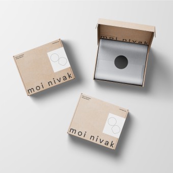
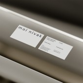
| DESIGN NAME: Moi Nivak PRIMARY FUNCTION: Brand Identity INSPIRATION: The foundation of the moi nivak brand is set off by primary typography set in Sunset Gothic. The word mark is a bespoke typeface, developed by Colophon Foundry's Benjamin Critton, with subjective mélange of a multitude of unattributed sans-serif painting styles. The typographic approach has been used throughout to provide legibility across all of moi nivak's brand communications. UNIQUE PROPERTIES / PROJECT DESCRIPTION: moi nivak is an online retailer dedicated to curation of contemporary collectibles, carefully select daily collectibles and design items from around the world. Combining a select store and design shop, the select store opens its door to welcome arts and cultural collectible lovers from around the world. Graphic Dpt has developed the brand identity framework to introduce moi nivak as a new player in the field. The brand system comprehends brand strategy, name, stationery and website. OPERATION / FLOW / INTERACTION: - PROJECT DURATION AND LOCATION: The project started in June 2021 and finished in September 2021 in Taipei. FITS BEST INTO CATEGORY: Graphics, Illustration and Visual Communication Design |
PRODUCTION / REALIZATION TECHNOLOGY: - SPECIFICATIONS / TECHNICAL PROPERTIES: Business Card – W 85mm x H 55mm / PMS color digital printing Packaging Box – W 320mm x D 255mm x H 140mm / Corrugated Mailer Box / 1-color offset printing TAGS: design select, select store, select shop, daily select, collectibles RESEARCH ABSTRACT: We went into research for typefaces at first. Sunset Gothic is a dexterous, workhorse sans-serif, designed by Benjamin Critton, published by Colophon Foundry. The brand's typography has signature gesture and legibility, include curvature terminals and type’s horizontal strokes, implicates the diversity of the business — a select store with collectible groceries and design products. CHALLENGE: - ADDED DATE: 2021-10-03 13:56:04 TEAM MEMBERS (1) : IMAGE CREDITS: Yuk Pui Cheung, 2021. |
||||
| Visit the following page to learn more: http://graphicdpt.design | |||||
| AWARD DETAILS | |
 |
Moi Nivak Brand Identity by Yuk Pui Cheung is Winner in Graphics, Illustration and Visual Communication Design Category, 2021 - 2022.· Read the interview with designer Yuk Pui Cheung for design Moi Nivak here.· Press Members: Login or Register to request an exclusive interview with Yuk Pui Cheung. · Click here to register inorder to view the profile and other works by Yuk Pui Cheung. |
| SOCIAL |
| + Add to Likes / Favorites | Send to My Email | Comment | Testimonials | View Press-Release | Press Kit |
Did you like Yuk Pui Cheung's Graphic Design?
You will most likely enjoy other award winning graphic design as well.
Click here to view more Award Winning Graphic Design.


