DESIGN NAME:
SDDA
PRIMARY FUNCTION:
Corporate Identity
INSPIRATION:
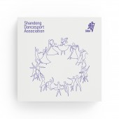
As the center of training and organizing dancesport competitions, higher, stronger and more beautiful are the goals of shandong dancesport association (sdda). Two partners are the most important feature that distinguishes dancesport from other arts of dances. As the saying goes, the mountain is high, the man is higher. The combination of two dancers and the peak emphasizes its outstanding artistic pursuit and achievement. The line from rotating dance steps highlights the association's duty: connection, communication, trust and vitality.
UNIQUE PROPERTIES / PROJECT DESCRIPTION:
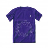
The old logo of sdda is a concrete dance figure, which always leads to misidentification of other associations and the copyright crisis. Rebrand of sdda is to refine the concrete posture into concise and easy-to-understand graphics. Only a single line from rotating dance steps presents the concept of sdda. The ten dance-graphics from classic postures let people understands the relationship of the body much clearly. The new logo can be compatible with different media, leading to the convenient identification and spread.
OPERATION / FLOW / INTERACTION:
Brand identity is mainly used in competition venues, print productions and social media.
PROJECT DURATION AND LOCATION:
The project started in July 2020 and finished in September 2020 in Jinan, China.
FITS BEST INTO CATEGORY:
Graphics, Illustration and Visual Communication Design
|
PRODUCTION / REALIZATION TECHNOLOGY:
The display at the competition venues uses multimedia display technology, and the materials of printing and clothing comply with environmental requirements.
SPECIFICATIONS / TECHNICAL PROPERTIES:
Brand identity guideline regulates the logo specifications to ensure legibility and consistency at all times. It comprises the minimum clear space, minimum size, brand color palette, typefaces, and rules for various applications.
TAGS:
Rebranding, rebrand, rebrandt, corporate, identity, logo, dance, dancesports, sport
RESEARCH ABSTRACT:
Rebranding of sdda is to create a unique logo with cultural of shandong province. From analysis of world dancesport organizations, two partners in waltz are widely used elements of dancesport. shandong, where sdda is located, is the location of mount tai, which is a world heritage and known as the head of the five great mountains in China. Therefore, the combination of dancers and mountain tai is in line with the concept of sdda. Two dance partners' rotating dance steps, like fluttering ribbon, can reflect the function of sdda. Ten dance-graphics have been recognized by professionals.
CHALLENGE:
Concision and modernity are the primary goals. How to combine the dancers, mountain and ribbon in a visual language is difficult. In order to obtain registration protection, the logo must be unique. Similarly, it is also a huge challenge to accurately select the dance poses that can represent the ten dance postures and how to present them clearly and easily. Finally using a single line as the visual element, not only present the brand logo, but also unify ten dancing images. In addition, data on the minimal and the inviolable space have also been obtained through extensive testing.
ADDED DATE:
2021-10-01 08:11:45
TEAM MEMBERS (1) :
Guorong Men
IMAGE CREDITS:
Guorong Men, 2021.
PATENTS/COPYRIGHTS:
Copyright belong to Sdda(shandong dancesport association),2021.
|


