Pattern of Nature Interior Residential by Kao Yu-Jou |
Home > Winners > #131522 |
 |
|
||||
| DESIGN DETAILS | |||||
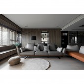
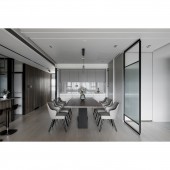
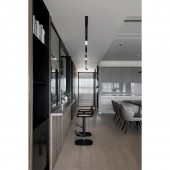
| DESIGN NAME: Pattern of Nature PRIMARY FUNCTION: Interior Residential INSPIRATION: The protagonist in the space is the homeowner’s favorite open kitchen. In addition to being located in the center of the main visual facade, it is also equipped with a "ㄇ"shape UNIQUE PROPERTIES / PROJECT DESCRIPTION: For this project, there is no pillar in the nearly 200 square-meters space, and the structure relies on thick beams like a spider web structure to carry the entire space. Without the constraints of the pillars, it seems that we can divide the space willingly. On the contrary, we must think more carefully about the response of the space and the ceiling, and reduce the pressure caused by the beams through the design. OPERATION / FLOW / INTERACTION: We hope to continue the meaning of our company's name in Chinese. We give every space a configuration, color tone, texture and temperature that suits them. We hope that every space is unique, warm and pure. The low-saturated color and natural texture, coupled with the appropriate configuration and spatial scale, make the space naturally full of vitality and comfortable feelings. PROJECT DURATION AND LOCATION: The project started in November 2019 and finished in November 2020 in New Taipei City,Taiwan. FITS BEST INTO CATEGORY: Interior Space and Exhibition Design |
PRODUCTION / REALIZATION TECHNOLOGY: Before starting to think about each case, we will communicate according to the needs and preferences of the users, and then we will analyze the space and extend the style. In the layout of the plane, we will think about the scale and proportion at the same time, and deepen the integrity of the space. During the process, we experienced communication and coordination with users, and slowly shaped the space into the most suitable appearance. SPECIFICATIONS / TECHNICAL PROPERTIES: 198 Sqm TAGS: ANCÈ INTERIOR DESIGN、ANCÈ DESIGN、ANCÈ STYLE、RESIDENTIAL DESIGN、OFFICE DESIGN、COMMERCIAL SPACE DESIGN、COMMERCIAL DESIGN、TAIWAN INTERIOR DESIGN、TAIPEI INTERIOR DESIGN、NEW TAIPEI CITY INTERIOR DESIGN RESEARCH ABSTRACT: The homeowner is hospitable and pays attention to the intimacy of the family. It is expected that the larger the public area, the better, while the private area is the opposite. We grab a horizontal line from the whole space to the main beam, and the whole wall runs through the master bedroom, open kitchen, guest toilet and second bedroom from left to right. The clean and complete facade is the visual focus through the warm wood tone base. At the same time, the area of the living room and dining room is enlarged, and the oppressive feeling of the long beam is also hidden. For short beams, we lowered the ceiling to the highest point and concealed the air-conditioning equipment, balancing the height difference between the ceiling and the beams, making the beams invisible through design techniques. CHALLENGE: The space has the rare advantage of lighting on three sides, while the private areas are evenly divided on both sides of the space. By moderately releasing part of the wall, we changed it to translucent glass to connect the master bedroom and the end of the corridor. The glass draws light into the room, preserving the most precious light and shadow stories in the space. ADDED DATE: 2021-09-30 07:44:54 TEAM MEMBERS (1) : IMAGE CREDITS: Image#1: Photographer Jackal Liu,2021 Image#2: Photographer Jackal Liu,2021 Image#3: Photographer Jackal Liu,2021 Image#4: Photographer Jackal Liu,2021 Image#5: Photographer Jackal Liu,2021 PATENTS/COPYRIGHTS: Copyrights belong to KAO YU-JOU, ANCÈ INTERIOR DESIGN. |
||||
| Visit the following page to learn more: https://www.100.com.tw/10475/represent | |||||
| AWARD DETAILS | |
 |
Pattern of Nature Interior Residential by Kao Yu-Jou is Winner in Interior Space and Exhibition Design Category, 2021 - 2022.· Read the interview with designer Kao Yu-Jou for design Pattern of Nature here.· Press Members: Login or Register to request an exclusive interview with Kao Yu-Jou. · Click here to register inorder to view the profile and other works by Kao Yu-Jou. |
| SOCIAL |
| + Add to Likes / Favorites | Send to My Email | Comment | Testimonials | View Press-Release | Press Kit |
Did you like Kao Yu-Jou's Interior Design?
You will most likely enjoy other award winning interior design as well.
Click here to view more Award Winning Interior Design.


