Nel Typeface by Jasper Nijssen |
Home > Winners > #131193 |
 |
|
||||
| DESIGN DETAILS | |||||
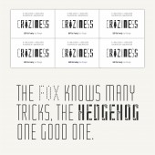
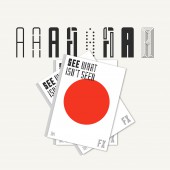
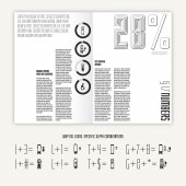
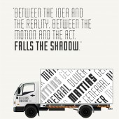
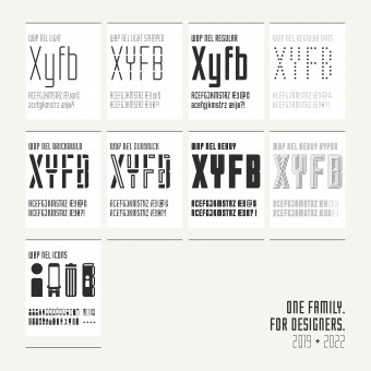
| DESIGN NAME: Nel PRIMARY FUNCTION: Typeface INSPIRATION: During the "mixing and matching" of a few typefaces, the question arose: Wouldn't it be nice for a typeface to have a regular style for the body text and some eccentric, fun versions for headers or high-lighted text? This typeface would make it possible to use different styles and still be coherent. UNIQUE PROPERTIES / PROJECT DESCRIPTION: This typeface is developed with the designer in mind. Nel is a modern typeface with lots of options. The Regular version consists of UPPERCASE and lowercase letters, and quite a few other punctuation marks. The Nel Brickbuild is a playful stencil version and the Nel Dots is a dotted typeface. The Nel also has a light and heavy style with corresponding fun versions. There are nine options in total to mix and match while designing awesome prints, posters, logos, websites, or identities. OPERATION / FLOW / INTERACTION: One of the hardest parts of designing a coherent layout is choosing which fonts to use. Nel solves this problem. All styles have their own characteristics, but they're all based on the same design choices. So all options can be mixed and matched with ease. Icons (the all icon font) has an extra. It's possible to combine glyphs. Example: When you type the capital i and 3, there's a bus and a silhouette. When you type the number sign (above the 3) instead of a 3, the human is inside the bus. PROJECT DURATION AND LOCATION: The main part of this project finished in January 2019 and is available on MyFonts.com. Although once in a while it gets an update. For example: Icons (an all icon font) has been added this February. FITS BEST INTO CATEGORY: Graphics, Illustration and Visual Communication Design |
PRODUCTION / REALIZATION TECHNOLOGY: The first sketches were doodles drawn on a lazy Sunday. Those doodles became a grid. The Regular consists of a width of three units and a height of nine units. Each unit is made up of a square of three by three subunits. The Light removes one sub-unit on either side to create a much thinner line and the Heavy adds a sub-unit. The fun, display styles are playful twists designed upon this base. SPECIFICATIONS / TECHNICAL PROPERTIES: All fonts are available in OTF (local) and WOFF (web) files. TAGS: font, typeface, decorative, playful, letterdesign, RESEARCH ABSTRACT: - CHALLENGE: The whole Nel is based on the same grid, and design choices. So the design process of the letters went quite smoothly. This was strengthened by the fact that some letters share quite a few similarities (the b > d > p > q). Some are harder to fit in (the k and x). The main challenge was is defining the whitespace between the letters (kerning). The space needs to be different between every letter to look the same. There are quite a few combinations, so this takes a lot of time and effort. ADDED DATE: 2021-09-28 21:33:44 TEAM MEMBERS (1) : IMAGE CREDITS: All images: Designer Jasper Nijssen, Visuals WBP Nel, 2022. PATENTS/COPYRIGHTS: ©2021 Jasper Nijssen |
||||
| Visit the following page to learn more: http://www.jaspernijssen.nl | |||||
| AWARD DETAILS | |
 |
Nel Typeface by Jasper Nijssen is Winner in Graphics, Illustration and Visual Communication Design Category, 2021 - 2022.· Read the interview with designer Jasper Nijssen for design Nel here.· Press Members: Login or Register to request an exclusive interview with Jasper Nijssen. · Click here to register inorder to view the profile and other works by Jasper Nijssen. |
| SOCIAL |
| + Add to Likes / Favorites | Send to My Email | Comment | Testimonials | View Press-Release | Press Kit | Translations |
Did you like Jasper Nijssen's Graphic Design?
You will most likely enjoy other award winning graphic design as well.
Click here to view more Award Winning Graphic Design.


