Polin and Herman Wedding Packet Design by Polin Kuyumciyan |
Home > Winners > #131176 |
 |
|
||||
| DESIGN DETAILS | |||||
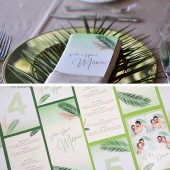
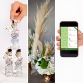
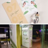
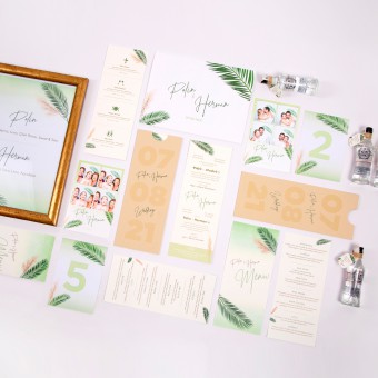
| DESIGN NAME: Polin and Herman PRIMARY FUNCTION: Wedding Packet Design INSPIRATION: The decoration theme for the wedding was all about palm leaves and pampas and a mix of beige, white and green colors. Once the decoration idea was set, the wedding packet was all about the reflection of that! UNIQUE PROPERTIES / PROJECT DESCRIPTION: This project is a personal one, designed from beginning to end for the designer's own wedding. The couple got married in August 2021 and the designer had the chance to make all design decision's for this special day. First item was the physical invitation and it was followed by digital invitation design. After these two came the rest of the project: menu, table cards, Photobooth exterior and photo frames, bottle tags, photograph envelopes and cocktail menu followed. Everything was in green and beige tones and decorated with big palm leaves and pampas in order to match the decoration. OPERATION / FLOW / INTERACTION: The most interactive part of the project is the physical invitation as it comes within an envelope and the receiver has to slide the paper vertically upward in order to read wedding details. The wedding date and the name of the bride and groom are printed on the envelope as that is the initial information. When on slides the interior paper out, the front face of the paper consists of the formal invitation in Armenian and Turkish. On the back side, all the events, represented by a fun icon, are listed from top to bottom in time order. PROJECT DURATION AND LOCATION: The project started in June 2021 in Istanbul and finished in July 2021 in Istanbul. FITS BEST INTO CATEGORY: Graphics, Illustration and Visual Communication Design |
PRODUCTION / REALIZATION TECHNOLOGY: The invitation was the main focus of this project. The weight and color of the paper depended on the design and a few changes had to made during production. On the original design, the invitation envelope was a dark green and the wedding date numbers were going to be embossed on one side. However there was shortage of time and materials so that affected the print process as well. So in order to deliver on time, we used a beige colored paper which ended up being better than green, and varnish the letters and the numbers since that was a quicker process. SPECIFICATIONS / TECHNICAL PROPERTIES: This project consists of many items and they each have varying sizes. Invitations are 98 x 255 mm, menus are 100 x 220 mm, cocktail list is 210 x 297 mm, Photobooth frames are 100 x 150 mm, table number cards are 105 x 148, mini bottle tags are 25 x 35 mm and photograph envelopes are 233 x 166mm. TAGS: wedding, invitation, menu, decoration, frame RESEARCH ABSTRACT: The design process began with the search of a venue. Once that was set, the design process began. The invitation was going to be both printed sent digitally as a jpeg. So the design had to be altered in order to fit both mediums. At first, the invitation envelope was designed to be green with embossed date numbers of one side. However, plans changed and emboss print and green paper was out. The envelope became beige with varnished letters and numbers. The invitation was the main item and once that was finished, the rest was a faster process. CHALLENGE: The whole process was based on the theme we chose for the decoration and all the items had to be in sync with each other, which was a challenge in itself because it all needed to stay in balance. Decisions such as adding color or subtracting a leaf or pampas from a certain item was hard as there a short amount of time to finish all and deliver. ADDED DATE: 2021-09-28 19:43:38 TEAM MEMBERS (1) : Designer: Polin Kuyumciyan IMAGE CREDITS: Image #1: Photographer Dacya Lisan Guloglu, 2021. Image #2: Photographer Dacya Lisan Guloglu, 2021. Image #3: Photographer Dacya Lisan Guloglu, 2021. Image #4: Photographer Dacya Lisan Guloglu, 2021. Image #5: Photographer Dacya Lisan Guloglu, 2021. |
||||
| Visit the following page to learn more: https://shortest.link/1b5U | |||||
| AWARD DETAILS | |
 |
Polin and Herman Wedding Packet Design by Polin Kuyumciyan is Winner in Graphics, Illustration and Visual Communication Design Category, 2021 - 2022.· Read the interview with designer Polin Kuyumciyan for design Polin and Herman here.· Press Members: Login or Register to request an exclusive interview with Polin Kuyumciyan. · Click here to register inorder to view the profile and other works by Polin Kuyumciyan. |
| SOCIAL |
| + Add to Likes / Favorites | Send to My Email | Comment | Testimonials | View Press-Release | Press Kit | Translations |
Did you like Polin Kuyumciyan's Graphic Design?
You will most likely enjoy other award winning graphic design as well.
Click here to view more Award Winning Graphic Design.


