Longrui Corporate Identity by Zhijian Su-Hauns and Rui Chen-Hauns |
Home > Winners > #129444 |
 |
|
||||
| DESIGN DETAILS | |||||
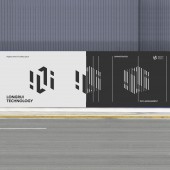
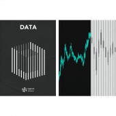
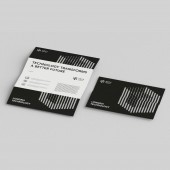
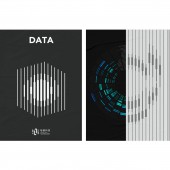
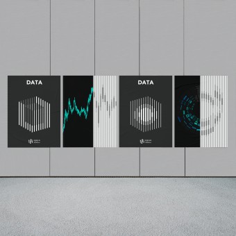
| DESIGN NAME: Longrui PRIMARY FUNCTION: Corporate Identity INSPIRATION: Longrui as one of the intelligent supercomputing data(IDC) center, found that the existing strategic positioning could not match the current design vision and identity. Therefore,how to make Longrui understand and feel the strategic positioning connect with brand identity in a more accurate and effective way has become the primary challenge we need to solve. According the concept of "taking quality as the core and diversification as the guidance" as direction,Inspired by the data space, we represent the data center space with the flattened pseudo-three-dimensi UNIQUE PROPERTIES / PROJECT DESCRIPTION: In terms of the extension of visual personality, elements bring wonderful visual experience by applying the illusion of plane movement and visual reading displacement. At the same time, in terms of many application environments, the three-dimensional data blocks seen from the plane exist in the plane objects through human visual movement reading. The application of this kind of visual illusion technique symbolizes the principle of "striving for perfection" upheld by Longrui and its brand service experience of bringing surprises to customers with output exceeding the existing standards. OPERATION / FLOW / INTERACTION: With regard to the construction of brand image this time, we use unique and interesting visual dislocation as the application method of visual expression, thereby perfectly presenting the service experience that Longrui is committed to bringing surprises to customers with the output exceeding the existing standards. PROJECT DURATION AND LOCATION: The project started in January 2021 in ShangHai and finished in May 2021 in ShangHai. FITS BEST INTO CATEGORY: Graphics, Illustration and Visual Communication Design |
PRODUCTION / REALIZATION TECHNOLOGY: To put it concretely, in this system, markers abstractly express the feelings of data flowing in space with concise vocabulary. In the center of the icon, two opposing lines symbolize the cooperation between Longrui and customers, and express the idea of opening the new data management service experience. In terms of color selection, Longrui forms a stable emotional feeling with a strong sense of data through black, white and gray. In a word, the design accurately expresses the concept of "taking quality as the core and diversification as the guidance" of Longrui, and then establishes the brand communication language system. SPECIFICATIONS / TECHNICAL PROPERTIES: In 2020, Longrui successfully reached a strategic cooperation with Tencent, which better strengthened its technical capability in the data field. At the same time, Longrui also launched a 45 billion Tencent Yangtze River Delta Artificial Intelligence Supercomputing Center project in Shanghai, China, with its current equity valuation of 11.983 billion yuan, which was acquired by GLP, a world-renowned investment management institution. From an objective perspective, the service quality and quality control of Longrui constantly refresh and upgrade the market level of the whole industry, and promote the development of China's IDC industry with the spirit of striving for perfection. TAGS: Brand Identity, Communication Design, China IDC, Graphics, Technology Identity RESEARCH ABSTRACT: In the actual creative process, we created a unique and delicate visual image system. In view of this, according to the core competitiveness of Longrui, we have deeply refined relevant valuable information points, and put forward the brand definition concept of "taking quality as the core and diversification as the guidance" for Longrui. With this concept, we are committed to guiding Longrui to refine its language and form a unique visual language, so as to help it establish an effective communication system. CHALLENGE: Longrui, as one of the intelligent supercomputing data center, found that the existing strategic positioning could not match the current vision. In the previous interviews and investigations, we realized that the visual system communication of the whole brand at the current stage lacked effective identification, which led to the failure to form a strong and effective visual communication system in terms of brand landing. Under this background, how to make Longrui understand and feel the core value and content of the brand in a more accurate and effective way has become the hardest challenge we need to solve. ADDED DATE: 2021-08-07 15:15:42 TEAM MEMBERS (4) : Creative Director:Zhijian Su, Designer: Rui Chen, Motion Designer: Junjie Lu and IMAGE CREDITS: Image #1-5: Hauns, 2021 #5. Video Credits: Junjie Lu |
||||
| Visit the following page to learn more: https://www.behance.net/gallery/12535105 |
|||||
| AWARD DETAILS | |
 |
Longrui Corporate Identity by Zhijian Su-Hauns and Rui Chen-Hauns is Winner in Graphics, Illustration and Visual Communication Design Category, 2021 - 2022.· Read the interview with designer Zhijian Su-Hauns and Rui Chen-Hauns for design Longrui here.· Press Members: Login or Register to request an exclusive interview with Zhijian Su-Hauns and Rui Chen-Hauns. · Click here to register inorder to view the profile and other works by Zhijian Su-Hauns and Rui Chen-Hauns. |
| SOCIAL |
| + Add to Likes / Favorites | Send to My Email | Comment | Testimonials | View Press-Release | Press Kit |
Did you like Zhijian Su-Hauns and Rui Chen-Hauns' Graphic Design?
You will most likely enjoy other award winning graphic design as well.
Click here to view more Award Winning Graphic Design.


