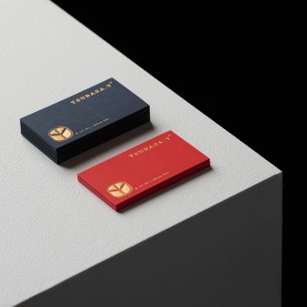
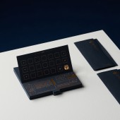
Tsubasa.Y Brand Integration by Siwei Lai |
Home > Winners > #127809 |
| CLIENT/STUDIO/BRAND DETAILS | |
 |
NAME: TSUBASA.Y PROFILE: TSUBASA.Y is a vintage selection shop, that in the piles of clothing of different times, looking for the exclusive taste of different self, producing a fashion sound that this generation has never had before, just like the name of Tsubasa (wing), leading the ancient fascination to fly in the different clothes Between the texture and the story. |
| AWARD DETAILS | |
 |
Tsubasa.y Brand Integration by Siwei Lai is Winner in Graphics, Illustration and Visual Communication Design Category, 2021 - 2022.· Read the interview with designer Siwei Lai for design Tsubasa.Y here.· Press Members: Login or Register to request an exclusive interview with Siwei Lai. · Click here to register inorder to view the profile and other works by Siwei Lai. |
| SOCIAL |
| + Add to Likes / Favorites | Send to My Email | Comment | Testimonials | View Press-Release | Press Kit |
Did you like Siwei Lai's Graphic Design?
You will most likely enjoy other award winning graphic design as well.
Click here to view more Award Winning Graphic Design.


