Zaku Inc. Corporate Identity by Nobuya Hayasaka |
Home > Winners > #127734 |
 |
|
||||
| DESIGN DETAILS | |||||
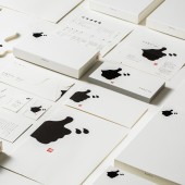
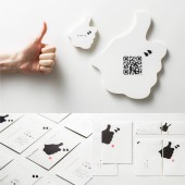
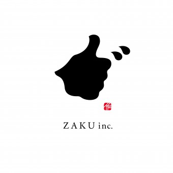
| DESIGN NAME: Zaku Inc. PRIMARY FUNCTION: Corporate Identity INSPIRATION: The designer decided to use the client's company slogan itself as the logo design. This company has the slogan "Create good! The symbol of the hand silhouette of "good!" is expressed in the typography of Japanese Kanji characters meaning "to create". And since this kanji can be read as "zaku", it also represents the company name. UNIQUE PROPERTIES / PROJECT DESCRIPTION: This symbol has two meanings. It is the company name and the company slogan. It consists of the typography of Japanese kanji characters, which read "zaku" in the company name. The combination of "signature and seal" in the mark will make Japanese people who see this design recognize it as kanji. The kanji also contains the meaning of "to create. The silhouette of Good!'s hand is formed using this character, which means "to create. In this way, the company's slogan of "Creating Good" is expressed in a single mark. OPERATION / FLOW / INTERACTION: The simple yet strong symbol design served to publicize the client's company's opening within the industry and in Japan. People who received the DM recognized the company's slogan and name, and the meaning and background of the logo design became a topic of conversation, facilitating communication. The "Shodo" typography and the silhouette of the "Good!" hand are catchy and memorable, and this design contributed to the recognition of the company's existence and brand image. PROJECT DURATION AND LOCATION: It opened in Japan in March 2021. FITS BEST INTO CATEGORY: Graphics, Illustration and Visual Communication Design |
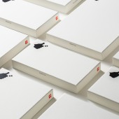
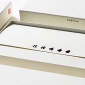
PRODUCTION / REALIZATION TECHNOLOGY: The typography incorporates elements of Japanese "Shodo," the art of writing with a brush using ink. The designer discovered that when the kanji meaning "to create" is written on paper, the ink blurs and spreads out to form the silhouette of the hand of Good! Shodo (Japanese calligraphy) is a culture that has been familiar to the Japanese people for a long time. With this Japanese touch, the design gives users a sense of trust and familiarity. SPECIFICATIONS / TECHNICAL PROPERTIES: The brand design items for this project are listed below. Logo Design: Symbol mark, Logotype, Motion Logo Sign Design: Signage Packaging Design: Document Case x 3 Print Design: Envelopes x 3, Promotion cards, Business cards x 3, Leaflets, Opening announcement flyer Web Design:html5, CSS TAGS: Typography, Logos, Symbols, Corporate Identity, Logotypes RESEARCH ABSTRACT: In this design, the challenge was to give a single symbol multiple roles. To make the company name read "Zaku". To give it the meaning of "create". To make it look like a silhouette of the hand of "Good! By achieving these three goals, the client's company was able to express that it is a creative company and gain recognition in Japan and in the industry. CHALLENGE: The difficult part was to achieve this with as few elements and as simple a design as possible, while still having multiple meanings. The designers were also careful to make sure that the letters were recognizable. The touch of brush strokes and the inclusion of "signature and seal" made the design more recognizable and readable. ADDED DATE: 2021-06-28 02:46:24 TEAM MEMBERS (3) : Creative Director:Hitoshi Kobayashi, Art Director:Nobuya Hayasaka and Copywriter:Takuma Suzuki IMAGE CREDITS: Nobuya Hayasaka, 2021. |
||||
| Visit the following page to learn more: http://zwoo.jp/ | |||||
| AWARD DETAILS | |
 |
Zaku Inc. Corporate Identity by Nobuya Hayasaka is Winner in Graphics, Illustration and Visual Communication Design Category, 2021 - 2022.· Read the interview with designer Nobuya Hayasaka for design Zaku Inc. here.· Press Members: Login or Register to request an exclusive interview with Nobuya Hayasaka. · Click here to register inorder to view the profile and other works by Nobuya Hayasaka. |
| SOCIAL |
| + Add to Likes / Favorites | Send to My Email | Comment | Testimonials | View Press-Release | Press Kit | Translations |
| COMMENTS | ||||||||||||||||||||||||||||||||
|
||||||||||||||||||||||||||||||||
Did you like Nobuya Hayasaka's Graphic Design?
You will most likely enjoy other award winning graphic design as well.
Click here to view more Award Winning Graphic Design.


