|
|
|


|
|
| DESIGN DETAILS |
DESIGN NAME:
Q Shinshu Apple Pie Laboratory
PRIMARY FUNCTION:
Brand Identity
INSPIRATION:
The store does not use any extra processing or seasoning so that consumers can appreciate the taste of the apples themselves. In order to convey the brand's vision and spirit of "cherishing the original taste of apples," I designed a simple symbol without any unnecessary decoration. To match this concept, I designed the interior without coloring, using the colors of the concrete and wood as they are.
UNIQUE PROPERTIES / PROJECT DESCRIPTION:
These are branding projects for "Q", an apple pie specialty store.
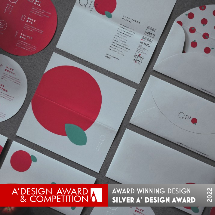
Two typographies of the store name "Q" were created using an apple as a motif, and this has become the store's symbol.
This simple and easy to understand symbol was used to design all the brand tools such as lighting, stools, uniforms, and packaging. By communicating with customers through this unified worldview, the store's commitment to apples was conveyed to customers.
OPERATION / FLOW / INTERACTION:
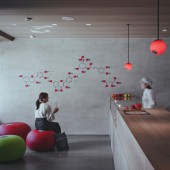
When customers visit the store, they can enjoy a consistent view of the world and purchase an apple pie. They enter the store through a curtain with an apple symbol at the entrance and place their order under a pendant light with the same symbol. Then, while waiting, they can sit on an apple stool, drink apple juice, and wait for their freshly baked apple pie. They can feel the concept and commitment of the store from start to finish, making it a special experience for them.
PROJECT DURATION AND LOCATION:
It opened in October 2019 in Ueda City, Japan.
FITS BEST INTO CATEGORY:
Graphics, Illustration and Visual Communication Design
|
PRODUCTION / REALIZATION TECHNOLOGY:
In line with the store's concept of "making the most of the taste of the ingredients as they are," the interior and packaging were designed without excessive coloring or processing, making the most of the colors of concrete, wood, and paper. The design was adjusted so that the red of the symbol mark would appear as an accent in the simple colors of the materials.
SPECIFICATIONS / TECHNICAL PROPERTIES:
The brand design items for this project are listed below.
Logo Design:Naming, Symbol mark, Logotype
Facade Design:Facade, Wall Sign, Goodwill
Sign Design:Interior, Pendant light, Stool x 3
Packaging Design:Paper bag x 2, Plastic bag x 2, Box x 2
Print Design:Shop cards, Business cards x 5, Envelopes, Leaflets, Invitation
Uniform Design:Hunting cap, Casket Hats, Apron, Dress shirt
Web Design:html5, CSS
TAGS:
Branding, store design, pastry shop, apple pie store
RESEARCH ABSTRACT:
These are branding projects for an apple pie specialty store that was set up to solve the problem of local apples not being well known.
We developed and designed products that would give consumers a taste of the apples themselves. We made apple pies for each variety of apple and designed them so that consumers can enjoy the different textures and flavors of each apple.
We designed the wall signs using the chemical structural formula of apple polyphenols as a motif. Customers can see this sign while waiting and get a sense of the store's research and commitment to apples.
CHALLENGE:
When customers saw the apple lights in the shape of the symbol logo and the apple stools, they took pictures of these and sent them out through SNS and other media. By setting up contents in the store that make users want to take pictures spontaneously, we were able to make more people aware of the existence of this store.
Customers were able to sense the vision and spirit of the store through the simple design. People who try our apple pies will notice the simple flavor and the natural taste of apples, and will be convinced of the meaning of the design. Through this brand, we were able to make them realize the beauty of the local apples.
ADDED DATE:
2021-06-23 05:13:51
TEAM MEMBERS (3) :
Creative Director:Hitoshi Kobayashi, Art Director:Nobuya Hayasaka and Photographer:Shusaku Nagahama
IMAGE CREDITS:
Nobuya Hayasaka, 2021.
|
| Visit the following page to learn more: http://zwoo.jp/ |
|
| CLIENT/STUDIO/BRAND DETAILS |
 |
NAME:
arica design inc.
PROFILE:
This firm is a design production company specializing in advertising and branding. They plan, design, and produce a wide range of products, from concept design to logos, videos, web, interior design, packaging, and more. Because they can art direct entire brands, they are able to provide consistent and unified designs.
|
|
|
| COMMENTS |
| Giulia Esposito |
Comment #14403 on December 27, 2022, 7:40 pm |
|
I am absolutely thrilled to see an amazing work like the Q Shinshu Apple Pie Laboratory winning the A' Design Award. The brand identity is a stunning masterpiece of graphics, illustration and visual communication design. Every part of it is a creative, eye-catching and memorable experience. From the vibrant colors to the unique typography, the design effortlessly portrays the brand message. Not only is it aesthetically pleasing, but the design is also intuitive and highly effective in communicating the brand story. This is truly a remarkable work and I'm so proud to have seen it win this award. Congratulations to Nobuya Hayasaka for their amazing achievement!
|
| Paul Williams |
Comment #62581 on January 3, 2023, 11:19 pm |
|
Q Shinshu Apple Pie Laboratory is an outstanding example of graphics, illustration and visual communication design. This work showcases Nobuya Hayasaka's exceptional skill to create a unified brand identity that communicates the store's commitment to apples. The unique symbol, created using an apple as its motif, serves as an eye-catching and easily recognizable visual that is used for all of the store's branding tools. The interior of the store also reflects the brand's vision and spirit with its simple design and use of natural colors. The use of the chemical structural formula of apple polyphenols as a motif for the wall signs further emphasizes the store's dedication to research and appreciation of apples. All in all, Q Shinshu Apple Pie Laboratory is a stunning work that deserves to be recognized.
|
| Paul Phillips |
Comment #73473 on January 4, 2023, 4:22 am |
|
This award-winning work is truly remarkable! The branding project for "Q", an apple pie specialty store, is a great example of how creativity can be used to create a unified and memorable design. The use of an apple as a motif for the two typographies of the store name "Q" is clever and effective, allowing the store to stand out from the competition. The integration of the symbol into all the brand tools such as lighting, stools, uniforms, and packaging is a testament to the designer’s skill and attention to detail. The result is a visually pleasing, cohesive design that communicates the store’s commitment to apples in a simple and effective manner. Kudos to the designer for creating such an amazing work!
|
| Elena Petrenko |
Comment #76903 on January 4, 2023, 6:01 am |
|
This award-winning work successfully conveys a unified brand message with its simple yet meaningful design and symbolism.
|
| Adam Harris |
Comment #83711 on January 4, 2023, 10:27 am |
|
This work is truly remarkable! The design is incredibly thoughtful, utilizing an apple motif to create two typographies of the store name and establish a unified worldview. The commitment to highlighting the original taste of apples is showcased through the simplicity of the design and the use of the chemical structural formula of apple polyphenols as a motif. It's really inspiring to see how the design has been used to create tools such as lighting, stools, uniforms, and packaging to communicate with customers and spread awareness of the store. It is clear that the designer has put a lot of effort and research into creating a unique and memorable brand. Congratulations to the designer of this amazing work!
|
| Chloe Turner |
Comment #90124 on January 4, 2023, 4:36 pm |
|
I am truly in awe of the simplicity and elegance of this design. It is a beautiful example of how minimalism can capture the essence of a brand vision without the need for any extra fluff. The designer has achieved a perfect balance between the colors of the concrete and wood, creating a stunning visual identity that speaks volumes about the brand's mission to preserve the original flavor of their apples. This is a truly remarkable work of art and I am very proud to be able to celebrate the success of the designer who created it.
|
| Mark Allen |
Comment #92072 on January 4, 2023, 6:46 pm |
|
Congratulations to the winner of the A' Design Award for their innovative and inspiring work in Graphics, Illustration and Visual Communication Design. The design concept of cherishing the original taste of apples was cleverly and effectively conveyed through the unified world view of the branding tools. The use of the chemical structural formula of apple polyphenols as a motif for the wall signs was a genius touch, while the simple colors of the materials balanced out the red of the symbol mark nicely. This work succeeds in making people aware of the store, and conveys the brand's commitment to apples through its unique design.
|
| Elisabeth Clark |
Comment #93295 on January 4, 2023, 8:13 pm |
|
I'm truly inspired by Nobuya Hayasaka's award-winning work "Q Shinshu Apple Pie Laboratory". The design of the logo and brand identity is so cleverly done, with such simplicity and elegance. The use of the apple as a motif is such a great idea, and I love how it's used to create a unified worldview for the store. It shows a deep commitment to cherishing the original taste of apples. The research behind the design is also commendable, as seen in the wall signs with the chemical structural formula of apple polyphenols motif. It's amazing how they managed to create products that give consumers a taste of the apples themselves. This is truly a great example of good design, and I'm so happy that Nobuya Hayasaka won the A' Design Award for it.
|
|
|
Did you like Nobuya Hayasaka's Graphic Design?
You will most likely enjoy other award winning graphic design as well.
Click here to view more Award Winning Graphic Design.
Did you like Q Shinshu Apple Pie Laboratory Brand Identity? Help us create a global awareness for good graphic design worldwide. Show your support for Nobuya Hayasaka, the creator of great graphic design by gifting them a nomination ticket so that we could promote more of their great graphic design works.
|
|

|
|
|
|


