|
|
City Ambassadors School Typographic Brand Identity by Tanya Dunaeva |
|
|

|
|
| DESIGN DETAILS |
DESIGN NAME:
City Ambassadors School
PRIMARY FUNCTION:
Typographic Brand Identity
INSPIRATION:
Moscow has a huge potential for tourist interest. Moscow as a real capital is very diverse, interesting stories are hidden behind every turn of the old streets and it is impossible to associate Moscow with any one minimal set of recognizable symbols. While studying the city, the future ambassador discovers it anew, like a student discovers a primer at school. Creating an opportunity for Muscovites to gain the necessary expert skills to engage in travel design
UNIQUE PROPERTIES / PROJECT DESCRIPTION:
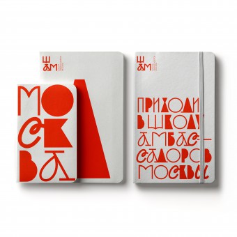
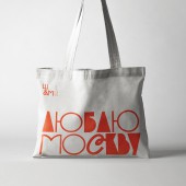
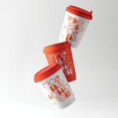
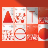
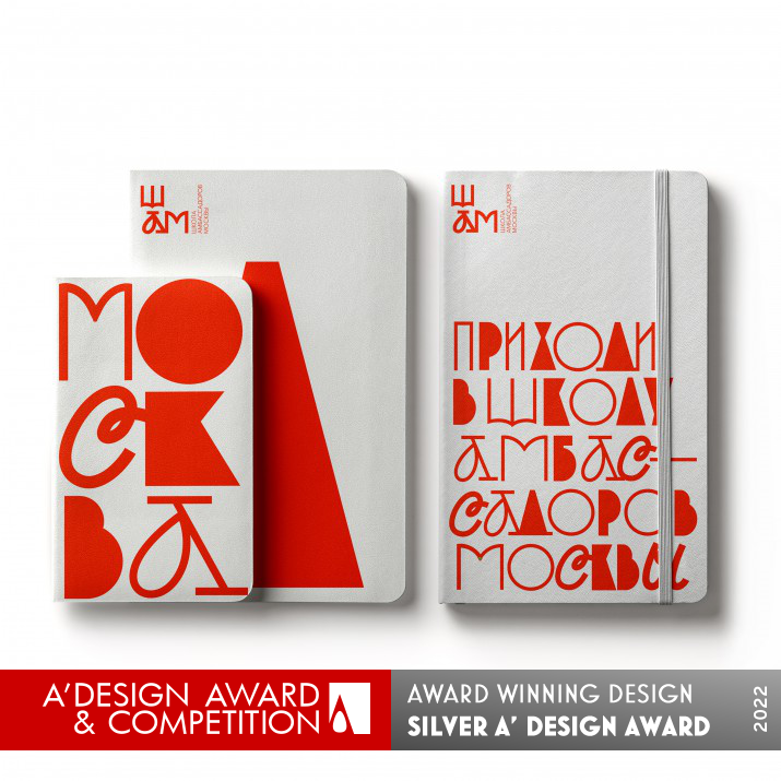
For the construction of the identity, a typographic solution was chosen, based on the principle of typographic eclecticism: the Old Russian script, interspersed with the cursive script and recognizable fonts of the avant-garde artist Sergei Chekhov, form a bizarre alphabet, on which the entire identity system is built.
OPERATION / FLOW / INTERACTION:
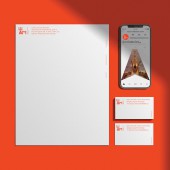
Typographic solution for this case is rather flexible and scalable for diffreent Markeing means, wearables, print ads and so on
PROJECT DURATION AND LOCATION:
The Project was accomplished during the Summer 2021 in Moscow
FITS BEST INTO CATEGORY:
Graphics, Illustration and Visual Communication Design
|
PRODUCTION / REALIZATION TECHNOLOGY:
The design is mainly realized in Print ads like brochures, caps, bags pens and so on. It is easily scalable for different off-line and on-line media
SPECIFICATIONS / TECHNICAL PROPERTIES:
Design can be fixed at any staff
TAGS:
Tanya Dunaeva, Typographics, Graphic Design, HSE Art and Design, Slavin
RESEARCH ABSTRACT:
The background of the Project is a history of Moscow reflected in the Fonts. It was necessary to condut chronological study of Moscow to determine key past and present Fonts that associated with Moscow and Russia
CHALLENGE:
It was really difficult to find Moscow identity especially reflected in Fonts. Nevertheless, thanks to the appeared Idea the Project has been successfully finalized
ADDED DATE:
2021-05-27 20:30:49
TEAM MEMBERS (2) :
Leonid Slavin - tutor and Dmitry Chernogayev - curator
IMAGE CREDITS:
Tanya Dunaeva, 2021.
|
| Visit the following page to learn more: https://bit.ly/3vbjvvS |
|
| CLIENT/STUDIO/BRAND DETAILS |
 |
NAME:
Tanya Dunaeva
PROFILE:
Tanya has more than 15 years design experience in mainly B2B sector providing different Creative solutions for Advertising, POS, Printing, Events etc. as Art-director and Freelancer. She is currently studying at HSE ART AND DESIGN School to upgrade her Graphic design skills and MADS to improve Creative ideas generation capabilities. Working at BBDO.
|
|
|
| COMMENTS |
| Giulia Esposito |
Comment #14309 on December 27, 2022, 7:08 pm |
|
I am thrilled to discover the work of City Ambassadors School by the A' Design Award. The typographic brand identity captures the essence of the school in an incredibly captivating way. I love how the use of bold, vivid colors and shapes creates an engaging visual experience that really stands out. The level of detail and thought that has gone into the design is truly remarkable. It is a work of art that will captivate the audience and leave a lasting impression. This is truly exceptional work and I applaud the designer behind it. Congratulations to Tanya Dunaeva on their success!
|
| Paul Williams |
Comment #62396 on January 3, 2023, 11:14 pm |
|
The City Ambassadors School project is a brilliant example of typographic eclecticism. The combination of Old Russian script, cursive script and recognizable fonts of the avant-garde artist Sergei Chekhov creates a unique and eye-catching brand identity. The designer has managed to capture the diversity and history of Moscow in a creative and engaging way. Through this work, an opportunity is created for Muscovites to gain the necessary expert skills to engage in travel design. It is an excellent example of how research and inspiration can be used to create a strong and memorable visual identity. Congratulations on winning the A' Design Award for Graphics, Illustration and Visual Communication Design.
|
| Paul Phillips |
Comment #73264 on January 4, 2023, 4:16 am |
|
This work is truly remarkable! The typographic solution used in this project is so creative and inspiring; it is a perfect blend of traditional Russian script with the avant-garde artist Sergei Chekhov's recognizable fonts. This combination of seemingly disparate elements is so seamlessly blended together to form a really unique and eye-catching brand identity. It's amazing how the entire identity system is built on this unique typographic alphabet. It's no wonder that this project was awarded the A' Design Award - it's truly a work of art!
|
| Elena Petrenko |
Comment #76711 on January 4, 2023, 5:55 am |
|
This typographic brand identity successfully captures the rich history of Moscow in a unique and stunning visual style.
|
| Adam Harris |
Comment #83503 on January 4, 2023, 10:17 am |
|
I am truly impressed by Tanya Dunaeva's work, the "City Ambassadors School" typographic brand identity! This unique and innovative design truly stands out and captures the city of Moscow in a captivating way. The typographic eclecticism used to build the identity system makes for a truly beautiful and creative design. The research and dedication to creating a typographic identity for the city is certainly commendable. Congratulations to Tanya Dunaeva for winning the A' Design Award for this remarkable work.
|
| Mark Allen |
Comment #91809 on January 4, 2023, 6:29 pm |
|
Congratulations to the designer of this unique and inspiring typographic brand identity! It's amazing to see how the Old Russian script, interspersed with the cursive script and recognizable fonts of the avant-garde artist Sergei Chekhov, come together to form a bizarre alphabet that helps to create a distinct and powerful identity system. It's wonderful to see how a comprehensive research into the history of Moscow has been used to determine the key fonts that associate with Moscow and Russia and to create an opportunity for Muscovites to gain the necessary expert skills to engage in travel design. The successful realization of this project is a true testament to the designer's creativity, skill and hard work.
|
| Elisabeth Clark |
Comment #93095 on January 4, 2023, 7:55 pm |
|
Congratulations to Tanya Dunaeva for winning the A' Design Award for her work, City Ambassadors School! It is an outstanding example of typographic brand identity, and it was evident that a great deal of research and thought went into creating such a unique and captivating design. The typographic eclecticism of Old Russian script, cursive script and recognizable fonts of the avant-garde artist Sergei Chekhov, interwoven throughout the design, is a clever way to capture the essence of Moscow. The background of the project is a beautiful reflection of Moscow's history, which was brought to life with the careful selection of fonts. As someone who appreciates good design, I am truly impressed by Tanya Dunaeva's work and am inspired by the innovative approach to promoting tourism in Moscow.
|
|
|
Did you like Tanya Dunaeva's Graphic Design?
You will most likely enjoy other award winning graphic design as well.
Click here to view more Award Winning Graphic Design.
Did you like City Ambassadors School Typographic Brand Identity? Help us create a global awareness for good graphic design worldwide. Show your support for Tanya Dunaeva, the creator of great graphic design by gifting them a nomination ticket so that we could promote more of their great graphic design works.
|
|

|
|
|
|
