Smartmoov Brand Identity by Ricardo Filipe Lopes da Silva |
Home > Winners > #126213 |
 |
|
||||
| DESIGN DETAILS | |||||
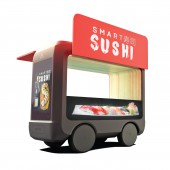
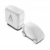
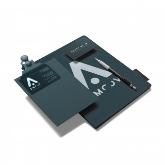
| DESIGN NAME: Smartmoov PRIMARY FUNCTION: Brand Identity INSPIRATION: Getting inspired and researched by small and big business owners who thoroughly know the market struggles. Renting a physical space to start a new business can be expensive and extremely bureaucratic these days. To tackle the problem, Smartmoov offers a mobile solution that reaches the target audience anywhere, anytime. Therefore, exploring this new way of interaction between clients and business owners proposed by Smarmtoov became the key value for the brand identity. UNIQUE PROPERTIES / PROJECT DESCRIPTION: Smartmoov positions itself as a technology company offering mobile solutions that have revolutionized the established way of doing business to fit in an increasingly new consumer lifestyle. The design emphasizes the mobility and the sustainable relations between business owners and customers by implementing a futuristic and minimalist style into the logo system. This system along with the technological color palette allows the visual identity to fit into distinct types of ventures. OPERATION / FLOW / INTERACTION: The design conveys a dynamic visual experience that lures the audience to connect and recognize the brand even without seeing the logo. More than the simple connection to the brand, it inspires the client to go beyond that. In this visual system, the potential owner is advised to adapt and customize its business through tailored visuals, maintaining the brand language. PROJECT DURATION AND LOCATION: August 2019 to November 2019 in Curitiba, Brazil FITS BEST INTO CATEGORY: Graphics, Illustration and Visual Communication Design |
PRODUCTION / REALIZATION TECHNOLOGY: The project was designed in Affinity Designer and Affinity Photo to keep the vector and photo montage quality. The visual system was built based on the Golden Ratio rule by using a Phi grid order to appear in the most harmonious way. On the production step, the designs were delivered in RGB, CMYK colours. SPECIFICATIONS / TECHNICAL PROPERTIES: For the stationery, digital media and products, the Visual Identity guidelines were provided to ensure that all the materials will be done correctly. All the graphics and illustrations were vectorized and saved as print-ready files. TAGS: shop, smartmoov, smart, dynamic, adaptable, mobile, kiosk, renewable, brand RESEARCH ABSTRACT: The research process was conducted by UX surveys to collect data about how the targeted audience, established and new business owners, could overcome their struggles on the market. In addition, technological and trend research has been carried out to better understand how futuristic trends are perceived by the public today and what companies around the world with a similar business model are building in terms of their brand language. CHALLENGE: Gathering relevant information about different types of retail business and their relations with customers, and translating it into the right symbols and colour scheme. The challenge was to create a dynamic and integrated visual system in order to communicate neutrality, versatility and mobility. ADDED DATE: 2021-05-13 12:30:32 TEAM MEMBERS (1) : IMAGE CREDITS: Ricardo Filipe Lopes da Silva, 2022. |
||||
| Visit the following page to learn more: https://bit.ly/3blZjMQ | |||||
| AWARD DETAILS | |
 |
Smartmoov Brand Identity by Ricardo Filipe Lopes Da Silva is Winner in Graphics, Illustration and Visual Communication Design Category, 2022 - 2023.· Read the interview with designer Ricardo Filipe Lopes da Silva for design Smartmoov here.· Press Members: Login or Register to request an exclusive interview with Ricardo Filipe Lopes da Silva. · Click here to register inorder to view the profile and other works by Ricardo Filipe Lopes da Silva. |
| SOCIAL |
| + Add to Likes / Favorites | Send to My Email | Comment | Testimonials | View Press-Release | Press Kit |
Did you like Ricardo Filipe Lopes Da Silva's Graphic Design?
You will most likely enjoy other award winning graphic design as well.
Click here to view more Award Winning Graphic Design.


