Platanus Corporate Identity by Pedro Panetto |
Home > Winners > #123099 |
 |
|
||||
| DESIGN DETAILS | |||||
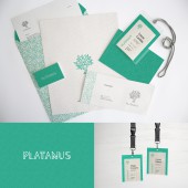
| DESIGN NAME: Platanus PRIMARY FUNCTION: Corporate Identity INSPIRATION: On the island of Kos in Greece, Hippocrates taught medicine and his ideals to the first doctors under a tree, a Platanus tree. The company has received the same name because it defends the same ideals: the search for the truth, respect for life, love of the medical art, human solidarity, the desire to serve, a good conduct and sincere interest for those who suffer. Visually the inspiration comes from elements of ancient Greek architecture blended to the organic and live aspect of a tree. UNIQUE PROPERTIES / PROJECT DESCRIPTION: The concept of this brand connects to an ideal of bringing more humanism to hospital medical care and all relationship among people from bio-medical areas. This is the principle in the history of medicine and we believe this principle must be restored. _Platanus _ is a psychiatry office with a humanized vision. OPERATION / FLOW / INTERACTION: The visual identity created for Platanus performs better than other common brands because all of its graphical elements and visual styles are deeply connected. Everything points toward the same concept; therefore the power of this brand is intensified through its design. PROJECT DURATION AND LOCATION: - FITS BEST INTO CATEGORY: Graphics, Illustration and Visual Communication Design |
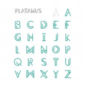
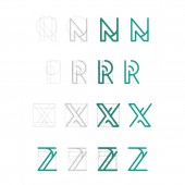
PRODUCTION / REALIZATION TECHNOLOGY: The project had a design methodology that provided the unification of its visual language. The symbol was created following organic concepts; the typography was designed exclusively for the brand and used the format of the symbol as its main parameter. Thereby everything was connected, the typography follows the symbol and the symbol follows the historical and organic concepts behind the name Platanus. Other graphics, patterns and stationery makes a really coherent visual language for Platanus. SPECIFICATIONS / TECHNICAL PROPERTIES: - TAGS: - RESEARCH ABSTRACT: The research sought for concepts related to medicine within a humanistic perspective. This led us to its roots in Greece and the teachings of Hippocrates. So we have the merge of Greek references to the Platanus tree, connecting something from antiquity to a current need of the mankind. After the historical research, it was understood that the sum of these concepts should be represented visually. CHALLENGE: The biggest challenge was how the concepts and visual references should interact in the symbol. We have different elements: a Greek column, a structure in the shape of a tree, Platanus leaves, fruits, branches and an hourglass. All these elements have a strong bond to the conceptual basis of the brand; making all these concepts converge to a visual symbol was extremely laborious, but we managed to blend everything, using the same trace, and achieving perfect harmony. ADDED DATE: 2021-03-07 01:41:32 TEAM MEMBERS (1) : IMAGE CREDITS: Pedro Panetto , 2020. |
||||
| Visit the following page to learn more: https://www.behance.net/pedropanetto | |||||
| AWARD DETAILS | |
 |
Platanus Corporate Identity by Pedro Panetto is Winner in Graphics, Illustration and Visual Communication Design Category, 2020 - 2021.· Read the interview with designer Pedro Panetto for design Platanus here.· Press Members: Login or Register to request an exclusive interview with Pedro Panetto . · Click here to register inorder to view the profile and other works by Pedro Panetto . |
| SOCIAL |
| + Add to Likes / Favorites | Send to My Email | Comment | Testimonials | View Press-Release | Press Kit |
Did you like Pedro Panetto's Graphic Design?
You will most likely enjoy other award winning graphic design as well.
Click here to view more Award Winning Graphic Design.


