Role Corporate Identity by Pedro Panetto |
Home > Winners > #123095 |
 |
|
||||
| DESIGN DETAILS | |||||
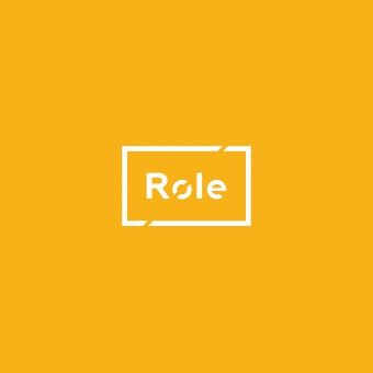
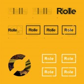
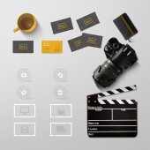
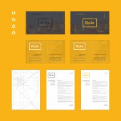
| DESIGN NAME: Role PRIMARY FUNCTION: Corporate Identity INSPIRATION: Role's visual identity has elements from the audiovisual poduction universe as its inspiration. The letter "o" cut in half connects itself to the old film rolls. The rectangular shape of its logo has been chosen by inspiration of this universe as well, for we see many rectangular elements, such as cameras, clapboards, screens and etc. The logo in motion connects with the name of the brand "Role", which in Portuguese comes from the verb to roll , its symbol is constantly rolling. UNIQUE PROPERTIES / PROJECT DESCRIPTION: Role is a video producer agency. Its visual identity works in motion or still, it conveys energy, dynamism. It works well in all kinds of applications, including videos in which this brand can behave in motion. OPERATION / FLOW / INTERACTION: - PROJECT DURATION AND LOCATION: - FITS BEST INTO CATEGORY: Graphics, Illustration and Visual Communication Design |
PRODUCTION / REALIZATION TECHNOLOGY: - SPECIFICATIONS / TECHNICAL PROPERTIES: All project and paper pieces were madw using the Golden Ratio. TAGS: - RESEARCH ABSTRACT: - CHALLENGE: - ADDED DATE: 2021-03-06 23:15:28 TEAM MEMBERS (1) : IMAGE CREDITS: Pedro Panetto, 2020. |
||||
| Visit the following page to learn more: https://www.behance.net/pedropanetto | |||||
| AWARD DETAILS | |
 |
Role Corporate Identity by Pedro Panetto is Winner in Graphics, Illustration and Visual Communication Design Category, 2020 - 2021.· Read the interview with designer Pedro Panetto for design Role here.· Press Members: Login or Register to request an exclusive interview with Pedro Panetto. · Click here to register inorder to view the profile and other works by Pedro Panetto. |
| SOCIAL |
| + Add to Likes / Favorites | Send to My Email | Comment | Testimonials | View Press-Release | Press Kit |
Did you like Pedro Panetto's Graphic Design?
You will most likely enjoy other award winning graphic design as well.
Click here to view more Award Winning Graphic Design.


