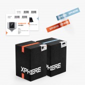
DESIGN NAME: Xphere
PRIMARY FUNCTION: Corporate Identity Rebranding
INSPIRATION: The new brand name Xphere is inspired by the client’s Chinese name – Rongxing, which means prosperous sphere. It’s a great challenge that combines the Chinese name meaning with the English name meaning together and creates a visual language. The research and exploration process led to an identity inspired by the star's nice shapes, and the design team found a perfect cutting shape on both the English logo mark and Chinese logo mark. They also incorporated the star concept as a visual element.
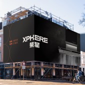
UNIQUE PROPERTIES / PROJECT DESCRIPTION: Rongxing had been carried out its activity with their old logo. However, with the purpose of the renewal logo and general identity, Rongxing started its collaboration with Yibang in 2020. The main goal was the renewal of the brand's appearance and created a powerful brand visualization. The design team refresh the brand's name to Xphere, and bring more bold colors and visuals to highlight the high-end line products.
OPERATION / FLOW / INTERACTION: The client was keen to ensure that the branding was appealing to a high end customer and especially for main cities in China. The client will start their main advertising campaign in 2021 on China popular social media, such as Red and TikTok. The overall visual language is compelling and youthful.
PROJECT DURATION AND LOCATION: The project started in October 2020 in San Francisco and finished in February 2021 in Beijing.
FITS BEST INTO CATEGORY: Graphics, Illustration and Visual Communication Design
|
PRODUCTION / REALIZATION TECHNOLOGY: Adobe Photoshop, Illustration, and InDesign.
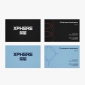
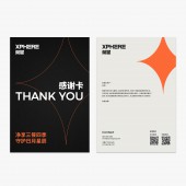
SPECIFICATIONS / TECHNICAL PROPERTIES: All print stuff will on matte heavy paper. The business card and the thank you card have embossed logo on the front side.
TAGS: Xphere, Visual Identity, Commercial, Branding
RESEARCH ABSTRACT: The research objective was to analyze the client’s direct competitors, and also include a lot of visual research for outside competitors. The focus was on the manufacturing industry and kitchen application cases. The goal was to find out the best solution to fit our client’s goal, and communicate new brand positioning.
CHALLENGE: Helping the client to find the best solution is always a challenge. The design team hosted some workshops to discuss with the client, to figural out their main concern.
Yibang design team had several interviews with the client and the brand target audiences. These interviews provided insights that really helped structure the brand value in a visual way.
ADDED DATE: 2021-03-06 21:24:06
TEAM MEMBERS (2) : Designer: Xiner (Cindy) Zheng, and Project Manager: Qing Lang
IMAGE CREDITS: Yibang
|