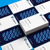
Clarity Corporate Identity by Jeffery Fulton |
Home > Winners > #122345 |
| CLIENT/STUDIO/BRAND DETAILS | |
 |
NAME: Clarity Innovations PROFILE: Clarity is a tech company specializing in digital services and transformation. Clarity has come a long way from its inception in 2012 and has grown in a number of ways. In size, in diversity, clients, and their processes. Clarity focuses on connecting people with the technology necessary to make their country (United States), and the world, a better, safer place. Discovering the technology and understanding the need is part of that quest. They practice servant leadership, respectful dialogue, technical excellence, and supporting and trusting one another. |
| AWARD DETAILS | |
 |
Clarity Corporate Identity by Jeffery Fulton is Winner in Graphics, Illustration and Visual Communication Design Category, 2020 - 2021.· Read the interview with designer Jeffery Fulton for design Clarity here.· Press Members: Login or Register to request an exclusive interview with Jeffery Fulton. · Click here to register inorder to view the profile and other works by Jeffery Fulton. |
| SOCIAL |
| + Add to Likes / Favorites | Send to My Email | Comment | Testimonials | View Press-Release | Press Kit |
Did you like Jeffery Fulton's Graphic Design?
You will most likely enjoy other award winning graphic design as well.
Click here to view more Award Winning Graphic Design.


