|
|
|

|
|
| DESIGN DETAILS |
DESIGN NAME:
School of Journalism CUC
PRIMARY FUNCTION:
Branding Identity
INSPIRATION:
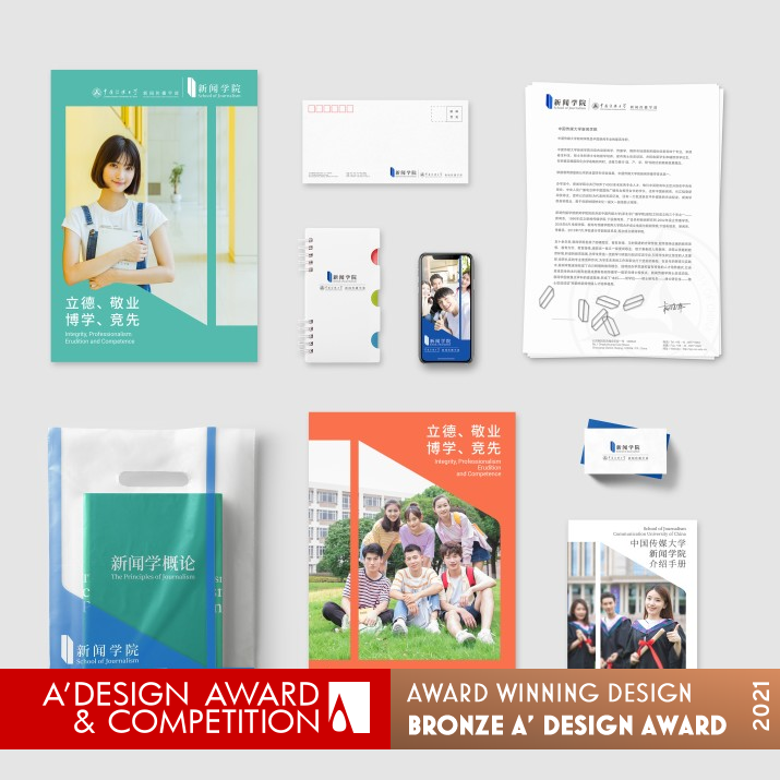
Find inspiration from the combination of paradox graphics and books. Paradox graphics represent both positive and negative views and an objective journalist attitude. Books represent knowledge and education. The combination of the two clearly expresses the connotation of journalism school.
UNIQUE PROPERTIES / PROJECT DESCRIPTION:
The journalism school of Communication University of China is China's highest educational institution in journalism, As one of journalism school with profound influence in society, the establishment of visual identity system contribute to up its brand value and image.The visual identification image design of journalism school focus on highlight its journalism professional attributes and the education characteristic. The visual effects strive to concise, modern and can reflect the professional connotation and the spirit of journalism school.
OPERATION / FLOW / INTERACTION:
-
PROJECT DURATION AND LOCATION:
Beijing, China
FITS BEST INTO CATEGORY:
Graphics, Illustration and Visual Communication Design
|
PRODUCTION / REALIZATION TECHNOLOGY:
-
SPECIFICATIONS / TECHNICAL PROPERTIES:
-
TAGS:
-
RESEARCH ABSTRACT:
-
CHALLENGE:
-
ADDED DATE:
2021-02-28 10:25:19
TEAM MEMBERS (3) :
Art director:Weimiao Du, Zhuo Ai, Design Director:xiaoling Dai and Creative Director:Shan Hao, YU Wei
IMAGE CREDITS:
photo:I'often,wu liu,qian yongze(699pic.com)
|
|
| CLIENT/STUDIO/BRAND DETAILS |
 |
NAME:
The School of Journalism of Communication University of China
PROFILE:
The School of Journalism of Communication University of China is the highest academic institution in the Chinese press.
This school is the first teaching and research institution in China to develop journalism talents, and has trained a large number of well-known journalists and program hosts.
|
|
|
| COMMENTS |
| Giulia Esposito |
Comment #13891 on December 27, 2022, 4:48 pm |
|
I am absolutely delighted to see such an exemplary branding identity that has won such a prestigious design award. "School of Journalism CUC" is a work of art that is incredibly captivating, with a perfect balance between creativity and functionality. The design is bold and unique yet simple to understand, and it is sure to draw the attention of viewers.
The colors used are vibrant and eye-catching, and the typography is spot on. The design really stands out and conveys the message clearly and effectively. It is definitely a work of genius and its success is a testament to the hard work and dedication of its creator.
Congratulations to Ecust-Creplus Design for their remarkable achievement!
|
| Chloe Turner |
Comment #89003 on January 4, 2023, 3:21 pm |
|
I'm in awe of the creative combination of paradox graphics and books in this work. It's a genius idea to represent both positive and negative views, while symbolizing an objective journalist attitude. The use of books to represent knowledge and education is spot on, and the overall connotation of the journalism school is very effective. This work is a wonderful example of how design can be used to communicate a message in a memorable and meaningful way. It's no wonder that this work was recognized with the A' Design Award.
|
|
|
Did you like Ecust-Creplus Design's Graphic Design?
You will most likely enjoy other award winning graphic design as well.
Click here to view more Award Winning Graphic Design.
Did you like School of Journalism Cuc Branding Identity? Help us create a global awareness for good graphic design worldwide. Show your support for Ecust-Creplus Design, the creator of great graphic design by gifting them a nomination ticket so that we could promote more of their great graphic design works.
|
|

|
|
|
|
