Flowering Street Charity Project Identity by Mingjun Jiang |
Home > Winners > #121372 |
 |
|
||||
| DESIGN DETAILS | |||||
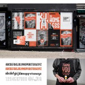
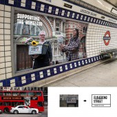
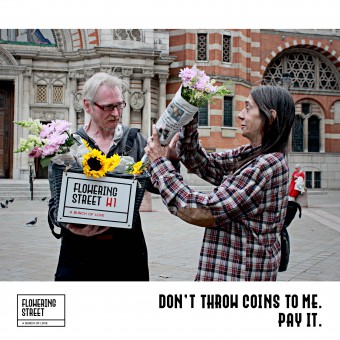
| DESIGN NAME: Flowering Street PRIMARY FUNCTION: Charity Project Identity INSPIRATION: According to the statistics of the Guardians in 2018, more than 3,000 people were found sleeping rough in London between July and September 2018. Related researches and social opinions also show the vital importance of highlighting this issue and finding a creative way to contribute to it. I was shocked and decided to try to create a brand with my brand knowledge and professional design skills, to draw the attention from different groups of the whole society and support the homeless. UNIQUE PROPERTIES / PROJECT DESCRIPTION: Flowering Street is aim at encouraging the homeless to believe in themselves and do a real job to cover their daily life, rather than depending on the donation till death. The shape of the logo was inspired by street signs in London, and a more interesting reason is that, homeless people would call each other street friends because they mostly sleep on the street. The street sign can be in good harmony with the situation of street, thus a proper choice to be the brand logo. OPERATION / FLOW / INTERACTION: Flower is an ideal charity product that can both draw the attention from the passengers and easy to get participate for the homeless. It also has a reasonable price which should be in consistent with the general market status, so that the homeless will get a part of the profits as their income. PROJECT DURATION AND LOCATION: The project started in January 2019 in London and finished in July 2019. It took about 7 months from design research, brand positioning to visual design.The target people is homeless in the UK. The original area of this welfare business in within London, and maybe next step is to expand the brand into other cities all over UK, and then make it a global brand. FITS BEST INTO CATEGORY: Graphics, Illustration and Visual Communication Design |
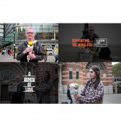
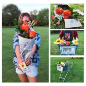
PRODUCTION / REALIZATION TECHNOLOGY: Flowers sold by the homeless. SPECIFICATIONS / TECHNICAL PROPERTIES: In the design of the flower wrapping, For reducing unnecessary fancy decorations on the packaging, using old newspapers (such as those collected at subway stations) and natural hemp ropes as tools. And to make it a warm brand, every bunch of flower sold by the homeless will be attached with a Thank You card, showing the gratitude and encouragement from the shops and the homeless, saying thank you for supporting the homeless. All of the above are made from recyclable natural materials, which can help to save money on packaging to support more homeless people. TAGS: charity, homeless, London, branding, visual, identity, flower RESEARCH ABSTRACT: This project combines various research methods, including face-to-face interviews, participated in various volunteer activities, field trips with homeless, literature reading and other methods, to help to understand the current situation of the British homeless, reveal the underneath causes of this social phenomenon. Summary: Through communication with different groups of people, problems such as business licenses, human management, preservation of fresh flowers, and finances, were found and taken into consideration in the proposal of this welfare brand. CHALLENGE: 1. How to make the project sustainable? 2. The Editorial Department of The Big Issue worried about the business license if this project gets applied, which reminds me to figure out the rules of selling on the street to make sure that everything is legal. 3. The visual effects that draw social attention are usually strong visual effects and bold fonts, but floral brands are usually slender and elegant. How to make this visual system suitable for the above two situations? ADDED DATE: 2021-02-27 11:30:18 TEAM MEMBERS (1) : Mingjun Jiang IMAGE CREDITS: Main Image is Image#Photographer: Yi Du, Flowering Street,2019 , Optional Imang is Imange#4Photographer: Mingjun Jiang, Flowering Street,2019 |
||||
| Visit the following page to learn more: https://www.monkavision.com | |||||
| CLIENT/STUDIO/BRAND DETAILS | |
 |
NAME: Monka Design PROFILE: A design team from Shenzhen China, focus on brand visual design. |
| AWARD DETAILS | |
 |
Flowering Street Charity Project Identity by Mingjun Jiang is Winner in Graphics, Illustration and Visual Communication Design Category, 2020 - 2021.· Read the interview with designer Mingjun Jiang for design Flowering Street here.· Press Members: Login or Register to request an exclusive interview with Mingjun Jiang. · Click here to register inorder to view the profile and other works by Mingjun Jiang. |
| SOCIAL |
| + Add to Likes / Favorites | Send to My Email | Comment | Testimonials | View Press-Release | Press Kit |
Did you like Mingjun Jiang's Graphic Design?
You will most likely enjoy other award winning graphic design as well.
Click here to view more Award Winning Graphic Design.


