He He Logo by Chao Yang, Jianhua Dong and Sy Xiang |
Home > Winners > #121319 |
 |
|
||||
| DESIGN DETAILS | |||||
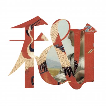
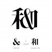
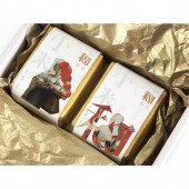
| DESIGN NAME: He He PRIMARY FUNCTION: Logo INSPIRATION: The design inspiration comes from the Chinese character "he" and the western "&", both of which express the meaning of fusion. They represent the fusion of Chinese art and Western art. UNIQUE PROPERTIES / PROJECT DESCRIPTION: Hehe is an artistic brand of agricultural products. The uniqueness of this brand logo design is the integration of Chinese culture and Western culture, forming a unique brand visual image. When it is applied, it can integrate Chinese culture and Western culture, and realize the combination of eastern culture and Western culture, agriculture and art. OPERATION / FLOW / INTERACTION: These visual graphic design can be directly used in packaging and outdoor publicity. PROJECT DURATION AND LOCATION: The project started in April 2020 in Hangzhou and finished in November 2020 in Hangzhou FITS BEST INTO CATEGORY: Graphics, Illustration and Visual Communication Design |
PRODUCTION / REALIZATION TECHNOLOGY: The logo is designed with the combination of eastern and Western characters. At the same time, it uses the creative way of graphics to fill in the cultural and artistic elements from the East and the west, realizing a set of brand image with the connotation of the integration of eastern and Western cultures. SPECIFICATIONS / TECHNICAL PROPERTIES: This visual design has no fixed size, and can be used according to the size of the media and packaging. TAGS: Brand image design, logo design, Chinese culture, western culture, integration RESEARCH ABSTRACT: The background of this project is to present an agricultural brand logo design through the integration of eastern and Western culture and aesthetic design. This design adopts the method of text design and graphic creativity, combines Chinese characters and English characters, and presents them in a mixed style. CHALLENGE: The biggest challenge of this project is the integration of Chinese culture and European culture, and the formation of a character symbol. The design of the logo cleverly finds two words with the same connotation, and organically combines them to present a brand logo with eastern and Western recognition. ADDED DATE: 2021-02-27 09:43:30 TEAM MEMBERS (3) : Designer: Chao Yang, Designer: Jianhua Dong and Designer: Shuyue Xiang IMAGE CREDITS: Image #01 : Designer, Chao Yang Image #02 : Designer, Jianhua Dong Image #03 : Designer, Shuyue Xiang Image #04 : Designer, Chao Yang Image #05 : Designer, Jianhua Dong |
||||
| Visit the following page to learn more: https://www.sohu.com/a/321574606_578913 | |||||
| AWARD DETAILS | |
 |
He He Logo by Chao Yang, Jianhua Dong and Sy Xiang is Winner in Graphics, Illustration and Visual Communication Design Category, 2020 - 2021.· Read the interview with designer Chao Yang, Jianhua Dong and Sy Xiang for design He He here.· Press Members: Login or Register to request an exclusive interview with Chao Yang, Jianhua Dong and Sy Xiang. · Click here to register inorder to view the profile and other works by Chao Yang, Jianhua Dong and Sy Xiang. |
| SOCIAL |
| + Add to Likes / Favorites | Send to My Email | Comment | Testimonials | View Press-Release | Press Kit |
Did you like Chao Yang, Jianhua Dong and Sy Xiang's Graphic Design?
You will most likely enjoy other award winning graphic design as well.
Click here to view more Award Winning Graphic Design.


