DESIGN NAME:
Manie
PRIMARY FUNCTION:
Typeface
INSPIRATION:
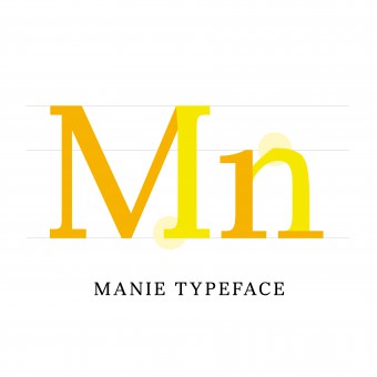
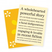
Manie is a typeface inspired by Wonder, a novel by RJ Palacio. It is an exploration of the connection between typography and the essence of a story. The round and friendly features of the typeface were designed to reflect the sweet and heartwarming story. The straight edge cut on the shoulder and the half curved, half straight serif characteristics contributed to the twist in the voice of the author. The calligraphic quality is also incorporated to portray the softness and kindness of the main character.
UNIQUE PROPERTIES / PROJECT DESCRIPTION:
Manie is a personal project that grew out of my passion for serif typefaces as a designer. Today, san-serif is widely popular due to its clean shape and distinctive features. Therefore, the goal for Manie was to design a serif typeface that is friendly and simple like san-serif typefaces yet still celebrates the intricacy and the details of a serif typeface.
OPERATION / FLOW / INTERACTION:
While Manie is clearly a Body Text face, its round and curvy letters make it easy for the readers to follow. It showcases moments of intricate details and its unique personality without interrupting the flow of the paragraph. At the same time, the small details are hidden within each letter also make it worth considering for Display face or headings.
PROJECT DURATION AND LOCATION:
The project started in February 2018 and finished in June 2018 in Providence, USA.
FITS BEST INTO CATEGORY:
Graphics, Illustration and Visual Communication Design
|
PRODUCTION / REALIZATION TECHNOLOGY:
Robofont was the primary software used for this project. But before building the typeface on Robofont, hundreds of lettering sketches from big to small were required in the beginning. Using the hand to draw the letters prior to digitalization has helped enormously in understanding the interaction between the letters and within each letterform. Gaining more awareness of the qualities and delicacy of the shapes was key to this project.
SPECIFICATIONS / TECHNICAL PROPERTIES:
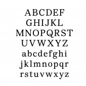
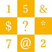
Manie Typeface created and completed. This includes two sets of numbers, lowercase letters, uppercase letters, special characters, and ligatures.
TAGS:
typography, type design, typeface, graphic design, font, serif, lettering, serif typeface
RESEARCH ABSTRACT:
The research depended entirely on the type of project but one thing that remains true for all is the process. The process is always the key in the journey that leads to the end product. This approach has allowed more exploration and experimentation instead of taking the safe route to a familiar product. The research for this particular project began with spending a lot of time learning the principles of type design with Professor Richard Lipton, type designer at Rhode Island School of Design. Many hours were invested in practicing lettering and calligraphy before jumping into designing Manie typeface. Exploring different terminals, stems, bowls, and ears of the letters has deepened the understanding of the anatomy of letters and typography. More hours were spent decoding the unique aspects that were inspiring from the movie Wonder with the aim to translate those joyful and positive moments into the typeface designed. Type design is a slow but beautiful process, shows how much time and effort type designers put in order to create the typefaces we use every day.
CHALLENGE:
Capturing the essence of the movie and translating that into a typeface was a real challenge. Communicating something that abstract was not an easy task. However, research on the language of typography allowed absorption of more knowledge of translating emotions into typographic characteristics. Finding that commutuality between the two was the heart of this design challenge.
ADDED DATE:
2021-02-26 20:40:03
TEAM MEMBERS (1) :
IMAGE CREDITS:
Pornmanie Snidvongs, 2018.
|
