R Gate Emblem Corporate Identity by Riiid Inc. |
Home > Winners > #120723 |
 |
|
||||
| DESIGN DETAILS | |||||
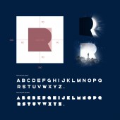
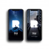
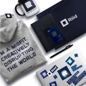
| DESIGN NAME: R Gate Emblem PRIMARY FUNCTION: Corporate Identity INSPIRATION: Riiid is the AI Ed technology company that believes education should help to discover and unleash the limitless potential of humankind. Every kid and parent believes in their potential at first but loses this belief as they enter the current education system where diversity and individual differences are not fully embraced. New corporate identity visualized the brand's "R" into a keyhole and a portal to represent Riiid is opening up a rusty old mindset and invites everyone to make their own breakthrough to remind of the belief: you are better than you think you are. UNIQUE PROPERTIES / PROJECT DESCRIPTION: An emblem was created using a keyhole motif. The negative white shape of R in a deep blue square creates R gate. R gate is a visual metaphor of a bridge portal for any students to open the unknown world of education. It is also a symbolic pathway to share Riiid’s Deep Learning based AI technology and new educational experiences with the world. Deep Ocean Blue is the primary color that highlights Riiid’s pioneer spirit in the field of AI Ed like a daring diver explores the unknown area of the deep ocean. OPERATION / FLOW / INTERACTION: CI serves a consistent look for internal and external, online and offline communication purposes. R gate becomes a framework for marketers and designers to fill with various images flexibly to represent the immense possibility of the formative learning experience. The R-gate logo clearly communicates the company’s dedicated vision that Riiid is a doorway to future education. For example, an office entrance is a physical R shaped gateway for employees to experience pushing into a new world. PROJECT DURATION AND LOCATION: The rebranding project started in September 2020 and finished in January 2021 in Seoul, South Korea FITS BEST INTO CATEGORY: Graphics, Illustration and Visual Communication Design |
PRODUCTION / REALIZATION TECHNOLOGY: With image digitalization programs such as Figma, Illustrator, Photoshop, designers developed a new corporate identity design system that can be easily adaptable to offline and online materials SPECIFICATIONS / TECHNICAL PROPERTIES: The ratio of the R gate emblem is 1to 1 ratio. The letter ‘R’ from the logo was used as a base measuring unit. Riiid cube typeface was developed based on the ratio of R. Typeface has two types, Extra Bold and Bold. Transforming from Extra Bold to Bold fonts symbolized portrays Riiid is defining real-world solutions in this important yet undefined field of education. TAGS: AI, AI Ed, Education, Branding, CI RESEARCH ABSTRACT: Riiid provided multiple products in B2C sectors only in Korean markets. Santa TOEIC, the Riiid’s first AI tutor solution, based on deep learning algorithms in 2017, quickly raised number one in education app sales with more than two million users. As Riiid is expanding B2B partnership beyond test prep, Riiid needs to redefine its brand identity that can connect its past and future and embrace different cultural nuances in different regional markets. With CI design renewal, Riiid was seeking to establish a strong visual anchor to tells the Riiid's belief that made the brand grow. CHALLENGE: As the company is expanding globally and its business from B2C to B2B, the major creative challenge was to maintain bold look of previous logo but to create an appropriate visual metaphor to embrace next phase of Riiid journey to transform education and improve the lives of students around the world. To reach out for global customers, the new logo has to be distinctive but responsive throughout all types of medium, media channels, and various platforms, from apps to physical space. ADDED DATE: 2021-02-26 02:40:40 TEAM MEMBERS (7) : Chief of Brand Strategy Officer: Sewon Cho , Brand/Content Marketer: Kwangmin Woo , Designer: Minsung Noh , Designer: Juhee Han , Global Brand Designer: Wha Kyung Su, Branded Content PD: Soohyeon Yoon and Producer: Hyekyung Mun IMAGE CREDITS: Riiid Inc., 2020. |
||||
| Visit the following page to learn more: http://www.riiid.co | |||||
| AWARD DETAILS | |
 |
R Gate Emblem Corporate Identity by Riiid Inc is Winner in Graphics, Illustration and Visual Communication Design Category, 2020 - 2021.· Read the interview with designer Riiid Inc. for design R Gate Emblem here.· Press Members: Login or Register to request an exclusive interview with Riiid Inc.. · Click here to register inorder to view the profile and other works by Riiid Inc.. |
| SOCIAL |
| + Add to Likes / Favorites | Send to My Email | Comment | Testimonials | View Press-Release | Press Kit |
Did you like Riiid Inc's Graphic Design?
You will most likely enjoy other award winning graphic design as well.
Click here to view more Award Winning Graphic Design.


