DESIGN NAME:
Benin
PRIMARY FUNCTION:
Branding
INSPIRATION:
Coffee lovers think that coffee is a divine drink that tastes like heaven. Whether it is a part of their morning ritual or a pause in a busy day, a cup of coffee gives them instant happiness. That heavenly good feeling was used as a starting point for Benin's brand concept, infusing its divine spirit into coffee shops through a symbol of an angel – a happy Cherub serving coffee. The underlying symbolism of the Renaissance movement is no coincidence; it illustrates the renaissance of the soul after having coffee, as well as the connection to Italy, the homeland of premium coffee.
UNIQUE PROPERTIES / PROJECT DESCRIPTION:
Benin is a family-run company offering different coffee services for over 30 years, with new plans that turn their coffee shop business into a franchise model. This lively family loves music and sharing happy moments, and they developed a warm and cheerful customer approach. The new brand wanted to transmit that energy into their franchise with the visual identity that tells a story of happiness, passion, and feel-good. Through Cherub’s loving, smiling face and brand’s bright colors, every customer can get a sense of Benin’s unique values.
OPERATION / FLOW / INTERACTION:
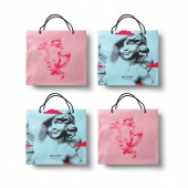
The brand had to speak to three levels of coffee lovers: basic, intermediate, and advanced. Most of them are Millennials and Gen Z, so the colors used are their favorite baby pink and blue tones. The addition of strong yellow and red pinpoint the energetic brand personality. Product packaging is designed as a secondary advertising mechanism and aligned with the target’s expectations of sustainability, using paper cups, jute tote bags, and tins. The texture with angelic clouds is present in multiple details, constantly transmitting the heavenly good feeling.
PROJECT DURATION AND LOCATION:
The project started in May 2021. in Rijeka and finished in August 2021. in Rijeka.
FITS BEST INTO CATEGORY:
Graphics, Illustration and Visual Communication Design
|
PRODUCTION / REALIZATION TECHNOLOGY:
To-go coffee cups and paper bags are produced with natural paper and CMYK offset technology.
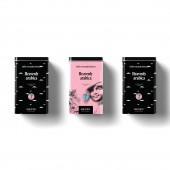
Benin package are produced and/or coated with metal materials to preserve the quality of coffee.
SPECIFICATIONS / TECHNICAL PROPERTIES:
Paper bag: 32x23 cm To go coffee cup small: 46x60 mm
To go coffee cup big: 59x110 mm Metal coffee box: 12x18 cm
TAGS:
Branding, visual identity, franchise, coffee shop, packaging
RESEARCH ABSTRACT:
After initial consultations, two workshops were conveyed to the client. The first one discovered the brand’s unique story, philosophy, personality, target market, and benchmark. In the second one, the client had to choose between three different brand personality mood boards, identifying the one that is best aligned with their unique market position. Benin was identified as a kind, warm, cheerful, and wise friend, which was interpreted with the Cherub icon and accompanying aesthetics. The design prototype was tested at every brand touchpoint before creating the final identity.
CHALLENGE:
The creation of Benin’s visual system was a result of an in-depth process that included the discovery of the client’s business drivers and company culture. Several challenges were identified: 1) Effective brand communication towards three different targets. 2) A strong symbol that unifies a heavenly pleasant experience and family values. 3) Brand standardization, so it can be successfully applied to the franchise concept: from interior design and packaging to marketing collaterals. 4) Using an affordable packaging material.
ADDED DATE:
2021-02-25 12:51:17
TEAM MEMBERS (1) :
Anja Zambelli Čolak
IMAGE CREDITS:
Anja Zambelli Colak, 2020.
|


