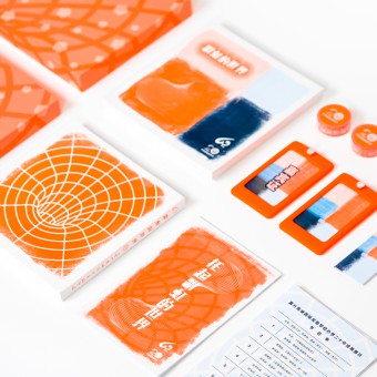
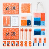
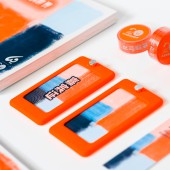
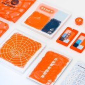
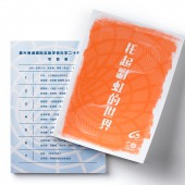
Colorful Childhood Visual Identity by Yuchen Chen |
Home > Winners > #116776 |
| CLIENT/STUDIO/BRAND DETAILS | |
 |
NAME: Jiaxing Nanhu International Experimental School PROFILE: Jiaxing Nanhu International Experimental School was organized in April, 1998. It’s the first private corporation management that is government owned school. In 2002 we started using the BOT system to finance and rebuild our school. The school follows the philosophy that A modernized school, with a bright future. The school is over 50000 square meters large and has a floor space of more than 30000 square meters. The environment of the campus is tranquil. It resembles the botanical garden. The buildings complex designs and leisure space gives the school its own uniqueness. The campus’s attractions differ from many other schools in the county. It has playgrounds, an indoor swimming pool, a tennis court and many other sports related features. Furthermore, it has a 24 hour internet access, a patrol system after curfew and so on. Since we have all these modernized technological devices, our school’s education level is obviously outstanding. we believe that teaching science and research makes a promising school, so we insist on educational reform, educational experiments and innovation. |
| AWARD DETAILS | |
 |
Colorful Childhood Visual Identity by Yuchen Chen is Winner in Graphics, Illustration and Visual Communication Design Category, 2020 - 2021.· Read the interview with designer Yuchen Chen for design Colorful Childhood here.· Press Members: Login or Register to request an exclusive interview with Yuchen Chen. · Click here to register inorder to view the profile and other works by Yuchen Chen. |
| SOCIAL |
| + Add to Likes / Favorites | Send to My Email | Comment | Testimonials | View Press-Release | Press Kit | Translations |
Did you like Yuchen Chen's Graphic Design?
You will most likely enjoy other award winning graphic design as well.
Click here to view more Award Winning Graphic Design.


