Royal Time Residence Display Center by Shanghai PTArchitects |
Home > Winners > #116078 |
 |
|
||||
| DESIGN DETAILS | |||||
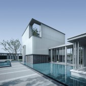
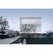
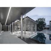
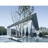
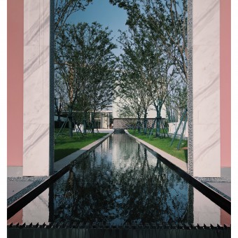
| DESIGN NAME: Royal Time Residence PRIMARY FUNCTION: Display Center INSPIRATION: The project is located in the downtown area of Taihu New Town, Suzhou, China. The owner of the project hopes that the display center can convey the same allure as the classical traditional Chinese gardens of Suzhou, meanwhile the façade be informative and impressive, and that the layout and functions conforms to the personality of the younger generation. For this reason, the area near a strip of 12 meter width city park becomes the point where the design gets started. UNIQUE PROPERTIES / PROJECT DESCRIPTION: The overall design emphasizes the visitor's experience of the space on site, especially when it conveys the fluid circulation of different spaces as experienced in traditional classical gardens in Suzhou. The display center consists of three separate functional buildings with an open area enclosed in the middle. It looks like three independent glass boxes of different shapes and sizes are beautifully scattered on the site. And different kinds of 'transitional spaces' connect them all to form a modern courtyard which will become a spot where residents in the future can stay, socialize and communicate. OPERATION / FLOW / INTERACTION: All the buildings open up to the inner courtyard. The showroom is located to the east of the three buildings. Its main function is to showcase the sand table of the real estate and to serve as a reception space; The building to the north functions as both a fitness club on the first floor and a children center on the second floor; The building to the west is the book-bar with another terrace on the second floor for relaxation. This terrace further helps to break up the view from within the courtyard. The architect avoids repeatedly using the same roof structures for different buildings. Instead three different roof types, namely, flat roof, single-sloped roof, and double-sloped roof, with varying heights, are used to achieve a richer visual effect. The main landscape surfaces of the three buildings all face to the inner courtyard. However, different architectural forms combined with the use of panels of glass with different sizes offers a unique visual experience. PROJECT DURATION AND LOCATION: The project started in Sept. 2019 and finished in Jun. 2020 in Suzhou, China FITS BEST INTO CATEGORY: Architecture, Building and Structure Design |
PRODUCTION / REALIZATION TECHNOLOGY: In order to dissolve the façade of the buildings, the architect decides to use large panels of U-profile glass as the main material. The panels that form the exterior of the fitness club vary in size, with the largest piece nearing 10 meters high. Intricately gray-toned rose-gold aluminum panels and small areas of locally produced clay bricks are applied to the building to soften up its architectural image. In order to make sure that the designing effect remains consistent with the final effect on site, a resident architect is put on the task of checking every material with the construction unit. SPECIFICATIONS / TECHNICAL PROPERTIES: As young and modern people are the major residents in the community, the owner of the project wishes to create a quiet and pleasant space for them, thus the viral book-bar was created. As an independent volume of building, the book-bar also uses large panels of U-profile glass(with each panel of 7.6-meter height) as the façade which is very eye-catching and soothing from any side, wherever the visitor comes in. From within, the glass panels provide the readers with a quiet and private environment for reading. TAGS: display center, fluid circulation, socialize and communicate, open community RESEARCH ABSTRACT: The spaces between the bricks at the bottom of the building gradually decrease from the middle outwards, forming a distinct rhythm and echoing the fantastical elements of the translucent glass above. The overall effect enriches the architectural language of the building. From the inside, these gaps become windows for the reader, offering a view of the outside. At night, light shines through the perforated wall, putting up a play of light and shadow. A sunshine terrace was specifically created on the second floor, making full use of the vertical space to increase the richness and flexibility of the space. CHALLENGE: How to let the project convey the inward temperament of traditional Suzhou architecture while the façade still remaining modern and impressive are the major challenge. The architect utilizes semi-transparent U-profile glass as the façade of the entrance, transforming it into a piece of a dazzling 'jade' of light weight, welcoming the visitors who appreciate it. The means of organically linking the three different buildings (Showroom, fitness club, book-bar) is another challenge in the process of design. Now the introduction of a waterscape within the inner courtyard creates a fluid experience for visitors and also makes the whole space filled with richness and flexibility. All the buildings extend from the inner courtyard. The rain corridors are sometimes open, sometimes closed, and sometimes become paths leading into the inner courtyard, or into the transitional spaces. The visitor can simultaneously experience the private interior, the open exterior, and being part of the nature in this open community. ADDED DATE: 2021-01-18 09:58:25 TEAM MEMBERS (1) : Shanghai PTArchitects IMAGE CREDITS: IMAGE by Yuan Yang |
||||
| Visit the following page to learn more: https://cutt.ly/ZjIUS3g | |||||
| AWARD DETAILS | |
 |
Royal Time Residence Display Center by Shanghai Ptarchitects is Winner in Architecture, Building and Structure Design Category, 2020 - 2021.· Read the interview with designer Shanghai PTArchitects for design Royal Time Residence here.· Press Members: Login or Register to request an exclusive interview with Shanghai PTArchitects. · Click here to register inorder to view the profile and other works by Shanghai PTArchitects. |
| SOCIAL |
| + Add to Likes / Favorites | Send to My Email | Comment | Testimonials | View Press-Release | Press Kit |
Did you like Shanghai Ptarchitects' Architecture Design?
You will most likely enjoy other award winning architecture design as well.
Click here to view more Award Winning Architecture Design.


