The Cairo Citadel Corporate Identity by Rana Galal |
Home > Winners > #113295 |
 |
|
||||
| DESIGN DETAILS | |||||
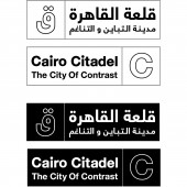
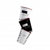
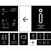
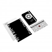
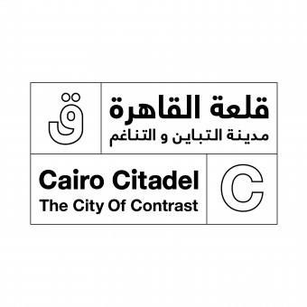
| DESIGN NAME: The Cairo Citadel PRIMARY FUNCTION: Corporate Identity INSPIRATION: The Cairo Citadel was the seat of government in Egypt and residence of its rulers for 700 years, From the 13th to the 19th centuries. Developing a visual identity created a huge challenge; to represent the contrast existing inside and outside the place and reflecting it in a fresh and modern look. The exploration and research process led to a rich identity inspired by the citadel's atmosphere and usage. I designed a bilingual logo mark to fit all my target groups and presents it in an opposite way by combining curvy with edgy letter forms and placing them in an opposite layout. UNIQUE PROPERTIES / PROJECT DESCRIPTION: The Cairo Citadel is the small version of Cairo. And while supporting the use of Arabian design patterns as inspiration. The logo was created in a block form that can be splitter into two rectangles that are always located opposite of each other to represent the changes happening in the culture and place in a n abstract way. Black and white are the primary colors they reflect the brand's slogan which is the City Of Contrast. The secondary color was inspired by the blood created in the Massacre event happened inside the citadel. Lately an experimental sign system was developed with the same concept. OPERATION / FLOW / INTERACTION: It produces a unique experience, where is also make people see the place in a new perspective through a simple and modern corporate identity. PROJECT DURATION AND LOCATION: 2019 German University in Cairo, 3 months During the bachelor in Graphic Design Degree. FITS BEST INTO CATEGORY: Graphics, Illustration and Visual Communication Design |
PRODUCTION / REALIZATION TECHNOLOGY: Exploring different visual languages to develop a brand identity, logo design and signage system that is inspired from the Egyptian culture and local citizens. SPECIFICATIONS / TECHNICAL PROPERTIES: The ratio of the logo is 2 squares to 5 squares. Helvetica New was chosen as the main typeface as it is a simple and very modern font. Also, it is somehow geometrical. The curves and angles of the font are similar to the logo type and this creates consistency and harmony. TAGS: Logo, Branding, Signage system, Typography, Visual Identity RESEARCH ABSTRACT: My research process mainly depends on the related designs within the culture and comparing between the old and modern Egyptian's lifestyle. The goal challenge was to shed the light on the importance of the Citadel that is full of heritage by giving it a powerful and fresh identity that reflects the culture and enhance a person's visit experience. My research journey for this project had to begin with spending a lot of time with the local and international visitors of the Citadel. I also invested many hours visiting and studying the brand's atmosphere, different religions, Islamic designs and guides. People who dedicated their lives to share the history and knowledge. They were the key of this project, as they opened my mind to new doors and visions. They taught me how to explore more by myself also I became a Tour guide assistant at the Cairo Citadel for a day. I took a deep dive into art, communications, history, literature and design. And at the end of this exhausting and exciting journey, I started sketching and building a clear and strong brand. CHALLENGE: Showing the soul of the history and comparing it with the modern life was challenging enough. As I was filling the gaps between the present and the past. To bring that history into today's world, needed a deep research into all common aspects. At the research showed that the contrast happening within the culture, gives it its identity, power and balance look and feel in order to make it visually simple and unique. Effort and time helped into completing the puzzle and barring the complexity of the history within the turn up of simple and modern design. This place was the heart of a challengeable creative research. ADDED DATE: 2020-10-27 16:42:03 TEAM MEMBERS (1) : none. IMAGE CREDITS: Rana Galal, 2020. PATENTS/COPYRIGHTS: Copyrights: Rebranding the Cairo Citadel, the city of contrast: Rana Galal |
||||
| Visit the following page to learn more: https://www.instagram.com/ranagalal.desi |
|||||
| AWARD DETAILS | |
 |
The Cairo Citadel Corporate Identity by Rana Galal is Winner in Graphics, Illustration and Visual Communication Design Category, 2020 - 2021.· Read the interview with designer Rana Galal for design The Cairo Citadel here.· Press Members: Login or Register to request an exclusive interview with Rana Galal. · Click here to register inorder to view the profile and other works by Rana Galal. |
| SOCIAL |
| + Add to Likes / Favorites | Send to My Email | Comment | Testimonials | View Press-Release | Press Kit |
Did you like Rana Galal's Graphic Design?
You will most likely enjoy other award winning graphic design as well.
Click here to view more Award Winning Graphic Design.


