Island Rain Spiked Sparkling Seltzer Packaging by Nicholas McMillan |
Home > Winners > #112913 |
 |
|
||||
| DESIGN DETAILS | |||||
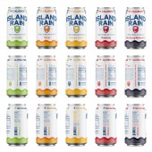
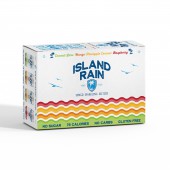
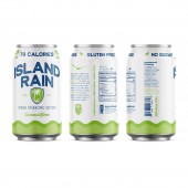
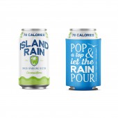
| DESIGN NAME: Island Rain Spiked Sparkling Seltzer PRIMARY FUNCTION: Packaging INSPIRATION: Inspired by the crisp, refreshing taste and flavors of the low calorie refreshment brewed in S. Georgia, the design looked to distinguish Island Rain as a unique product line that would be sold to international markets. UNIQUE PROPERTIES / PROJECT DESCRIPTION: The new logo is inspired by island and beach-themed typography while subtly incorporating elements that are easily distinguishable by those familiar with OBC, but not key to understanding the Island Rain brand. A clean and crisp white can design compliments the logo and establishes a design language which will speak to a younger market, as well as, appeal to those who already enjoy Island Rain. Splashes of color allows for a consistent design with easily identifiable flavors. OPERATION / FLOW / INTERACTION: Pop open a can and enjoy the beverage that is Island Rain. PROJECT DURATION AND LOCATION: The project started in October 2019 in Omaha, Georgia USA and concluded in January 2020. Island Rain is now being distributed to international markets arriving on shelves in Guatemala in September 2020. FITS BEST INTO CATEGORY: Packaging Design |
PRODUCTION / REALIZATION TECHNOLOGY: The initial design was intended to be printed directly on substrate, instead the client decided to continue using shrink wrapped cans for the current production run. SPECIFICATIONS / TECHNICAL PROPERTIES: 12 FL OZ Aluminum Can Height 413mm Diameter 211mm TAGS: packaging, typography, clean, crisp, bright RESEARCH ABSTRACT: Research Objectives To determine how to distinguish OBCs new sparkling spiked seltzer from their existing beer products while also creating a product that would compete in a crowded market. Research Methodology Review of current client product design and that of potential competitors was observed. As the primary designer of past designs, I had knowledge of the aesthetic which the client wanted to move away from. Data Collection Qualitative Participants and Experiments Test market groups were introduced to the new product line to receive feedback before final production. CHALLENGE: The most difficult challenge was to create a new and unique design that fulfilled the request of the client while not alienating a dedicated community who was already invested in the brewery. Furthermore, a priority of this initiative was to produce a design that would allow for the lowest production cost available. Producing an eye-catching design that had to solve many marketing problems with a limited color palette also proved to be a challenge. ADDED DATE: 2020-10-09 20:04:06 TEAM MEMBERS (1) : IMAGE CREDITS: Nicholas McMillan, 2020. |
||||
| Visit the following page to learn more: http://www.ntmcmillan.com | |||||
| AWARD DETAILS | |
 |
Island Rain Spiked Sparkling Seltzer Packaging by Nicholas McMillan is Winner in Packaging Design Category, 2020 - 2021.· Read the interview with designer Nicholas McMillan for design Island Rain Spiked Sparkling Seltzer here.· Press Members: Login or Register to request an exclusive interview with Nicholas McMillan. · Click here to register inorder to view the profile and other works by Nicholas McMillan. |
| SOCIAL |
| + Add to Likes / Favorites | Send to My Email | Comment | Testimonials | View Press-Release | Press Kit |
Did you like Nicholas McMillan's Packaging Design?
You will most likely enjoy other award winning packaging design as well.
Click here to view more Award Winning Packaging Design.


