BCC and Beautycorn Identity by Ki-Seok Nam |
Home > Winners > #111682 |
 |
|
||||
| DESIGN DETAILS | |||||
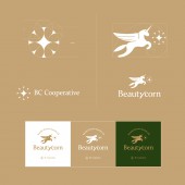
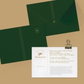
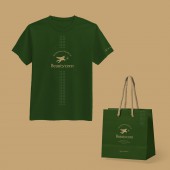
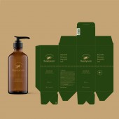
| DESIGN NAME: BCC and Beautycorn PRIMARY FUNCTION: Identity INSPIRATION: BCC is a hair beauty company and a cooperative made up of experts. and conduct education business in the field of hair beauty and produce products such as shampoos. BCC's main customers are women. so focus on what women want, and the design is finally inspired by flowers. Ultimately, the goal is to use BCC's main images in the form of flowers and deliver them to the customers. UNIQUE PROPERTIES / PROJECT DESCRIPTION: The symbol mark is designed in the form of flowers blooming, which means cooperation and prosperity. The brand logo beautycorn was developed as a compound word of beauty and unicorn and is visually linked to the symbol mark. OPERATION / FLOW / INTERACTION: Graphic patterns form a visual identity in the brand's products and prints. PROJECT DURATION AND LOCATION: This project started in March 2020 and finished in May 2020 in Daejeon in Korea. FITS BEST INTO CATEGORY: Graphics, Illustration and Visual Communication Design |
PRODUCTION / REALIZATION TECHNOLOGY: The symbol mark, brand logo and graphic identity are all designed in a golden ratio. SPECIFICATIONS / TECHNICAL PROPERTIES: Used Adobe Illustrator to work on a vector. TAGS: Logo, Identity, Branding RESEARCH ABSTRACT: The client wanted the symbol mark and brand logo to be visually connected. The key to this project was to ensure consistency in the design. CHALLENGE: We aim to deliver beautiful images to BCC's customers and form their values. ADDED DATE: 2020-09-28 21:13:45 TEAM MEMBERS (2) : Graphic designer Ki-seok Nam and Graphic designer Bora Lee IMAGE CREDITS: Ki-Seok Nam, 2020. |
||||
| Visit the following page to learn more: http://winners7.com/BCC | |||||
| AWARD DETAILS | |
 |
Bcc and Beautycorn Identity by Ki-Seok Nam is Winner in Graphics, Illustration and Visual Communication Design Category, 2020 - 2021.· Read the interview with designer Ki-Seok Nam for design BCC and Beautycorn here.· Press Members: Login or Register to request an exclusive interview with Ki-Seok Nam. · Click here to register inorder to view the profile and other works by Ki-Seok Nam. |
| SOCIAL |
| + Add to Likes / Favorites | Send to My Email | Comment | Testimonials | View Press-Release | Press Kit |
Did you like Ki-Seok Nam's Graphic Design?
You will most likely enjoy other award winning graphic design as well.
Click here to view more Award Winning Graphic Design.


