DESIGN NAME:
Sof
PRIMARY FUNCTION:
Brand Identity
INSPIRATION:
SOF is a personal project inspired by the designer’s journey with uterine fibroids, the frustration of being handed the same generalized brochure after a doctor's visit, meeting women in similar positions who have waited too long to get treated. While not dangerous, ignoring the symptoms can lead to complications. Possible solutions involve creating a sense of urgency, giving patients enough personalized information and a support system.
UNIQUE PROPERTIES / PROJECT DESCRIPTION:
SOF is an acronym for Sisters Overpowering Fibroids. To translate the core of the brand identity, it was essential to use a simple name that embodies strength and support. Consequently, the goal is to bridge the gap between people diagnosed with uterine fibroids, their doctors, as well as creating a safe and supportive space. SOF aims to encourage and empower patients to be in charge of their health through multiple design deliverables.
OPERATION / FLOW / INTERACTION:
It's a brand identity for a community. The brand aims to enhance and expand the experience of people diagnosed with uterine fibroids by identifying common problems that lead patients to ignore their symptoms until complications occur. Finding the solution was merely about giving them control over their health in a safe and shared environment.
The common problems were, first, the medical brochure given to patients is generalized and not always relevant to their symptoms. Moreover, these brochures look and feel like any other medical brochures. Second, no sense of urgency is given when the fibroids are small, so most people tend to ignore them until complications occur. Some may opt-out of treatment, especially if surgery is needed because other things in life seem more important. Third, the lack of a supportive community.
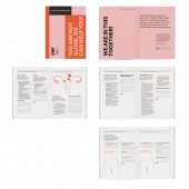
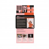
Therefore, possible solutions could be, creating a cohesive branding different from the usual medical visuals. A customized booklet tailored to be used during doctor's visits and can be reviewed at home or anywhere the patient chooses. Posters with bold typography to encourage people with uterine fibroids to take action. A website includes a message forum to create a safe sharing space, get a copy of the booklet, and fun merchandise to promote togetherness and empowerment.
PROJECT DURATION AND LOCATION:
The ideation and concept phase started in late 2018 while recovering from a uterine fibroid removal surgery. The initial design began in July, 2020. Final design was completed in September, 2020 in San Francisco, California.
FITS BEST INTO CATEGORY:
Graphics, Illustration and Visual Communication Design
|
PRODUCTION / REALIZATION TECHNOLOGY:
Adobe Indesign and Illustrator were used. The booklet printed on durable Neenah paper and saddle stitched. A digital format is provided of the posters so they can be printed accordingly for both outdoor and indoor usage. The tote bags and shirts are screen printed on fabrics.
SPECIFICATIONS / TECHNICAL PROPERTIES:
Posters: 116x152cm , Booklet: Saddle Stitch A5, Tote bag: 27x31cm, Website: Responsive, it will scale proportionately according to the device and browser.
TAGS:
Branding, Graphic Design, Identity, Logo, Poster, Booklet, Strength, Memorable, Health, Graphic Design
RESEARCH ABSTRACT:
The research was conducted based on a concept to understand better the delay of treatments for people diagnosed with uterine fibroids. The design’s objective is to create a brand that offers patients services to take action for their health. Through simple qualitative research, the designer recognized the importance of providing tools to be used before, during, and after visiting a doctor.
Starting with posters to convey a sense of urgency, a booklet designed as an assessment tool during doctor visits. The patient and physician will work together to find the most suitable pathway customized to the patient’s needs, from treatments, surgery details to reviewing different opinions and more, and an online platform to provide a sense of a supportive online community where patients can interact. While staying true to the topic, the material’s design conveys urgency, strength, and compassion.
CHALLENGE:
The original idea was to stay true to the vernacular of the medical field, such as greens and blues to represent growth and health. However, after the initial feedback from a small group of design professionals, the designer realized that it isn’t the best approach, but to introduce a new visual system that is bolder yet calm. Therefore, the designer changed the design to utilizing bold typography and a bold color palette. The designer used the initial keywords to represent each color, Red for Urgency, Black for Strength, Pink for Compassion, and Pale Pink for Calmness.
ADDED DATE:
2020-09-26 04:17:15
TEAM MEMBERS (1) :
Hamda Al Naimi (Alnuaimi)
IMAGE CREDITS:
Mock up Images: Placeit, Urban Poster mockup, Pixeden, Creative Market
Stock images: Unsplash.
*Models are part of the license of each image mentioned above.
|


