Yoonly Visual Identity by Fanny De Bray |
Home > Winners > #109809 |
 |
|
||||
| DESIGN DETAILS | |||||
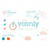
| DESIGN NAME: Yoonly PRIMARY FUNCTION: Visual Identity INSPIRATION: The logo features the letter Y with a pin, which evokes the idea of geolocation, and is an image which is frequently used in the travel industry. Duck green can evoke the sea and blue skies, while the color orange evokes human warmth, sunshine, the earth, and emotions. The round lowercase typography is contemporary and inspired by the lettering used by start-ups and other current brands. UNIQUE PROPERTIES / PROJECT DESCRIPTION: The letter Y with a pin creates an on/off button which perfectly illustrates the baseline: switch on life. The two Os in Yoonly represent the sign for infinity, emphasizing the idea of memories which will last a lifetime. The bottom of each letter flicks to the right, making the logo dynamic and textured. OPERATION / FLOW / INTERACTION: This design has been adapted to be displayed both on digital (website, app, icons) & printed (book, guides, flyers, business cards...). The logo is adapted to suite better each media it is displayed on. PROJECT DURATION AND LOCATION: The project started in June 2019 and finished in May 2020. Since septembrer 2020 a website has put into action this design. FITS BEST INTO CATEGORY: Graphics, Illustration and Visual Communication Design |
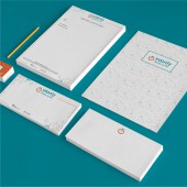
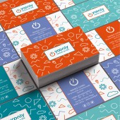
PRODUCTION / REALIZATION TECHNOLOGY: Logo Business card Letterhead paper Envelope SPECIFICATIONS / TECHNICAL PROPERTIES: Business card: 85 X 55 mm Letterhead paper: A4 Envelope: 220 x 110mm TAGS: travel, young, branding, graphic design, vacation, experiences, mountains, sea RESEARCH ABSTRACT: Several research have been conducted to create this design : - Analysis of youth expectation for their travel through social network publication, competition and user interviews - Brand platform with the company direction : What is the mission ? What are the USP ? Who is the target ? - Moodboard of images & emotions that need to be associated with the brand (with the company direction) CHALLENGE: Create a universe that matches the expectations of millennials. Have a clear enough message with the logo, but also leave a creative interpretation possible. Create a universe that can work with multiple destinations : mountain, sea side and much more. ADDED DATE: 2020-09-09 16:26:12 TEAM MEMBERS (2) : Creative Director: Fanny de Bray and Brand Strategist: Amandine Lantelme IMAGE CREDITS: Copyright Made for you PATENTS/COPYRIGHTS: Copyright Made for you |
||||
| Visit the following page to learn more: http://urlz.fr/dMY6 | |||||
| AWARD DETAILS | |
 |
Yoonly Visual Identity by Fanny De Bray is Winner in Graphics, Illustration and Visual Communication Design Category, 2020 - 2021.· Read the interview with designer Fanny De Bray for design Yoonly here.· Press Members: Login or Register to request an exclusive interview with Fanny De Bray. · Click here to register inorder to view the profile and other works by Fanny De Bray. |
| SOCIAL |
| + Add to Likes / Favorites | Send to My Email | Comment | Testimonials | View Press-Release | Press Kit |
Did you like Fanny De Bray's Graphic Design?
You will most likely enjoy other award winning graphic design as well.
Click here to view more Award Winning Graphic Design.


