WeAre4810 Brand Indentity by Laura Ferrario |
Home > Winners > #109713 |
 |
|
||||
| DESIGN DETAILS | |||||
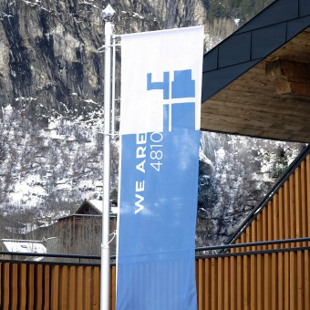
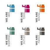
| DESIGN NAME: WeAre4810 PRIMARY FUNCTION: Brand Indentity INSPIRATION: WeAre4810 . WeAreFamily. The goal was to underline the fame of the name 4810 which had always been used by the Grivel family. It is inspired on the height of the Mont Blanc: an umbrella that encloses ideas objects materials and is fluid enough in its meaning to also include a numerical form. The brand is graphical form is based on the idea of using highly contemporary and solid numbers, almost as a seal to guarantee quality and modernity. Numbers that could themselves become a container of image. UNIQUE PROPERTIES / PROJECT DESCRIPTION: For 4810 the idea of renewal starts with the renovation of the historic sports equipment rental shop in Courmayeur. Consequently the time has come to also evolve the concept of the brand which could include from Rental to Shopping to Food thus creating a new mood more contemporary but at the same time continuing to express traditional values under a one big hat represented by the unique 4810 brand. Innovation and tradition together. OPERATION / FLOW / INTERACTION: The Brand has been designed so that it can be reproduced on any material surface and transmitted on various channels such as mobile phones or videos. A manual has been drawn up that can help both the customer and the possible supplier to reproduce the original as faithfully as possible. PROJECT DURATION AND LOCATION: The project started in January 2018 in Courmayeur and finished in February 202020 FITS BEST INTO CATEGORY: Graphics, Illustration and Visual Communication Design |
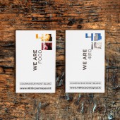
PRODUCTION / REALIZATION TECHNOLOGY: The goal was to underline the fame of the name 4810 which had always been used by the Grivel family. It is inspired on the height of the Mont Blanc 4810m a point of reference in Courmayeur an umbrella that encloses ideas objects materials and is fluid enough in its meaning to also include a numerical form. WeAre4810 the Brand of reference WeAreRental expertise for rental of skis WeAreFood one cuisine which at the same time lies well within everyone WeAreShopping dedicated to sports apparel and accessories WeAreOutlet Promotions and offers WeAreFamily a long family tradition rooted in the distant 19th century SPECIFICATIONS / TECHNICAL PROPERTIES: The whole Brand Identity has developed on different materials shapes and channels having to communicate multiple messages. We used paper for brochures postcards shopping bags sugar sachets and menus. The PVC for the external signs of the structure. Ceramics for the coffee cups and the fabric for the uniforms. It was a truly complete project where various printing techniques were used from traditional pad printing, screen printing to digital printing. We have created a web site that talks about their history and their services until you can book skis online. TAGS: brand Identity, brad design, logo design, viusal identity RESEARCH ABSTRACT: A very large project where I had to combine a technical product like skis and an emotional product like food. There are several variable factors that I found to make different situations coexist: the colors, the symbol where to insert the images and the name WeAre is declinable in many aspects: WeAreRental for the rental shop, WeAreFood for the restaurant, WeAreShopping for the shop and so on. CHALLENGE: WeAreFood is the real change. 4810Food is the meeting point for sports enthusiasts: the space where you come in the morning for breakfast, go for lunch for polenta and stop after skiing to try a snack and maybe combine it with a nice wine. Thus was born the idea of the clock that marks the day and 4 very specific moments. Contemporary terms for an international audience all combined with a clock that recalls history where the hands become fork and spoon to emphasize that at 4810Food you eat. ADDED DATE: 2020-09-07 15:22:43 TEAM MEMBERS (2) : Creative Director: Laura Ferrario and Copy: Chiara Villa IMAGE CREDITS: Image #No 1: Photographer Aiace Ace Bazzana, Image #No 2: Photographer Laura Ferrario, Image #No 2: Photographer ALaura Ferrario, Image #No 3: Photographer Aiace Ace Bazzana, Image #No 4: Photographer Aiace Ace Bazzana |
||||
| Visit the following page to learn more: https://bit.ly/32ejNmJ | |||||
| AWARD DETAILS | |
 |
Weare4810 Brand Indentity by Laura Ferrario is Winner in Graphics, Illustration and Visual Communication Design Category, 2020 - 2021.· Read the interview with designer Laura Ferrario for design WeAre4810 here.· Press Members: Login or Register to request an exclusive interview with Laura Ferrario. · Click here to register inorder to view the profile and other works by Laura Ferrario. |
| SOCIAL |
| + Add to Likes / Favorites | Send to My Email | Comment | Testimonials | View Press-Release | Press Kit | Translations |
| COMMENTS | ||||||||||||||||||||
|
||||||||||||||||||||
Did you like Laura Ferrario's Graphic Design?
You will most likely enjoy other award winning graphic design as well.
Click here to view more Award Winning Graphic Design.


