Nirvana Brand Corporate Identity by Viana Patricio Barbosa Neto |
Home > Winners > #106621 |
 |
|
||||
| DESIGN DETAILS | |||||
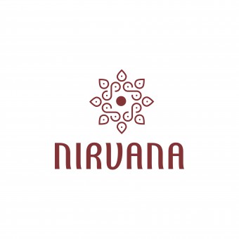
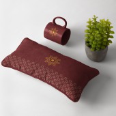
| DESIGN NAME: Nirvana Brand PRIMARY FUNCTION: Corporate Identity INSPIRATION: The referential symbology seeks to bring the representativeness of the Nirvana brand project through the infinity symbol, which seeks continuity, and through the meditative position symbol which brings the sense of balance. After obtaining the initial result with the first symbol, we tried to create a more organic shape that would bring a balance conetcion as a group, just as it is a large part of the Nirvana project, which is also collective. UNIQUE PROPERTIES / PROJECT DESCRIPTION: This identity and brand project was developed here in Brazil for a space for meditation and holistic therapies. It is distinguished by the simplicity of geometric shapes, which together bring elements that represent the proposal of balance and self-knowledge. The infinity symbols, the lotus flower and the meditative position were used as a reference for the composition of the logo. The color of the wine comes from the Buddhist garments and the yellow color of the ornaments used in the monasteries. OPERATION / FLOW / INTERACTION: Because it was designed using a vector editing software, the possibilities are limitless in terms of use and ease. Thus, the created brand can be used in different types of media, materials and objects. It is an identity that is easy to apply because it has proportion and balance. It can be reduced, expanded and applied without losing information. PROJECT DURATION AND LOCATION: The project started in April 2020 and finished in June 2020 in Brazil. FITS BEST INTO CATEGORY: Graphics, Illustration and Visual Communication Design |
PRODUCTION / REALIZATION TECHNOLOGY: In this composition we used simple geometrical shapes and applied a grid system to adjust the symmetry. The composition process itself was simple, the conceptual part that was explored looking for a clean, functional and organic symbology. We used a vector editing software for the creation process. SPECIFICATIONS / TECHNICAL PROPERTIES: The product was designed using a vector drawing software. The logo can be scaled to different sizes without losing the quality of the compositions. The client received the files in order to be able to use them for printing in CMYK, as well as, for web in RGB mode. TAGS: Identity, Branding, Meditation, Packaging, Logo, Budism, Logo Design, Ayurveda, RESEARCH ABSTRACT: In the development of this brand project, extensive research was carried out on elements and symbols linked to meditation, Buddhism and Auyrveda culture. After these studies, symbols and colors were identified to be used in the composition of the logo and identity. Much of the creation time was spent exploring geometric shapes with the use of a grid system, aiming at the symmetry and harmony of the brand. CHALLENGE: One of the biggest difficulties to create this brand was trying to produce something original, but, at the same time its composition could not be too complex. In this project we seeked to absorb the sense of identity of the brand. We worked hard to overcome the barriers of the creative process which sometimes can be exhausting, as it requires constant reconstruction and several attempts, tests and more tests for a remarkable result. ADDED DATE: 2020-06-12 14:59:22 TEAM MEMBERS (1) : IMAGE CREDITS: Pexels |
||||
| Visit the following page to learn more: http://design.com.vc/behance | |||||
| AWARD DETAILS | |
 |
Nirvana Brand Corporate Identity by Viana Patricio Barbosa Neto is Winner in Graphics, Illustration and Visual Communication Design Category, 2020 - 2021.· Press Members: Login or Register to request an exclusive interview with Viana Patricio Barbosa Neto. · Click here to register inorder to view the profile and other works by Viana Patricio Barbosa Neto. |
| SOCIAL |
| + Add to Likes / Favorites | Send to My Email | Comment | Testimonials | View Press-Release | Press Kit |


