Woonwaard Rebranding by Ruud Winder - Rebrandt |
Home > Winners > #103738 |
 |
|
||||
| DESIGN DETAILS | |||||
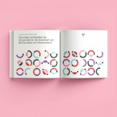
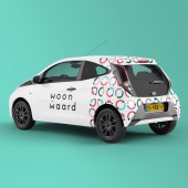
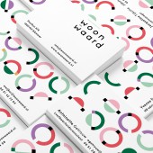
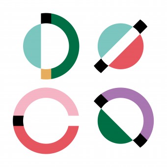
| DESIGN NAME: Woonwaard PRIMARY FUNCTION: Rebranding INSPIRATION: Woonwaard is one of the largest housing associations in the Netherlands. In everything they do - building, maintaining and renting out houses - their main goal is to offer people a home on a sustainable and inclusive way. The activities of the association are carried out without a profit motive. Woonwaard offers a relatively large number of social housing, and since 2019 Woonwaard it can claim the title of the most sustainable housing association of the Netherlands. UNIQUE PROPERTIES / PROJECT DESCRIPTION: The unique brand identification program quickly revealed that the Woonwaard identity had to be modern, yet serious, and it had to convey calmness and serenity. The identity also had to represent the diversity of the tenants and the positive aspects of renting. OPERATION / FLOW / INTERACTION: DTP and Print productions: Koopmans’ drukkerij Zwaag – www.koopmansdrukkeri PROJECT DURATION AND LOCATION: 3-4 Months region Amsterdam, The Netherlands FITS BEST INTO CATEGORY: Graphics, Illustration and Visual Communication Design |
PRODUCTION / REALIZATION TECHNOLOGY: It goes without saying that the set of resources complies with all the most sustainable guidelines. FSC certified, but also digital applications instead of paper. An organization that is so strongly represented in the daily lives of many tenants should set a good example in this. SPECIFICATIONS / TECHNICAL PROPERTIES: Each application in the identity is given a unique set of circles. Made possible by a balanced basic design with more than 250 circles in different compositions and colors, the media are printed on FSC HVO paper in 6 Pantone colors plus Black. TAGS: rebranding, award, rebrand, rebrandt, woonwaard, corporate, id, identity, housestyle, dutch agency RESEARCH ABSTRACT: The rebranding of one of the largest housing associations in the Netherlands started in 2020 in the region Amsterdam. The rebranding is already a global Award winning project but more importantly; in addition to the client and its employees, the tenants have enthusiastically embraced the new design. CHALLENGE: The multiple character of being solid and stable, and also being active and progressive. both sides have been successfully covered in the overall corporate identity. ADDED DATE: 2020-03-15 11:59:21 TEAM MEMBERS (6) : Designer | Design and Brand Architecture: Ruud Winder - www.linkedin.com/in/ruudwinder, Brand Storyteller - Corporate Story of Woonwaard: Vincent Jeitler – www.linkedin.com/in/vincentjeitler, Brand Stylist - Brand-Identification-Program + Styling: Nikkie Wester, Junior Designer - Graphic Design: Simone Winder, Animator - Animation and Graphics: Peter Puntman and Client: Woonwaard - Anniek van Belle, Nina Beute IMAGE CREDITS: All rights REBRANDT® |
||||
| Visit the following page to learn more: https://www.rebrandt.com | |||||
| AWARD DETAILS | |
 |
Woonwaard Rebranding by Ruud Winder-Rebrandt is Winner in Graphics, Illustration and Visual Communication Design Category, 2020 - 2021.· Read the interview with designer Ruud Winder - Rebrandt for design Woonwaard here.· Press Members: Login or Register to request an exclusive interview with Ruud Winder - Rebrandt. · Click here to register inorder to view the profile and other works by Ruud Winder - Rebrandt. |
| SOCIAL |
| + Add to Likes / Favorites | Send to My Email | Comment | Testimonials | View Press-Release | Press Kit |
Did you like Ruud Winder-Rebrandt's Graphic Design?
You will most likely enjoy other award winning graphic design as well.
Click here to view more Award Winning Graphic Design.


