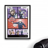
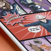
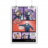
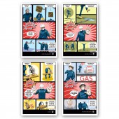
Debes Intervenir Poster by Eduardo Walles |
Home > Winners > #101449 |
 |
|
||||
| DESIGN DETAILS | |||||
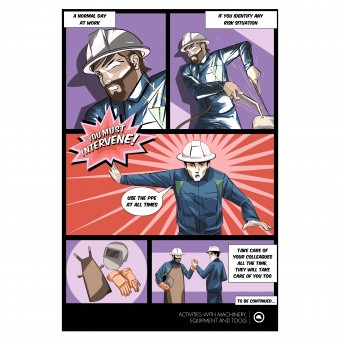
| DESIGN NAME: Debes Intervenir PRIMARY FUNCTION: Poster INSPIRATION: The comic style of the campaign is a resource that, due to its visual nature, allows an opening to reasoning much easier to digest, as well as a direct and logical understanding for the receiver without waiting for a scolding or opinion even when the message is. tApp decided to used the colorful and exciting path of the comic world to generate empathy and engagement with the collaborators in the workplace. UNIQUE PROPERTIES / PROJECT DESCRIPTION: Debes Intervenir is the result effort to take care of all the staff, regardless of range in the work areas. In this campaign, the tApp team seek to represent the correct and incorrect use of tools and facilities, underlining as an axis the key moment when something is about to go very wrong. The comic style turned out to be the approach channel towards the workers to generate a friendly, peaceful and pleasant bond. OPERATION / FLOW / INTERACTION: The comic phenomenon has always been a factor that invites to read and reason the messages described under this visual style. The idea of integrating a graphic character that guides plant workers under the facade of an illustration it turned out to be a more direct link and understandable to the receiver. PROJECT DURATION AND LOCATION: The project started in September 2016 and finished in November 2016 in CDMX. FITS BEST INTO CATEGORY: Graphics, Illustration and Visual Communication Design |
PRODUCTION / REALIZATION TECHNOLOGY: For this project the tApp team decided to use the illustration tools that has Animate, because they needed a quality of organic, loose stroke and at the same time vectorized, for the graphic style they were looking for. For this reason tApp had to leave out to Illustrator software. In the end for composition, adjustment, color, masks, assembly and output they worked in Photoshop. SPECIFICATIONS / TECHNICAL PROPERTIES: Styrene 900 mm X 600 mm. Depth. 50 TAGS: Workers, Plants, Companies, Communication, Security, Colorful, Artwork, Agency, Strategy, internal, design, illustration, comic, poster RESEARCH ABSTRACT: For the realization of this project the tApp team review and rely on many references about comics, bullet handling, textual language, colors and the design of characters; since these are the main thread of a narrative and it is in them in whom instruction falls on how actions should be performed in a work area, which is it the main theme of the campaign. They also analyze the way on how messages can be direct without hindering persuasion and learning and as tie them with the graphic part to finally close the message. CHALLENGE: tApp knew from the beginning that the idea of the comic would be the channel for the message, but to find the style, the character design as well as the different possibilities were delaying them. There were many selection rounds, first the internal ones as a team, and then those of the client. The way to polish every detail on characters was long and excessive in the amount of changes, since they always found new things to contribute. ADDED DATE: 2020-02-27 01:02:10 TEAM MEMBERS (2) : Creative Director: Rodrigo Romandia and Art Director: Eduardo Walles IMAGE CREDITS: None, everything was created form scratch. PATENTS/COPYRIGHTS: None, everything was created form scratch. |
||||
| Visit the following page to learn more: http://www.tapp.mx/ | |||||
| AWARD DETAILS | |
 |
Debes Intervenir Poster by Eduardo Walles is Winner in Graphics, Illustration and Visual Communication Design Category, 2019 - 2020.· Read the interview with designer Eduardo Walles for design Debes Intervenir here.· Press Members: Login or Register to request an exclusive interview with Eduardo Walles. · Click here to register inorder to view the profile and other works by Eduardo Walles. |
| SOCIAL |
| + Add to Likes / Favorites | Send to My Email | Comment | Testimonials | View Press-Release | Press Kit |
Did you like Eduardo Walles' Graphic Design?
You will most likely enjoy other award winning graphic design as well.
Click here to view more Award Winning Graphic Design.


