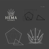
HEMA Alliance Corporate Identity by Pedro Panetto |
Home > Winners > #100934 |
 |
|
||||
| DESIGN DETAILS | |||||
| DESIGN NAME: HEMA Alliance PRIMARY FUNCTION: Corporate Identity INSPIRATION: The Historical European Martial Arts are deeply connected to their heritage and have strong cultural bonds. The research comprised concepts from the medieval European culture, passing though the Renaissance and reaching as far as the Victorian era. Proportions of several historical sword models were investigated during this process. Within the HEMA context, it was investigated what kind of symbol could embrace every practitioner from this really diverse community. UNIQUE PROPERTIES / PROJECT DESCRIPTION: A brand with 160 variations. The HEMA Alliance is an US association that provides support for the practitioners of Historical European Martial Arts (HEMA) and acts as an international meeting point for the community. The brand has a global reach; the 160 variations represent the diversity of the community and enable each practitioner choosing the symbol that best suits their preferences. The project connects with the historical heritage of the martial arts, it revives traditions. OPERATION / FLOW / INTERACTION: Each HEMA practitioner can choose the symbol variation that best suits their training style and sword preference, then embroider on their fencing jacket. The flexibility of this brand is big but still keeps the identity so each and every variation can be clearly identified as the HEMA Alliance symbol. PROJECT DURATION AND LOCATION: - FITS BEST INTO CATEGORY: Graphics, Illustration and Visual Communication Design |
PRODUCTION / REALIZATION TECHNOLOGY: The production of this Project was very complex, the biggest challenge was related to proportions.Every sword and weapon design needed to follow exact ratios of real historical models. The symbol varied 40 times, and each individual symbol has 4 visual arrangements, totalizing 160 variations. A complex diagram was developed for the project, in accordance with the Golden Ratio, so the consistence in and between all variations could be measured and achieved. SPECIFICATIONS / TECHNICAL PROPERTIES: Each letter was designed for this brand in accordance with the Golden Ratio. Spacing between letters and between elements of the Visual Identity also follows the proportional laws of the Golden Ratio. The symbol’s diagram, in all its variations, uses the same proportional relations of the Golden Number. Thus the use of the Golden Number, 1.61803398875…, is the main technical parameter for this Project and provides proportional consistence. TAGS: Golden Ratio, Logo, Brand, HEMA, Sport, Martial Arts, History RESEARCH ABSTRACT: It was necessary to convey a historical aspect to a martial-looking symbol. The research led to the blending of historical context to the tactical aspect of the current martial arts. The brand should be attractive, strong and at the same time convey the revival of a tradition. This blending was the guideline of the complete research process and design. CHALLENGE: The main challenge was offering a symbol representing a great number of historical weapons. For each individual practitioner, its training weapon is the best in their eyes. To please such a large and passionate community was the main creative and research challenge. The challenge was overcome by a variable symbol, so all practitioners felt represented. As a result of this new, all-embracing representation, the association quickly increased its membership after the launch of the new brand. ADDED DATE: 2020-02-25 18:24:18 TEAM MEMBERS (2) : Pedro Panetto. and Francesco Brugnera Teixeira. IMAGE CREDITS: Pedro Panetto , 2019. |
||||
| Visit the following page to learn more: https://www.hemaalliance.com/ | |||||
| AWARD DETAILS | |
 |
Hema Alliance Corporate Identity by Pedro Panetto is Winner in Graphics, Illustration and Visual Communication Design Category, 2019 - 2020.· Read the interview with designer Pedro Panetto for design HEMA Alliance here.· Press Members: Login or Register to request an exclusive interview with Pedro Panetto . · Click here to register inorder to view the profile and other works by Pedro Panetto . |
| SOCIAL |
| + Add to Likes / Favorites | Send to My Email | Comment | Testimonials | View Press-Release | Press Kit |
Did you like Pedro Panetto's Graphic Design?
You will most likely enjoy other award winning graphic design as well.
Click here to view more Award Winning Graphic Design.


