Pure Green Visual Identity by Xinqi Liu |
Home > Winners > #100488 |
 |
|
||||
| DESIGN DETAILS | |||||
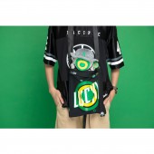
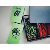
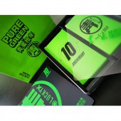
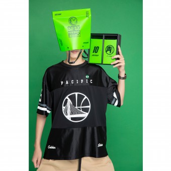
| DESIGN NAME: Pure Green PRIMARY FUNCTION: Visual Identity INSPIRATION: The designers take Chongqing's impressions of "tradition and innovation", "modern and retro", "market and fashion", which are all concepts of strong collision and coexistence. In the selection of the overall visual style, they develop a brand specific "national trend" model to match the target consumer groups. At the same time, they deepen the popular national fashion style with unique brand genes, so the concept of "Green Trend" comes into being. UNIQUE PROPERTIES / PROJECT DESCRIPTION: Pure Green is a representative work, which uses a young "national trend" way to upgrade the original brand. In order to make the brand exclusive symbols present in front of consumers in more diverse forms and media. The designers deepen and extend it again, and create a lovely and mysterious IP image, while further promoting the brand, the distance between the brand and the consumer is drawn. OPERATION / FLOW / INTERACTION: Among the red oil hotpot, fresh pepper hotpot is the best way to innovate and salute the traditional hot pot, also links the Pure Green with the young people in Chongqing. The designers do not weaken its difference, but strengthen it more, and use visual language to highlight the unique brand personality. PROJECT DURATION AND LOCATION: The project started in July 2019 in Chongqing and finished in December in Chongqing. FITS BEST INTO CATEGORY: Graphics, Illustration and Visual Communication Design |
PRODUCTION / REALIZATION TECHNOLOGY: The IP image represents the positive circle and the negative cross element. The national essence mahjong is used to replace the physical five senses to create an IP image that adheres to independence, mystery and vitality. SPECIFICATIONS / TECHNICAL PROPERTIES: The project covers a total of 256 square meters. In brand operation, the designers try to turn disadvantage into advantage. The fresh pepper hotpot researched by Pure Green through years of precipitation and technological breakthrough is an important core asset of the brand, which should not be avoided, but should be vigorously promoted. TAGS: Visual Identity, Commercial, Restaurant, Modern, Fashion, IP, National Trend, Hot Pot, Mobee RESEARCH ABSTRACT: In the process of communicating with the founder's team, the designers understand their concerns. In the market environment where "red oil hotpot" is popular in Chongqing, the bottom of green hot pot is too niche, which is not in line with the cognition of Chongqing locals. Therefore, how to upgrade the brand image as a whole, at the same time, get more consumers' cognition, even brand recognition, has become the focus of this design. CHALLENGE: The biggest problem between the original brand and space design is that there is no clear brand positioning, so there is no presentation of brand culture personality and no clear brand memory point. To this end, the designers take the unique green color of fresh pepper hotpot as the brand color to echo the large red area. ADDED DATE: 2020-02-24 15:08:59 TEAM MEMBERS (5) : Xinqi Liu, Siyu Xu, Ye Fang, Tao Chen and Yuting Wang IMAGE CREDITS: Image #1: Photographer MET Creative Brand, Pure Green, 2019. Image #2: Photographer MET Creative Brand, Pure Green, 2019. Image #3: Photographer MET Creative Brand, Pure Green, 2019. Image #4: Photographer MET Creative Brand, Pure Green, 2019. Image #5: Photographer MET Creative Brand, Pure Green, 2019. PATENTS/COPYRIGHTS: Copyrights belong to Xinqi Liu, 2019. |
||||
| Visit the following page to learn more: http://c7.gg/fUU2v | |||||
| AWARD DETAILS | |
 |
Pure Green Visual Identity by Xinqi Liu is Winner in Graphics, Illustration and Visual Communication Design Category, 2019 - 2020.· Read the interview with designer Xinqi Liu for design Pure Green here.· Press Members: Login or Register to request an exclusive interview with Xinqi Liu. · Click here to register inorder to view the profile and other works by Xinqi Liu. |
| SOCIAL |
| + Add to Likes / Favorites | Send to My Email | Comment | Testimonials | View Press-Release | Press Kit |
Did you like Xinqi Liu's Graphic Design?
You will most likely enjoy other award winning graphic design as well.
Click here to view more Award Winning Graphic Design.


