Calm the World Dental Clinic by Matt Liao |
Home > Winners > #100357 |
 |
|
||||
| DESIGN DETAILS | |||||
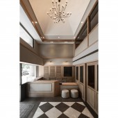
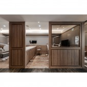
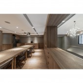
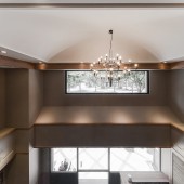
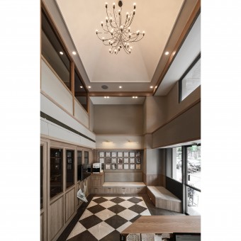
| DESIGN NAME: Calm the World PRIMARY FUNCTION: Dental Clinic INSPIRATION: To many patients, seeing dentists have always been stressful. And since the waiting time is usually longer than expected, the design team proposed that a calm ambiance while waiting would be the key to the design. A spacious high ceiling lobby functioned as the reception and waiting area was then created for patient's first impression. They use a groin vault ceiling and some simple wood moldings plus the marble grids in promoting the ambiance of an old school library, where one can always seek for his own calmness. UNIQUE PROPERTIES / PROJECT DESCRIPTION: This project was designed after finishing this client's previous dental clinic renovation in the same neighborhood. Although both properties have the same small dimensions, the space requirement was way much more in this new site. The design team was asked to put three examination rooms, one x-ray room, a dental laboratory with 2 separate in/out doors, a reception, a waiting area and restrooms within this narrow 84-square-meter area of the first floor. For the mezzanine, an operating room, a consulting room, a multi-use office, restrooms are required. OPERATION / FLOW / INTERACTION: By now, the clinic had been operating for more than 9 months. Waiting for examination has become quite relaxed and calm experiences according to the interviews with some patients. Even though people tend to receive digital information via digital devices nowadays, the old-school library can still be a reminder to one's sense of calmness. PROJECT DURATION AND LOCATION: The project started in February 2019 and finished in June 2019. FITS BEST INTO CATEGORY: Interior Space and Exhibition Design |
PRODUCTION / REALIZATION TECHNOLOGY: Formica, Steel, Glass, Wallpaper, Marble. SPECIFICATIONS / TECHNICAL PROPERTIES: This site located on the first floor, has a total area of 145 square meters including a 60-square-meter mezzanine. The dimension is 5.8 meters in width and 14.7 meters in length. TAGS: World, Dental, Clinic, DMore, Taipei RESEARCH ABSTRACT: By sacrificing a big part of space to the entrance lobby, we had to avoid some doors and walls in the clinic in order to achieve more openness. A wider one turn staircase to the mezzanine leads us to the multi-use office with a luxury view of a modern chandelier hanging from our groin vault lobby in the New Taipei City street view background. CHALLENGE: To understand very detailed dental examination and operating procedures was critical while trying to put many functions in this small site. In addition, insisting a spacious waiting lobby had made this even more difficult. The dentists and dental equipment supplier's opinions and comments were truly helpful in the whole process. ADDED DATE: 2020-02-24 06:00:09 TEAM MEMBERS (3) : Designer: Matt Liao, Designer: Red Hong and Designer: Yang Chen IMAGE CREDITS: Image #1: Photographer Kelvin Ku Image #2: Photographer Kelvin Ku Image #3: Photographer Kelvin Ku Image #4: Photographer Kelvin Ku |
||||
| Visit the following page to learn more: http://www.dmoredesign.com | |||||
| AWARD DETAILS | |
 |
Calm The World Dental Clinic by Matt Liao is Winner in Interior Space and Exhibition Design Category, 2019 - 2020.· Read the interview with designer Matt Liao for design Calm the World here.· Press Members: Login or Register to request an exclusive interview with Matt Liao. · Click here to register inorder to view the profile and other works by Matt Liao. |
| SOCIAL |
| + Add to Likes / Favorites | Send to My Email | Comment | Testimonials | View Press-Release | Press Kit | Translations |
Did you like Matt Liao's Interior Design?
You will most likely enjoy other award winning interior design as well.
Click here to view more Award Winning Interior Design.


