| THE AWARD |
| CATEGORIES |
| REGISTRATION |
| SUBMIT YOUR WORK |
| ENTRY INSTRUCTIONS |
| TERMS & CONDITIONS |
| PUBLICATIONS |
| DATES & FEES |
| METHODOLOGY |
| CONTACT |
| WINNERS |
| PRESS ROOM |
| GET INVOLVED |
| DESIGN PRIZE |
| DESIGN STORE |
| THE AWARD | JURY | CATEGORIES | REGISTRATION | PRESS | WINNERS | PUBLICATIONS | ENTRY INSTRUCTIONS |
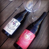
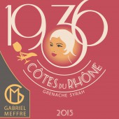
Gabriel Meffre Bottle of Wine by Delphine Goyon and Catherine Alamy |
Home > Winners > Design #52889 >Interview |
 |
|
FS: What is the main principle, idea and inspiration behind your design?
DG: It was at the beginning of the 30's that promotional displays and advertising developed. Outstanding artists emerge, making graphic art a creative expression and cultural engagement. The display largely uses the Art Deco style, particularly elegant female representations or highly sought-after typography. The "1936" cuvée from the Gabriel Meffre house uses these codes, typical of the 1930s, to transport us 80 years back, at a time when the French poster is at its peak.
FS: What has been your main focus in designing this work? Especially what did you want to achieve?
DG: The main goal in achieving this label was both to create a label that is in the universe of the 30s, while using the contemporary printing techniques that we have today to give a collector dimension to this vintage.
FS: What are your future plans for this award winning design?
DG: We look forward to attending the gala night in late June at Lake Como in Italy to receive our trophy and meet the organizers and other participants of A design award to exchange with them.
FS: How long did it take you to design this particular concept?
DG: We worked with our client for about a month and a half, 2 months to reach the completion of the project. The meeting with the printer was decisive for carrying out the project and defining with him all the printing techniques chosen.
FS: Why did you design this particular concept? Was this design commissioned or did you decide to pursuit an inspiration?
DG: This creation is an order from our client Gabriel Meffre, Wine Producer in the Rhône Valley and South of France. This order was intended to represent the vintage collector of 80 years of the house Gabriel Meffre.
FS: What made you design this particular type of work?
DG: The design was chosen and used, produced by our client.
FS: Where there any other designs and/or designers that helped the influence the design of your work?
DG: I have watched the posters of the 30s to develop the universe of this collector's label.
FS: Who is the target customer for his design?
DG: The label must appeal to wine consumers, but also distributors such as wine shops, restaurants ...
FS: What sets this design apart from other similar or resembling concepts?
DG: This label is typical of the graphic design of the 30s and differs both in its unusual graphic design, as well as the printing techniques used such as embossing and hot foil stamping.
FS: How did you come up with the name for this design? What does it mean?
DG: 1936 is the year of creation of the house Gabriel Meffre. It is therefore natural that for the anniversary vintage of the 80 years of the house, the year of creation is included on the label and enhancement.
FS: Which design tools did you use when you were working on this project?
DG: The project was entirely realized with the Adobe Illustrator software by directly working the drawing in vector with the pen tool.
FS: What is the most unique aspect of your design?
DG: The singularity of forms and the composition a little crazy years of the 30s
FS: Who did you collaborate with for this design? Did you work with people with technical / specialized skills?
DG: We worked in collaboration with the commercial teams and the communication department of our client.
FS: What is the role of technology in this particular design?
DG: The print quality was fundamental in this project because it allowed to give a truly qualitative and high-end product.
FS: Is your design influenced by data or analytical research in any way? What kind of research did you conduct for making this design?
DG: Yes, of course, we have both drawn our inspiration from the posters of the 30s but also in design works, on social networks. Inspiration is everywhere.
FS: What are some of the challenges you faced during the design/realization of your concept?
DG: The label should both be characteristic of the 1930s and at the same time give the impression that it was made recently. It was therefore quite paradoxical to realize.
FS: How did you decide to submit your design to an international design competition?
DG: We are quite fond of competition and our agency has itself created a design contest platform Favourite Design.
FS: What did you learn or how did you improve yourself during the designing of this work?
DG: Each project is enriching because it allows us to dive into a universe, an era to explore graphically. This was the case for this project with a fabulous return to the 30s in France
FS: Any other things you would like to cover that have not been covered in these questions?
DG: We are delighted to have worked on this very enriching project humanly and graphically
FS: Thank you for providing us with this opportunity to interview you.
A' Design Award and Competitions grants rights to press members and bloggers to use parts of this interview. This interview is provided as it is; DesignPRWire and A' Design Award and Competitions cannot be held responsible for the answers given by participating designers.
| SOCIAL |
| + Add to Likes / Favorites | Send to My Email | Comment | View Press-Release | Translations |


