| THE AWARD |
| CATEGORIES |
| REGISTRATION |
| SUBMIT YOUR WORK |
| ENTRY INSTRUCTIONS |
| TERMS & CONDITIONS |
| PUBLICATIONS |
| DATES & FEES |
| METHODOLOGY |
| CONTACT |
| WINNERS |
| PRESS ROOM |
| GET INVOLVED |
| DESIGN PRIZE |
| DESIGN STORE |
| THE AWARD | JURY | CATEGORIES | REGISTRATION | PRESS | WINNERS | PUBLICATIONS | ENTRY INSTRUCTIONS |
Typographic Posters Poster Series by Manuel Guerrero |
Home > Winners > Design #45541 >Interview |
 |
|
FS: What is the main principle, idea and inspiration behind your design?
MG: When tis project was made the aim was to communicate with the only use of typography. To do that, the reference in the work of designers like Müller-Brockmann, Wolfgang Weingart, Niklaus Troxler, Isidro Ferrer and Felix Beltran was very important to define the concept and the technique.
FS: What has been your main focus in designing this work? Especially what did you want to achieve?
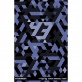
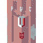
MG: My main focus was to design this posters was the use of typography through the use of lines and isometric perspective, this made a visual game where characters and typographic signs appears and disappears. This technique was shown to be an effective way to reproduce some principles of the optic art.
FS: What are your future plans for this award winning design?
MG: I would like to get it seen by as many people as possible; getting it into as many exhibitions and publications as I can with the aim to eventually make posters to international clients.
FS: How long did it take you to design this particular concept?
MG: This is a collection of posters made during 2013 and 2015, the main idea came from the particular objective and the experimental use of type.
FS: Why did you design this particular concept? Was this design commissioned or did you decide to pursuit an inspiration?
MG: These posters were commissioned by friends for different reasons, some for events and others for anniversary but in each case; the inspiration in the work of other designer was an important part of the design process.
FS: Is your design being produced or used by another company, or do you plan to sell or lease the production rights or do you intent to produce your work yourself?
MG: Each client produce their poster for their events, but I’m working to produce a collection of posters for exhibitions about the use of typography.
FS: What made you design this particular type of work?
MG: The use of typography is an affordable vehicle for me to express myself at this stage in my life and explore the things I'm interested in.
FS: Where there any other designs and/or designers that helped the influence the design of your work?
MG: When I was a student the work of the designers like Müller Brockman, Wolfgang Weingart, Niklaus Troxler seemed great to me and now I see my work I find that taste is present.
FS: Who is the target customer for his design?
MG: All people interested in culture and people how likes the visual design.
FS: What sets this design apart from other similar or resembling concepts?
MG: In some cases the simplicity, and in others the perceptual game produced by lines and patterns.
FS: How did you come up with the name for this design? What does it mean?
MG: The name of this project represents the common characteristic in the collection of posters.
FS: Which design tools did you use when you were working on this project?
MG: Poster images were made with Adobe Illustrator using a grid of lines, with no 3D support, and printed in silkscreen in free-acid paper.
FS: What is the most unique aspect of your design?
MG: Typographic posters are a perceptual experience related to how vision functions. As the Op Art, this project is based in two primary ways. The first, and best-known method is the creation of effects through the use of pattern and line. Another reaction that occurs is that the lines create after images of certain colors due to how the retina receives and processes light.
FS: Who did you collaborate with for this design? Did you work with people with technical / specialized skills?
MG: Yes, some posters were printed in serigraph technic and specialized people help to produce this project.
FS: What is the role of technology in this particular design?
MG: The use of computer was fundamental to make the posters in less time, but the technics used can do of manual form, but you need much time to produce it.
FS: Is your design influenced by data or analytical research in any way? What kind of research did you conduct for making this design?
MG: This project involves the experimental use of type to make a visual game where the characters and typographic signs appears and disappears, because I like to play in the thin line where the letter perceives like a form and letter at the same time.
FS: What are some of the challenges you faced during the design/realization of your concept?
MG: The biggest challenge for this project was the typographic expression.
FS: How did you decide to submit your design to an international design competition?
MG: In this occasion I receive a nomination to participate at this competition.
FS: What did you learn or how did you improve yourself during the designing of this work?
MG: I learn many things, especially in the process. But I know I have a long way to learn.
FS: Any other things you would like to cover that have not been covered in these questions?
MG: Just say thanks
FS: Thank you for providing us with this opportunity to interview you.
A' Design Award and Competitions grants rights to press members and bloggers to use parts of this interview. This interview is provided as it is; DesignPRWire and A' Design Award and Competitions cannot be held responsible for the answers given by participating designers.
| SOCIAL |
| + Add to Likes / Favorites | Send to My Email | Comment | View Press-Release | Translations |


