| THE AWARD |
| CATEGORIES |
| REGISTRATION |
| SUBMIT YOUR WORK |
| ENTRY INSTRUCTIONS |
| TERMS & CONDITIONS |
| PUBLICATIONS |
| DATES & FEES |
| METHODOLOGY |
| CONTACT |
| WINNERS |
| PRESS ROOM |
| GET INVOLVED |
| DESIGN PRIZE |
| DESIGN STORE |
| THE AWARD | JURY | CATEGORIES | REGISTRATION | PRESS | WINNERS | PUBLICATIONS | ENTRY INSTRUCTIONS |
Fluxion Mall by Zhipeng Kang |
Home > Winners > Design #32587 >Interview |
 |
|
FS: What is the main principle, idea and inspiration behind your design?
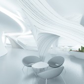
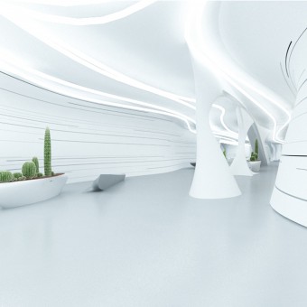
ZK: The inspiration came from a movie called "Empire Of The Ants", then I had an idea to design a shopping mall and make it look like an anthill or a cave.
FS: What has been your main focus in designing this work? Especially what did you want to achieve?
ZK: I have to make sure that the project will achive the expected visual effects,and the same times ensure that the arrangement of the interior space is distributed rationally and comfortably . So I did some research on anthills .Then I learned that ants are really good at grasping the space. Though the internal structure of anthill is complex, it is distributed rationally with all the space interconnected, which enables ants move freely. Besides, every part has its own unique function, and the spatial distribution varies according to the the difference of its function. So it is necessary for me to consider applying ants’ wisdom to human’s spatial structure. The most important part is to use the rational distribution of anthill for reference, because the rationality of spatial function is the most important element in humane design. Therefore,what I need to consider first is the planning of spatial function in the design, and the planned space will just as smooth and beautiful as anthill.
FS: How long did it take you to design this particular concept?
ZK: It took me about 40 days .
FS: Why did you design this particular concept? Was this design commissioned or did you decide to pursuit an inspiration?
ZK: I want customers to feel something different, a kind of distinctive spatial experience, which is based on the combination of vision and psychological feelings. So, here I created a shopping center design concept which is inspired from an ant hill structure.
FS: Which design tools did you use when you were working on this project?
ZK: First , I used mark pen to draw sketches .Then I finished the rendering with 3DMAX.
FS: What is the most unique aspect of your design?
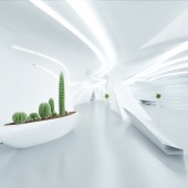
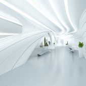
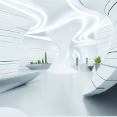
ZK: This project's visual effects and spatial arrangement were both inspired from ant hills . The visual mall is shaped as a curve on the whole. In addition, the curve is like the graceful arc reflected in the anthill. The gorgeous liquidity space is going to bring us some impact, so that we have a unique and exotic experience going through the tunnels. Meanwhile, for the plan of spatial functions,I use the logical structure inside the ant hill for reference. As everybody knows, in the anthill, there are thousands of routes connecting all the spaces. This system keeps the interflow fluent and orderly, though complicated. I think this concept can be applied compatibly to the space in a mall because customers need to be free and relaxed. Therefore, all parts of the designing space is connected with each other. None of them are isolated. As for colors ,considering the complexity of interior spaces, only white, black and gray are used. The simplified colors would make the spaces compact, bright and distinct. Meanwhile, the wall is decorated with black and gray lines, which can beautify the spaces and guide us to the right direction.
FS: Thank you for providing us with this opportunity to interview you.
A' Design Award and Competitions grants rights to press members and bloggers to use parts of this interview. This interview is provided as it is; DesignPRWire and A' Design Award and Competitions cannot be held responsible for the answers given by participating designers.
| SOCIAL |
| + Add to Likes / Favorites | Send to My Email | Comment | View Press-Release | Translations |

